~Credits to Galyna Andrushko , ~fenne-stock , =night-fate-stock and Mykola Velychko ~ (5 years and 3513 days ago)
(5 years and 3513 days ago)
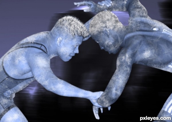
Love the hair! Good work, author!
I like your concept and I'm sure this was quite a challenge.
Howdie stranger!
If you want to rate this picture or participate in this contest, just:
LOGIN HERE or REGISTER FOR FREE
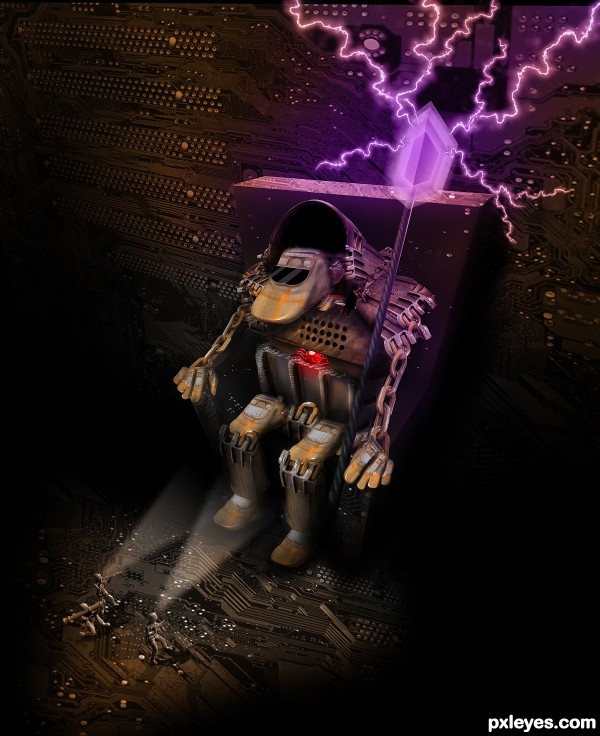
Plot: an expedition to the center of the Earth discovers something truly amazing!
I made this picture in 3-4 days, some at home.. some at work in my lunch brake with my sandwich over the keyboard.. Anyway, my SBS will be mostly ritten because i didn't took printscreens. My end file has almost 90 layers, this would mean to take 90 screenshots, at home and at work.
I want to thank pixpix80 from Stockexchange for tha circuit board picture
Also fraserw2 from DeviantArt for the ArmyMen picture (5 years and 3513 days ago)
Nice entry author. Only nitpicks would be the masking on his left chain arm and the beak of the head. Other than that great job. Good luck!
Edit: much better!
Try to get rid of the white outline around the little guy, who doesn't have nearly the quality of the rest of your image.
This is very cool, author, great concept for the main character, love the chair and scepter idea. If you have time, just work on the edges of the small white character to blend into the background a little more. Love that you added purple in this to contrast with the orangey tones of the source. 
It's really lovely and atmospheric! Good work!
Brillient great manipulation!
impressive idea, and luv the perspective as well... ...
...
Ah, much better, author. Good idea on selection of these images to replace your original, and recoloring them. They also have a little halo around them, mostly on the left unlit side, but big improvement. Now I can see a story from this! 
Really imaginative! Hope to see lots more of your work!! GL
Simply excellent! 
You did a good job using the source image. Very creative.... GL author.
Awesome entry. I'm impressed!
great ......... 
It has all been said before but let me repeat! Magnificent work and wonderfully creative image. Great story and presence to the whole piece ... it is an instant fav for me and high marks for sure!!!
Agrees, agrees, agrees!! Not like you need it, but GL!
Fantastic creation author...very well done
Oh wow, thats awesome! So much detail and so well thought out. I love the perspective and everything. Very well done!
Congrats  Awesome work
congrats friend 
Congrats for your first place, Mircea! 
Congrats for first....
Congratulations! This was very well done 
Bravo Mircea!
Congrats...great entry and well deserved 1st...keep going...
Congrats!! Special congrats for your first, first place!
Howdie stranger!
If you want to rate this picture or participate in this contest, just:
LOGIN HERE or REGISTER FOR FREE
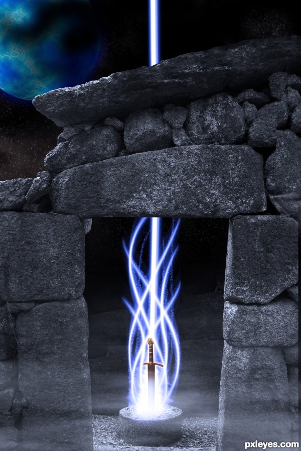
Mythical stone circle with a glowing sword embedded in a stone under a blue moon. I made the stars, the moon, and the comet using simple photoshop skills. Hope you guys like it and any specific questions, just ask ;) (5 years and 3514 days ago)
Awesome 
Your sword image is not usable. Please read http://www.pxleyes.com/blog/2009/06/how-and-where-to-find-legal-source-images/
I'm sure you can find a replacement sword with no trouble. Your image is good, my only suggestion would be to give the glow a bit of outer glow and less opacity. GL.
Thanks man. all fixed!
Thanks man. all fixed!
It looks real good.... good luck.
Lovely cold lighting effects 
very nice idea author...gl
Howdie stranger!
If you want to rate this picture or participate in this contest, just:
LOGIN HERE or REGISTER FOR FREE
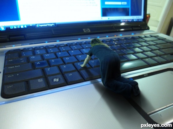
(5 years and 3515 days ago)
nice idea -- hand on the C key needs a bit of work as it looks like it is in the key not on it. -- wonder about the light as well maybe should be a secondary shadow from the light on the right
Edit -- looks better
hey alan thanks for the eagle eye, had a bit of a play with some new shadows and also did a (pretty dodgey) paint job for a hand correction
very interesting idea... and pretty well executed. love the shadow but the pixel difference between the person and the computer is kind of evident.. and perhaps try to select the person a little bit better because you can still see the white edge on the shirt!! but very interesting idea 
Good one, i like it.
I like your concept but feel you miniaturized the person instead of supersizing the lap top. The coke can onto the right makes all the difference. Perhaps mask it out?
Nice concept. Would have been nice if you had lowered the C key seeing the person is pressing on it.
thanks every one. Solkee- i did attempt that but i never found a method that gave me a good result
Creative idea, but I have to kinda agree with jadedink, its more of a downsized image than a supersized image.
very very nice idea and cool work author...best of luck
Howdie stranger!
If you want to rate this picture or participate in this contest, just:
LOGIN HERE or REGISTER FOR FREE
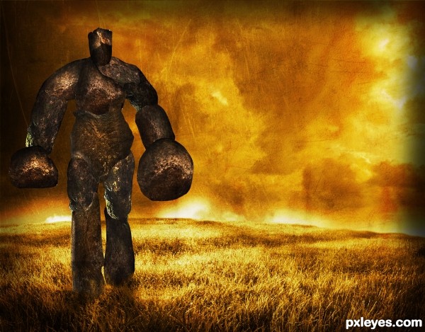
Fascinating image. Not sure if I like the texture ... it is great in the background but over the figure it is not quite working. Sorry I am so late with my comment (I was sick) ... I know there is nothing you can do now but this is a very interesting image and I liked it a lot so had to let you know my only minor problem ... maybe for next time ;-D
You did a good job. I like the colors and the making of the stone man.... good luck.
I have always been afraid of people with small heads (brains) and huge bodies
very nice mood....gl
Howdie stranger!
If you want to rate this picture or participate in this contest, just:
LOGIN HERE or REGISTER FOR FREE