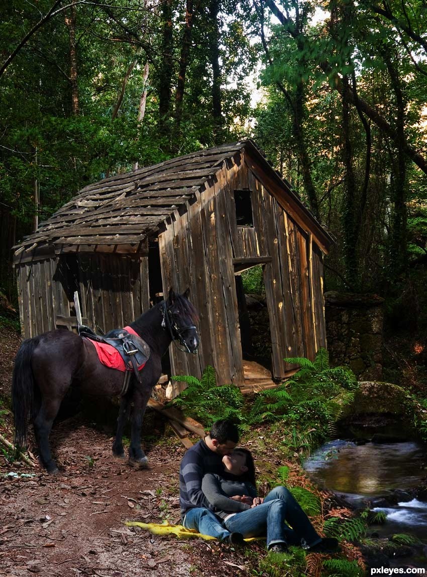
Thanks to mqtrf for the beautiful pics of the horse, river, ruins, and the couple.
(5 years and 3382 days ago)
4 Sources:
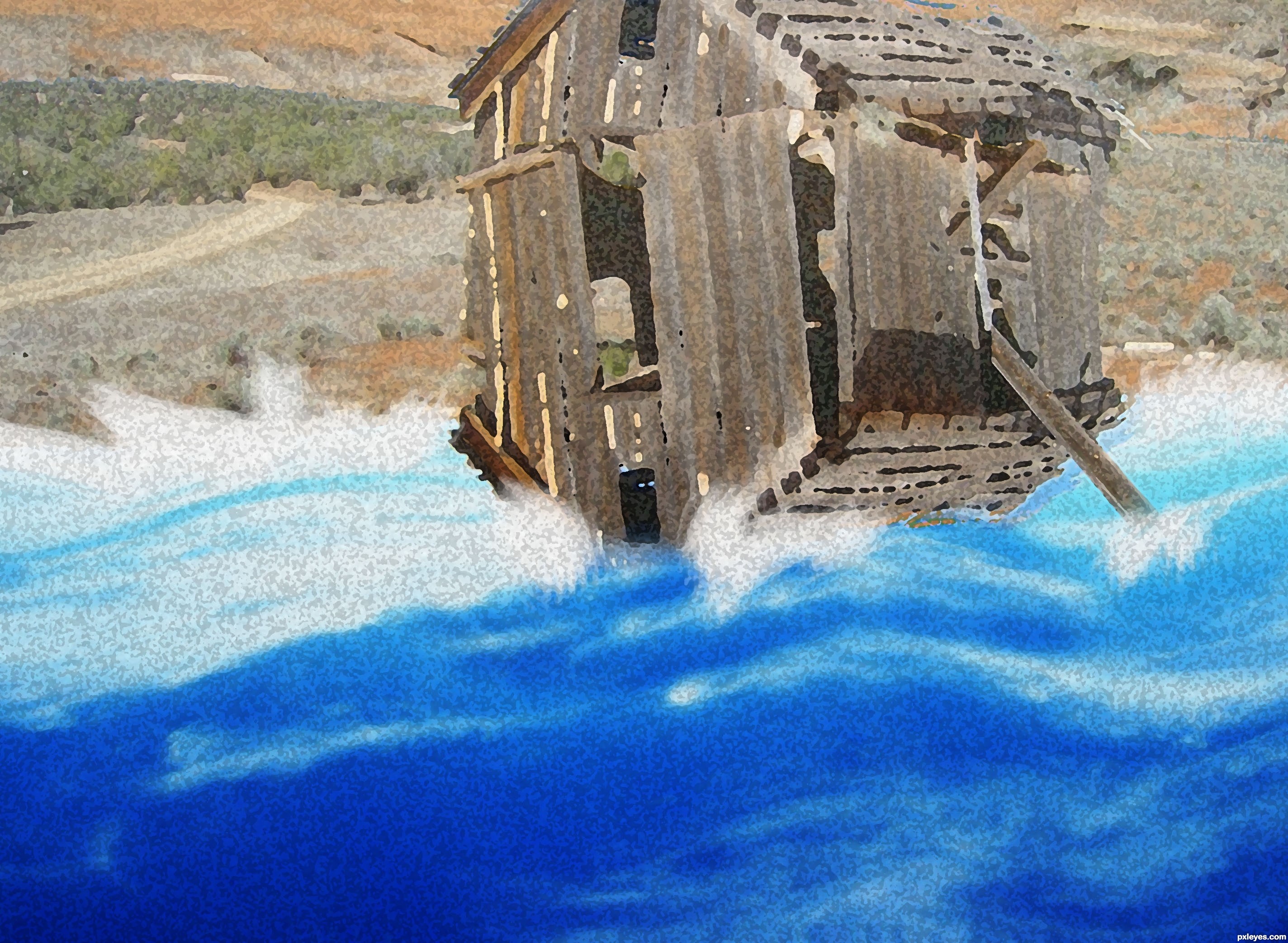
Just an ark in the sea.
I have vertical flipped the picture. Select the shed and made two new layers of it. One 'shed' layer is vertical flipped. The other one lays on top. One for the 'roof', one for the bottom of the ark.
The water is selected and a wave-effect is applied to it.
I add some white spots around bottom of the borders of shed and the border of the shore with a brush.
The paddle on the right is one piece of the shed.
To finish the picture, i used some filters (sponge, dry brush to make it look painted. (5 years and 3382 days ago)

nice idea
Not sure what to see in it ...
Like it though 
looks like a watercolor..... good idea.... good luck....
Agrees with the egg 
why would you crop out the top part of the image? I think would have looked way better as a whole...
Howdie stranger!
If you want to rate this picture or participate in this contest, just:
LOGIN HERE or REGISTER FOR FREE
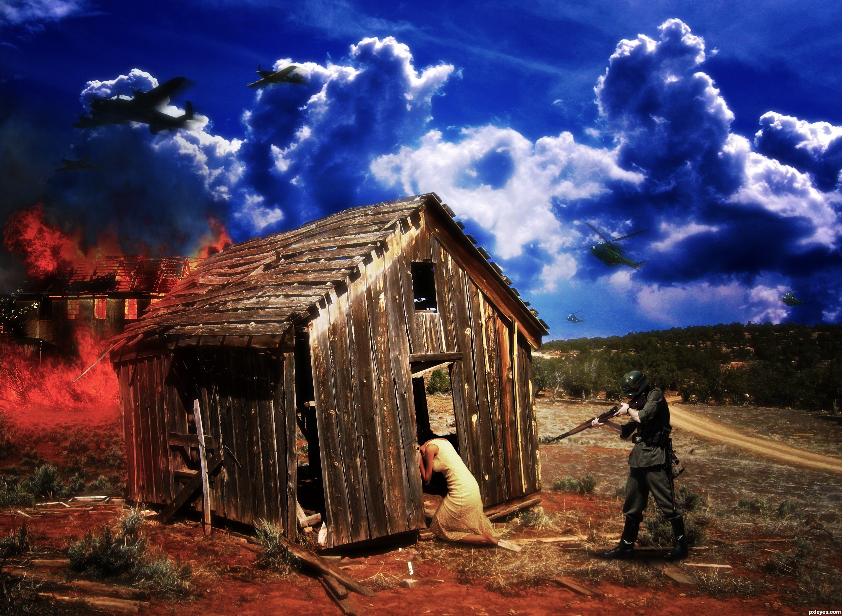
The World war two was a horrible time. Many people were executed for small, or for no reasons.
Luckily it's over now. But we shouldn't let it ever happen again !
(5 years and 3382 days ago)
That's cruel! Different sources were brought together quite smoothly and you paid some attentions to the detail such as changing the colors on the house. However, I have some suggestions for you:
1. If you want to focus on the two people and the house, they should be the main objects, so their shapes, colors, etc. should be noticeable compared with the environment. Consider that, the sky and the fire should be more desaturated and brighter in color, you can also blur them slightly to make the better depth (including the road and the hill).
2. Applying the motion blur is a nice touch but your choice of object is not right. The flight is so far away from the ground, so their movement is slow compared to other actions or movements on the ground and close to the camera. The camera has to capture the image within several seconds to see that effect, but in this case, the remaining parts of the image will be overbrighten and almost nothing will be seen. Just apply that filter to something close to the camera and move very fast compared with the others  .
.
3. Let see the shadow of the house, it's sharp, so the shadow of the soldier should be the same  .
.
Hope that my comment is helpful to you. Good luck!
Thanks! Great advice I'll work in it straight away when I'm done with school today !!
Again ! Thanks for takin the time to write the comment !!
Greets
I like this entry very much author...idea is maybe a bit cruel but that was our history, and we never should to forget all horrors that war brings...and now for the execution,i like almost everything...only one thing bothers me...sky is to blue compared with the ground...i know is to late now but for some other entry's u could create some color adjustment layer above all other...in this case maybe, dark brown color layer and maybe gray/blue soft light layer with low opacity...u always could try with some colors, never know how the things will turn up...Best of luck for u...
Sad....painful......but an interesting image..... your idea is good. Good luck.
Twisted! GL!
Howdie stranger!
If you want to rate this picture or participate in this contest, just:
LOGIN HERE or REGISTER FOR FREE
(5 years and 3382 days ago)
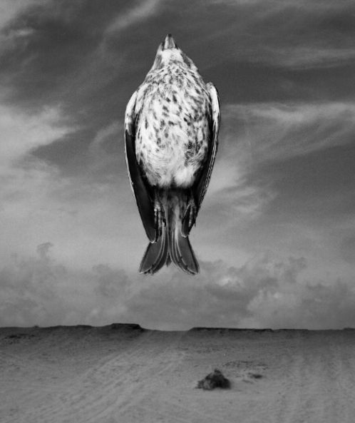
Author, I like your concept, but somehow it needs another dimension. Pasting a bird pic onto a background is hardly surrealism, but it is a dramatic visual statement. Take it a step further.
I dont know what it is about this one, but it sent chills down my spine, i love it!!!
Did you try to make that motion blur, like it's taking off? Back then, when they were making photos looking like this 18-19 hundreds you had to stay still for half an hour or so
It's a dead bird...he would have no trouble staying still. 
Like the statement this makes.
Howdie stranger!
If you want to rate this picture or participate in this contest, just:
LOGIN HERE or REGISTER FOR FREE
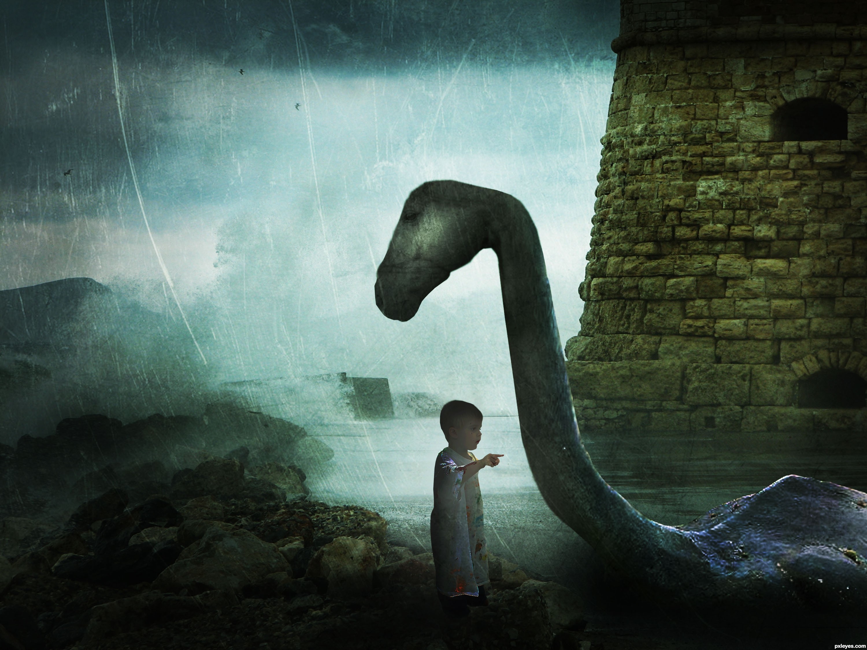
Credits to ~ttwm-stock , valpictures , Jaimie Duplass , Archin Camille and =night-fate-stock.
Im not very satisfied with it, so suggestions are welcomed.
Updated. Thanks everyone. (5 years and 3382 days ago)
It's too dark. Mood lighting is one thing, but when it's like a bad case of glaucoma, you need to lighten the image. It's almost impossible to see your figures, they basically look like shadows.
EDIT: Much better. Your focal point is easier to appreciate now. Good work.
I brightened the image. Thank you.
Very nice mood author, and great imagination...good luck
I would suggest working a little more on the detail around the head, at the moment it looks very two dimensional, and it doesn't fit with the rest of the image. I also notice (even in low-res) that there is a section of very overstretched pixels around the neck, try to avoid that by duplication and cloning.
Good luck.
nice mood,but Its not new.stick with your own style.That's your real talent
textures are always fun! and i like your overlaying texture here (familiar, i think i've used that quite a few times! )...one thing, i might suggest using a soft edge eraser set at a 15 or 25 % opacity and erase a little more around your main focus of your piece...so that the texture doesn't detract from the focus. also, might make the boy a bit more visable, right now he's getting lost in the business.
i agree with ponti on the pixels on the neck...and on the bit of the head looking "flat" ... could us a bit of work.
all in all, i say good luck to you!
Wonderful!! Love the mystical style!
Thanks a lot for all your suggestions. I'll work on that
Nice job overall, some very good points made above. The only thing that concerns me about the composition is that the little child is right under the monsters head, yet seems to be looking off into the distance rather than up at its face.
Work Updated. Thanks everyone
Did you try to place the kid a bit to the left and rotate his head so that he looks at the monster's head and not like ignoring him? I know it's not easy but it would have a great effect.
Lol I`m partial to a loch ness image myself .... Great image author & very best of luck!
Nice.
cute idea.... colors work well here.... little dark...but nice....gl author
I really llike that you did something different. That's the only way to grow. I agree about having the child looking up, but congrats on a good entry! GL
Howdie stranger!
If you want to rate this picture or participate in this contest, just:
LOGIN HERE or REGISTER FOR FREE
Photography and photoshop contests
We are a community of people with
a passion for photography, graphics and art in general.
Every day new photoshop
and photography contests are posted to compete in. We also have one weekly drawing contest
and one weekly 3D contest!
Participation is 100% free!
Just
register and get
started!
Good luck!
© 2015 Pxleyes.com. All rights reserved.


Shadows are wrong, and too dark...you'd be better off without them. Looks good otherwise.
Thanks CMYK.... got rid of shadows....
Yep, better.
What, what? It looks better WITHOUT shadows?
The thing is there's an obvious shadow on the shed so..
Well at least you could try to burn under horsey or smth, but you know how to do a shadow, so place it under him.
If you could place those fern on top of the shed-layer by using masks, it would already look better. GL
I had to bring the shadow back.... I just lowered the opacity. I think greymval is right, there is a shadow on the shed, so, it should be a shadow by the horse and the couple. Hope it looks better.
Thanks again for suggestions and comments.... moved the shadow underneath the horse, and got rid of the couple's shadow.
Well i won't lie, it's not perfect, but the overall image has improved from the first time i saw it.
A lot of the blending is off but keep trying. You'll get it.
Thanks jawshoewhah.... I will.....
Howdie stranger!
If you want to rate this picture or participate in this contest, just:
LOGIN HERE or REGISTER FOR FREE