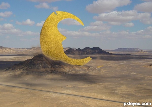
(5 years and 2703 days ago)
- 1: Desert scene
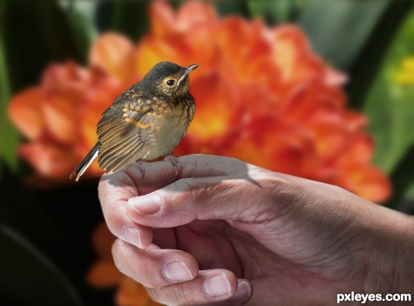
Thanks to Mely-o and Douglas Brown from flickr for the pics provided for this entry.
Mely-o pic of the bird.
Douglas Brown pic of the flowers. (5 years and 2704 days ago)
Great idea for picture - the hand looks just the right pose. I do wonder however if the bird's shadow is a bit too dark, or if the feet are too light?
Thanks nicehotcupoftea, I lowered the opacity for the shadow and darkened the feet.
Nice idea!
...I would have put the bird on the index finger, the thumb is a little too big for the bird's feet. It would give the picture a more realistic action when the bird sits on the index finger...
For the shadow, I agree with "nicehotcupoftea": the feets should be darker...
Apart from that, good job!
Thanks Marc...I placed the little bird over the index finger and worked in the shadow, suggestions appreciated.
Looks more realistic to me now 
Good Job!
Good luck!
Howdie stranger!
If you want to rate this picture or participate in this contest, just:
LOGIN HERE or REGISTER FOR FREE

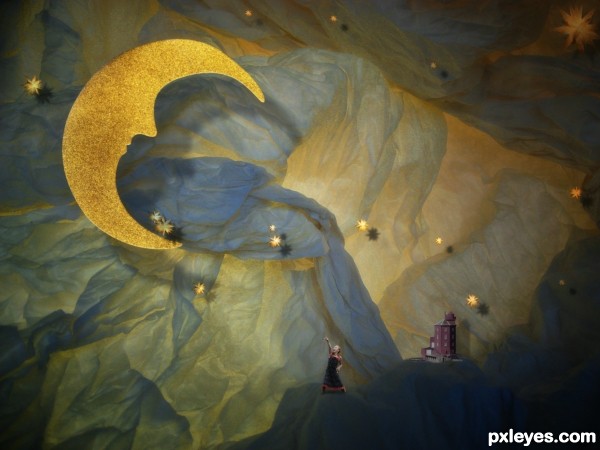
...and the night was young.
No external sources used. I added noise filter, blur and shading to the other layers to match with the moon. (5 years and 2704 days ago)
Nice one!
Thank you!
love the idea...
Thanks!
Very cute 
Thank you 
So sweet compostion, congrat
Thank you so much!!
Really tender! 
Thank you!! 
Congrats!!
Howdie stranger!
If you want to rate this picture or participate in this contest, just:
LOGIN HERE or REGISTER FOR FREE
(5 years and 2705 days ago)
Nice job !
Thanks!
Very creative and fun to portray the artificiality of a theater set. The background source is inspired. I wish there were a greater feeling of depth, however.
First off, I would delete the big star painted onto the upper right corner of the backdrop. At the bottom prong of the moon, the big star above the prong should not be casting a shadow on the prong (as stars are always much farther away than the moon). The medium star below the bottom prong has a shadow that doesn't match the strength of that of the other stars I think the moon's shadow [why is bottom prong's shadow weaker than the shadow for the rest of the moon?] should be moved more southeast to make it seem clearly the foreground element the girl is pointing at.
The girl's meager shadow seems inconsistent with the shadows of all the other elements. I would make the lighthouse bigger (maybe by at least 100%?). And make the blue mountain the girl and lighthouse are standing on darker and crisper to seem more foreground.
Thanks! your comments are appreciated!
Howdie stranger!
If you want to rate this picture or participate in this contest, just:
LOGIN HERE or REGISTER FOR FREE
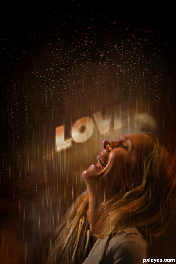
Well I love a rainy night
I love to hear the thunder Watch the lightning When it lights up the sky You know it makes me feel goodWell I love a rainy nightIt's such a beautiful sightI love to feel the rainOn my face
(5 years and 2705 days ago)
Eddie Rabbit!
Congrats!!
thank you 
congrats 
thanx 
Howdie stranger!
If you want to rate this picture or participate in this contest, just:
LOGIN HERE or REGISTER FOR FREE
Howdie stranger!
If you want to rate this picture or participate in this contest, just:
LOGIN HERE or REGISTER FOR FREE