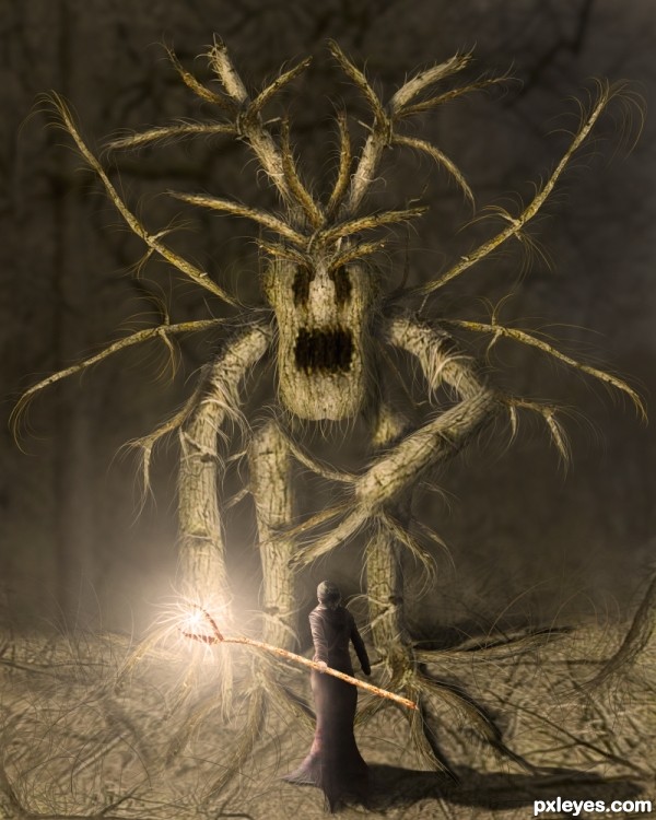
The brave sorceress is ready for her most hard test!!
No additional sources used. (5 years and 3411 days ago)
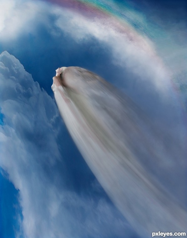
She loved the days when the Rainbows came out. Flying through the moisture laden clouds and circling through all the colours. What a joy!
Edit: Redid the sizing and the motion trail. Lost some detail but brought it closer to the theme. Trying to get the blur from the figure flying in one direction and the wings moving in another was a pain!
All images except the model are my own.
Thank you to rammkitty-stock. (5 years and 3412 days ago)
Beautiful...
I can't make out what is flying. It looks like either just a bird wing, or a dead bird. Now that I studied your SBS, I can barely make out the woman, but the wings are too large and overdominate the woman, making the image very hard to "read" without seeing the SBS...
Perhaps you could give her face and hair a bit more contrast.
Even if i don`t understand what`s happen in this pics it looks beautifull.....
EDIT DONE ... changed so much that the SBS is not very applicable to this image. Sorry about that, I did not have time to change it. It still shows that I did the work and gives details of my first image.

Author I have to be honest that it took me 5 minutes too to actually see what was flying there (and I watched the SBS a couple of times and wondered how you used the sources). Somehow you have a kind of visual illusion here, either you see it or you don't 
Nevertheless I really like this entry, visually it is good, has some mystery in it and makes you want to look again. The motion could be a bit better, looks like she's photographed with a stroboscoop now, if there would be anything you want to improve I'd say have a look at that again 
Okay ... tried some changes. I think it is better but I believe Rob is right. When you look at something a long time you have a vision of what it looks like but it only you can see it. Sometimes it is not a good vision LOL!
Please let me know if you think it is better???
 think it is more recognisable now what is flying there
Hey Rob! Thanks! Just one question, is the motion blur better? I worked on that too! 
To be honest If I were you I'd keep the original entry for my personal portfolio (I liked it better) but also think you made the right choice to change it for this contest. Think you have to search for a photo which has got motion blur on it and see how that looks like on a photo, it will give more a blur trail.
Much better! You can clearly make out the woman, and the motion looks more "moving," to fit the statement.
Great improvement!
I could be a "stop-motion" image, or a "slow-motion". Very beautiful, and it makes our imagination fly away... 
oh, very nice one... 
Fantastic entry author...i did not saw the previous version/versions but this one is powerful...well done
Thanks Nator. I was unsure about the changes so it is really great to get positive feedback now that they are done.
i should have seen this earlier..., beautiful job 
Howdie stranger!
If you want to rate this picture or participate in this contest, just:
LOGIN HERE or REGISTER FOR FREE
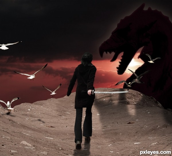
Using various techniques, i have created this scene. Enjoy! *This is the updated 1, as per edit from comments below. Thanks guys (5 years and 3412 days ago)
This is really awesome! Hope she wins! LOL
Good idea...dragon shadow is wrong. Light source is too low to create a shadow on the rocks.
agree with Bob on the dragon shadow, also her stride looks a little unnatural having her right leg in the air, might want to move the shadow so both feet are on the ground. A bit of shadow on the handle of the sword (that is behind her back) wouldn't hurt either.
Good use of the source, i like the different elements you chose to include. Good luck 
Very interesting creation with great mood...i like selection of colors and the idea of dragon in shadows...best of luck
Howdie stranger!
If you want to rate this picture or participate in this contest, just:
LOGIN HERE or REGISTER FOR FREE
(5 years and 3412 days ago)
Nice image. How have you used the source here?
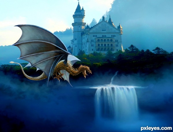
Step 7 on, -- the head and neck plus the legs and talons. distorted to fit.
got it! nicely done
Very nice, good luck author
OH WOW! You should turn this into a cartoon! 
Love the sense of movement and flow to the dragon.
Fantastic creation...Dragon body is top notch but the wings have to be the same color or similar color as body...now they pop up to much from the body but at the same time they are to integrated with the background...Just an idea author
um... my comment was a compliment... I was meaning it's an excellent shot that I can see a cartoon made out of this character! Geeze...
Very nice image best of luck 
Great fantasy image, interesting the the wing closest is a bit transparent, tho. Very nice painting and integration of the images. 
Howdie stranger!
If you want to rate this picture or participate in this contest, just:
LOGIN HERE or REGISTER FOR FREE
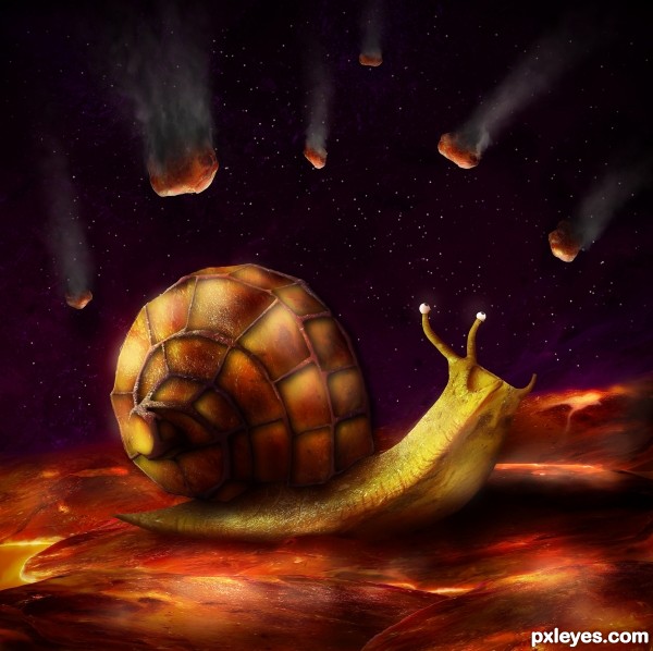
Only source (5 years and 3413 days ago)
Super realistic! Well done.. a flawless result 
The face expression is just cute :]
Great build and super idea
wow  glad to see u after a long time
Absolutely stunning piece of work 
Looks so real!! wonderful!!!
nice work but the cartoonish eyes are off putting and not as well blended as the rest IMO.
I think there's nothing wrong with the eyes; a snail has a pair of eyes with a black dot on them...
Very well done, author. GL! 
this is very good
Very impressive and I love the eyes; give a whole personality that is perfect. I love the way you created a whole mood and story from just the source! Super!
Love the two little eyes with a very scarry expression...
Fantastic work author...great usage of the source image...i am glad u work again...best of luck
awsome work......best in this contest and first place for sure.....
great ....... 
Absolutely amazing work!
Cute space snail 
Congrats on first place!
Congrats . . . . 
Congrats on first place 
congrats Abraham 
Congratulations!
Congrats!!! 
Enhorabuena amigo!! muy buena
Congrats for your first place, Abe! 
Congrats!! Love this guy!
Howdie stranger!
If you want to rate this picture or participate in this contest, just:
LOGIN HERE or REGISTER FOR FREE
Really good job here. I love the overall feel of this work, and the lighting effects are well done.
smart uses of the provided pic,.......well done ,,..
This is so good! I love it! The monster reminds me of the Wickerman movie.
Really nicely done! The lighting, color and details pull it all together. Good luck!
Great piece of work, good luck author
I suggest blurring the woman's shadow a little more and adding a gradient mask that gradually reduces in opacity, right now the shadow looks a bit too strong.
 The light.. the use of source.. the creature.. all look wonderful
  Well done!
Overall as an image i think it's fantastic though
Luuuv it!
Magnificent work author...i like the colors,effects,mood...simply perfect...Only one idea not suggestion,u could create some kind of light sphere at the top of the wand,to give the more effect on the spell...Instant fav from me and best of luck of course...
Nice entry, GL
Stupendous work ... I would not want to have to battle that one... he looks like one very mean creature!
What a beast!
Congrats on first place!
Congrats, great idea and execution!
Congrats Marco, another awesome work, keep it up my friend!
Thank you to all for the nice comments and votes
Congrats on first place
Congrats on your win...
Congratulations!
Congrats!!!
Congratulations ... this is one great creation!
Congrats for your first place, Zakfuego! Great image!
Congrats!!
Howdie stranger!
If you want to rate this picture or participate in this contest, just:
LOGIN HERE or REGISTER FOR FREE