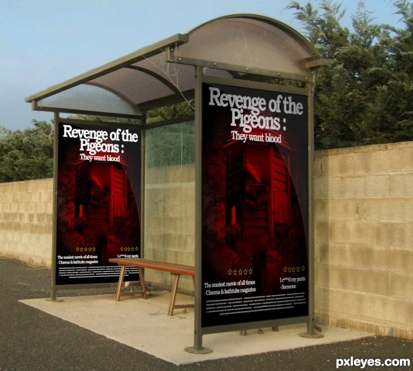
Revenge of the Pigeons.Movie Posters. (5 years and 3538 days ago)
- 1: source1
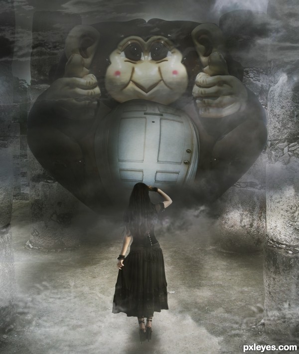
Credits to :
Door - robenmarie
Sky - *B-SquaredStock
Ruins - ~greenleaf-stock
Girl - ~Noree-stock
(5 years and 3538 days ago)
this is really nice! Love the shading from my end. 
nice smoky feel
Well done, I like the mystery here, what's behind that door, and is she brave enough to even get that close = )
Howdie stranger!
If you want to rate this picture or participate in this contest, just:
LOGIN HERE or REGISTER FOR FREE
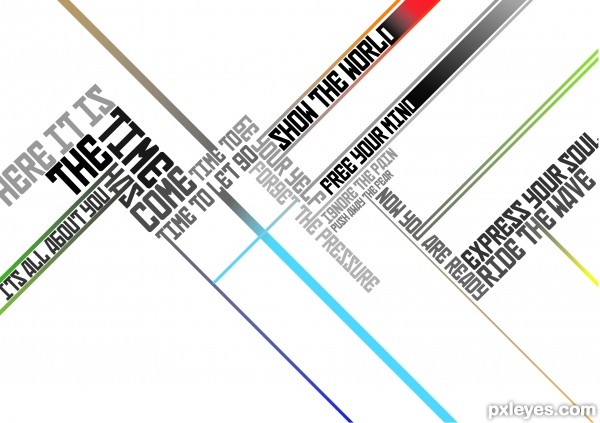
Not sure what I was thinking but the time is now just came to mind and I flowed with it. (5 years and 3538 days ago)
Sorry guys this is still not totally complete, I did this is about 15mins didn't have time to do more but still wanted to.
Hope you like.
Laters
PC spazzed sorry for the repeats
you can delete the repeats 
Thanks for the heads up
hey you had good five minutes.
Are you sure that the the clock you feel not runs a lil bit slow? looks like more time. I like your composition.
good luck!
very professional work...best of luck author
Howdie stranger!
If you want to rate this picture or participate in this contest, just:
LOGIN HERE or REGISTER FOR FREE
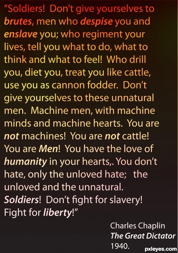
This quote was written and performed by Charlie Chaplin in his 1940 film "The Great Dictator." I came across the clip it is from on Youtube shortly after reading the brief for this Typography competition and the quote was too powerful, to pertinent not to use.
My concept for the brief was to use colour rather than shape to show the intensity of the words and the way they offer a choice for "soldiers" (I think here Chaplin meant everyone) could reject brutality and strive toward liberty.
I readily acknowledge that this quote is a selective section of the whole speach from the film but it beautifully reflects my personal politics and phill-osophy.
_Phill_ (5 years and 3538 days ago)
That's a great movie... you should watch the whole thing
I believe you can only use ONE SENTENCE in this contest if I read rules correctly.
@Kyricom: I have watched it several times, its a pretty much perfect movie 
@artgirl1935: I hear what you say and am quite prepared to be disqualified (I did it for the enjoyment as much as anyhing) although reading the discussion attached to the competition brief there did seem to be some vagueness....
Howdie stranger!
If you want to rate this picture or participate in this contest, just:
LOGIN HERE or REGISTER FOR FREE
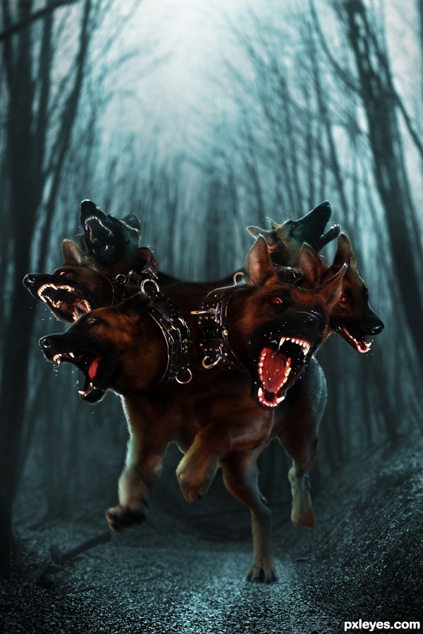
Credits to jin-kstock (DA) (5 years and 3539 days ago)
"..you need to use JUST ONE person or animal for this, so MIXING HEADS FROM DIFFERENT BEINGS is not allowed."
Really nice creation, but doesn't fit in this contest...
Thank you for the comment but I didn't mix their heads. As I understand, "this" means "multiple heads", not "body".
EDIT: Okie, I just want to introduce it to this contest because I'm sure suggester didn't think about this case when the heads come out from the waist.
If you don't want it to stay in the contest, just red flag it, I don't want to discuss too much about on or off theme here.
I don't like to think that way but seems like you really want to kick out my work. If I found out an off theme entry, I've never said that way and even don't red flag if I saw the effort of author.
And for who thumbed down my explanation, learn to love and cherish what you created before judging the others, many people know that I didn't submit my entries for fun and just bring the best of mine to the contests. At least I deserved to have more friendly comments, I really don't understand what's in your mind.
ONE octopus body can only have an octopus head. Since you have the majority of a person on top, that's TWO. Add in the dogs, and you have THREE...
Read my first comment again..."One person OR animal."
Not one person AND one animal.
Not one person AND two animals.
You need to use JUST ONE person OR animal for this. That means body AND heads. You have mixed TWO animals AND one person for this. You've mixed heads AND bodies, and no matter how you understand it, you're using more than ONE...
"Mixing heads" is pretty self explanatory. Since you are using dogs heads AND a person's head, you are mixing...
Nice changes.
Doesn't matter if the heads come out of a neck, off the leg, or the back.
One is ONE. Three is NOT ONE.
Math is not hard, here. The rules were plain enough, and the reason I pointed them out to you (REPEATEDLY) was NOT to "kick out your work," so much as to get you to understand that your efforts were NOT going to do well in this contest if they did not follow the rules. The longer you refused to "conform" to the contest, the more low votes you would get for a "bad" entry.
Had I wished you ill, I could have said nothing, just reported your entry, and let the mods yank it...
Do not assume the worst of people who attempt to help you.
Your explanation did nothing to change the fact that your previous entry was not following the contest rules, it was just arguing why you thought you didn't have to follow them. Telling people to cherish what they create is MOOT when what you create does not fit where you have entered it. Rather you should learn to not cherish your creations SO much, that you refuse to see reason when it is clearly pointed out to you.
Best of success to you with your new entry.
There are many ways to help a person but it's not true that all of them are good. Doing something different is always risky, I just waited for somebody who thought my creation is acceptable. I really hate people who gave the thumb down without showing themselves, I didn't give you any thumb down even you made me not comfortable. They can give you the thumb up, that's fine, but I responded to defend my opinion by the most polite way, I'm not deserved to get that. I'm not a fool or a child to not understanding what you said at the first comment, don't need to repeat that. Just make it easy, red flag my entry, and I'll discuss with the mods if necessary.
It's YOU who need to read that:
Pxlxeyes guidelines
3.4: Don't make negative comments without suggestions for improvement.
3.7: Don't comment on 'administrative' issues of the entry (such as being off-topic for example), but raise a red flag instead.
I accept people telling me the administrative issues, but you should stop after your first comment.
I like the dogs, the saliva and the blur on the legs are a nice touch, however the background doesn't seem to blend with them.... the contrast between the two different photos stands out... (probably just me)... the other thing it might be is the angle of the background photo, to me its making the dog look a little distorted....................................... honestly though.... its a distorted animal too have that many heads in the first place i guess hehehehehehe
Thanks Keiley for your comment, I know that it's difficult to create an animal with so many heads without making it looks distorted, I'm not really happy with this one. I don't have much time to work on that because I had to change my entry, the previous one was much different.
Good work! I really like it  I also wanted to do a Cerberus ;P but didn't have time
hee hee..Great work Author, GOOD LUCK!!
I can't say anything about your previous entry because I didn't see it. But about this one I can say that it's fantastic, bizarre, well done. Amazing, like your other entries. You made the dogs look wilder than they really are. Congrats in advance! 
Author your picture looks good. I like the concept very much. Overall it is an impressive work. I do have a nit pik and that is I'm seeing a more or less a horizontal line. It is directly under your Cerberus perpendicular to the road, also the creature seems to be floating or is not casting much of a shadow.
Thank you my friends for your kind comments. @Loopy: hope to see your Cerberus someday  , @Erikuri: Thank you very much for that compliment :x, @Mr.Chappy: thank you for that critique, the horizontal line is not the real horizontal line because the source is not really a straight path, I don't know how to call that, but anyhow, base on the final image, it's a kind of misleading, I'll consider more carefully in the future entries. About the Cerberus (thank you for that also, I mistyped it to Ceberus) I want to show it in jumping position, leaving all the background behind, so the background is all blurred and no shadow was casted. But I think it's not a wise option because you and Keiley think it's problematic. I really appreciate you opinions!
very nice...good for a horror movie...
I saw the original image and I like them both ... hard call as they are quite different but I almost like this one more ... something about the simplicity that lets you get the full horror of the creature! Great work!!!
This one is my fave, I really like how they are coming at me and how you did the dof, nice work.
Howdie stranger!
If you want to rate this picture or participate in this contest, just:
LOGIN HERE or REGISTER FOR FREE
Took me a minute to get it (a little slow on the uptake) but once I did it put a real smile on my face! Great idea ... excellent work!
same here , at first glance I though it was a wrong entry and didn't belong on this contest, but once I paid more attention, I had the same reaction as arca - it is a nice entry and unique idea, gl
HAHA creative idea!
HAHA creative idea!
hahahaha me too was fooled at first sight!! wow!! cool concept auth
  omg!!! i wish ppl pay close attention to d entry n dont skip it

amazin wrk auth...high vote
hahahaha...cool...
Howdie stranger!
If you want to rate this picture or participate in this contest, just:
LOGIN HERE or REGISTER FOR FREE