(5 years and 3426 days ago)
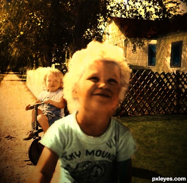
I chose an original retro picture from the 1950's without colour as I wanted some challenge. I tried to keep the feeling of an actual old photograph. Besides standard brushes I used several external sources for the textures.
I somewhat doubled the original image size to make working a bit easier as the resolution wasn't that good to start with.
Skin textures and small boy clothes from the child source
Fence and roof from the wood source.
Pavement from the dirt source.
Grass and trees from the grass and willows sources. (5 years and 3426 days ago)
Howdie stranger!
If you want to rate this picture or participate in this contest, just:
LOGIN HERE or REGISTER FOR FREE
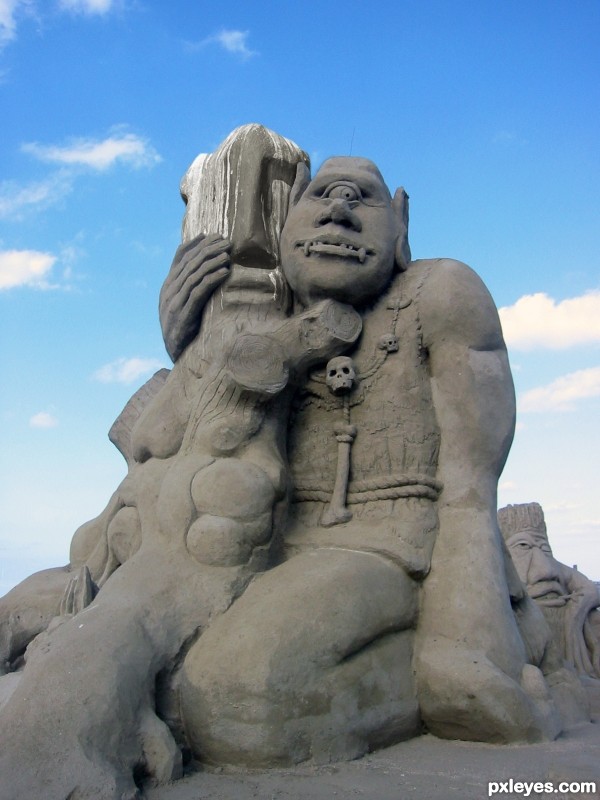
Well, I was inspired to give you a second version of the statue. I see her in love with a matching partner :D
I made the Photo from the cyclone during the Sandworld-Show at the Baltic Sea Lübeck-Travemünde and he seems to be the perfect for her... (5 years and 3426 days ago)
Great idea and well done -- might loose the text on the image however
author, you need to place your original picture in the step by step, it's cool that you linked to the source but it's your account and once it's recognized you will no longer be able to stay anonymous... (great idea and GOOD LUCK)
thx for your comments, yes @ Alan you're right, Text is mostly difficult on an image.
@Drivenslush: I will do so during my next Contest-Upload, just don't see that stepbystep can be added afterwards.
yes u can add sbs afterwards....above u see the options....go to my stuff and then go to my contest entries...thr you will get the option of adding sbs...so plz upload the original image in ur sbs...othrws ths creation of urs might b removed by the mods...gud luck...and nice idea on the image..but as alan said the text is not workng for me either...
okay, sometimes less is more, the text love is in the air was absorbed from the cyclone 
and stepbystep my photo is available.
Try color matching the head for a better result.
hm I'm not sure cause she is in the state of non finished assimilation. It should suggest a process.
Then have the blending be more gradual and possibly in some other regions to "suggest the process" more clearly.
Yeah, I would also blend some more of the original colour here and there or match the colour with another source. Very nice idea thou.
It would look better if the colors of the statues matched. Just use an adjustment layer on the given source image, either Hue/Saturation or Color Balance should do it.
this is very good one ,you get it
Good idea but try to fix the green color on the dirty face statue, Good luck author
aloah assimilation is now progressed. Seems that they are substantial in love...
color replacement and Hue Saturation in some cautious steps did it.
Much better! 
Nice improvement 
Great work author,unique idea and fabulous execution...well done
That's just great ! 
exceptional blending! GL!
Gongrats
congrats.... great image 
congratulations!!
congs 
Congrats!!
wow, thank you  I nevver thought to have a good placement like this
Howdie stranger!
If you want to rate this picture or participate in this contest, just:
LOGIN HERE or REGISTER FOR FREE
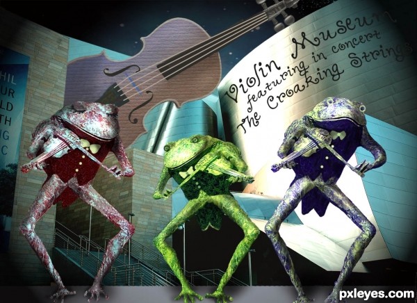
Thanks to mike-in-ny at flckr.com for the nebulae source; Thanks also to kconnors at morguefile.com for the building source for background; and to atis547 at flckr for the frog statue; (5 years and 3428 days ago)
What a cute concept!
Excellent chop work on all the elements, especially the frogs! Well done!
Love the enthralled look on their faces ... looks like a poster for a concert (which in my opinion is a good thing).
i really dunno wat to comment on this but i`m luvin it 
gl author
fantastic author  Love it!!!
i love it , fantastic !
It's an image very cheerful and gracious, full of magic!
Cool band! 
omg, a Kermit song is on the radio..... too perfect! Author, I love that you know the parts of the instrument. Love what you did with the one frog, and their formal attire. Great concept and good work on this. 
What a crazy band....
WELL DONE... 
TOADily kewl image author
And I 'Toadily' appreaciate everyone's comments, fav's, etc . Was lots of fun to do, so am glad folks have enjoyed it.
Howdie stranger!
If you want to rate this picture or participate in this contest, just:
LOGIN HERE or REGISTER FOR FREE

(5 years and 3428 days ago)
Howdie stranger!
If you want to rate this picture or participate in this contest, just:
LOGIN HERE or REGISTER FOR FREE
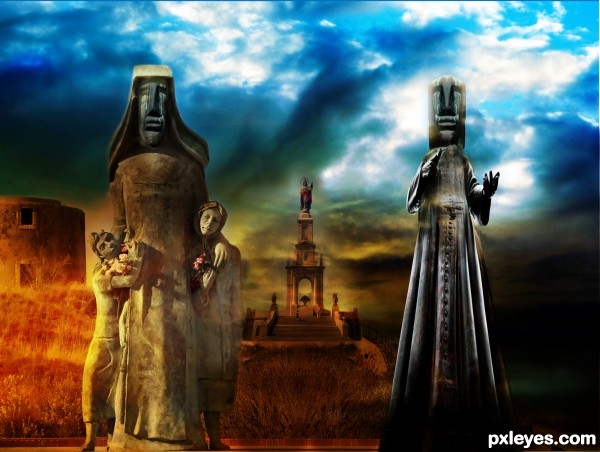
Good idea, nice clean chop! If you can flip the background statue it'll match the light source on the left foreground statue.
Always a keen eye, good observation. I was so fixated with the building and colours I forgot to think about the statue itself. Inverted it to match the left oriented light source, thanks CMYK.
wow, I like this colorful implementation. The warm colors of the left side. Also a good idea to segue dark to the right.
I think it could be a good idea to associate the right staue more with the background, it seems now a lil bit superimposed.
nice colors author and cool mood...
Howdie stranger!
If you want to rate this picture or participate in this contest, just:
LOGIN HERE or REGISTER FOR FREE