sources are from sxc (5 years and 3428 days ago)

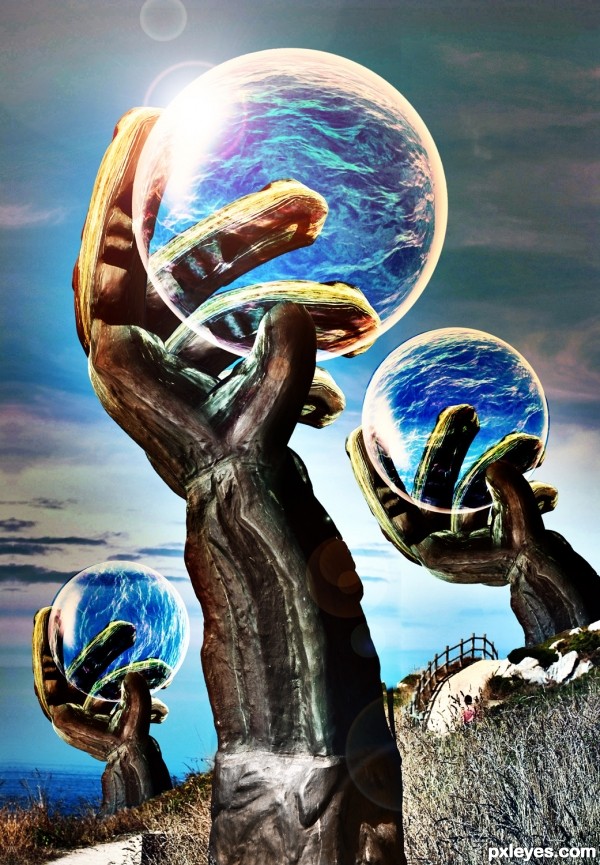
Picture I took of the ocean combined with the source picture (5 years and 3429 days ago)
Great idea like the image -- would not the fingers be distorted through the water
very nice construction author...good luck
the idea is very nice ,but .....,good luck
Good idea, a little chop debris either side of the middle arm, the ocean layers are hanging out of the small bubbles a little & the fingers would have much more distortion and blur (as alan rightly points out).
My comment is based on observation & anyone can see that its correct. While I`m not sure why you make reference to Ponti55, I do agree that you are nothing like him....he was very talented indeed & very missed.
^ yet another personal attack unrelated to the entry..... my original comment will remain unless the powers that be see anything untoward contained in it. I`m sorry if you dont like it author but there is an option not to accept public comments on an entry if you feel so strongly.
strange you should continue to attack about "borrowing work"....and going further to mention Ponti55..... subconsciously I guess you must be needing this link to one of ponti`s work ( he had it as his avatar for a very long time as I recall)..... look familiar to anyone?
http://www.pxleyes.com/photoshop-picture/4bb36dca480de/Birth.html
EDIT: Author deleted the attacking comments after this was made public.
The authors link below is reference to my avatar (that is not in judgment here btw) the image is a photograph by Levi van Veluw, and he makes landscapes on human & manequin models & photographs them. I love his work and my avatar uses just one of his amazing images.... here is his site http://www.levivanveluw.nl/ and the video ... http://www.levivanveluw.nl/work/landscapes
hehehehe
http://raphaellowe.com/portal/wp-content/uploads/2008/10/levi_landscape.jpg
Oh.. and Geex.. here's a tissue.. 
(I know truth SEEMS like an attacking comment.. but you got the message so I figured that was my point anyway.. sorry you feel truth is attacking.. something you should work on (even the avatar is copy paste, sigh)
Howdie stranger!
If you want to rate this picture or participate in this contest, just:
LOGIN HERE or REGISTER FOR FREE

Comments and Critiques please. I feel like it's missing something and I should add a lot more.
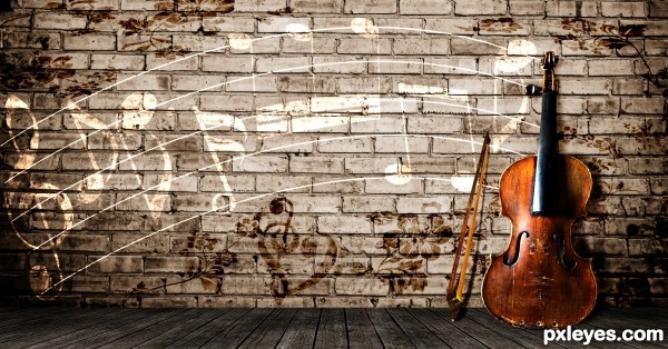
EDIT: Changed perspective of violin to what looks right to me, tell me if it still it weird.
Added a bow, hope that didnt ruin the image. (5 years and 3429 days ago)
GREAT SHOT!!!
i quiet like it author, but to me the cello seems a bit flat the way its leaning against the wall.... they are rather big musical instruments... can you make it a bit more three dimensional ???
as i said though... i do like this idea 
Violin is distorted.
composition is very nice,colors are cool but as Bob sad distortion of the violin is stab the eyes...
Thanks for comments  . I think i undistorted it or it looks to me like i did and i added the violin bow.
Howdie stranger!
If you want to rate this picture or participate in this contest, just:
LOGIN HERE or REGISTER FOR FREE

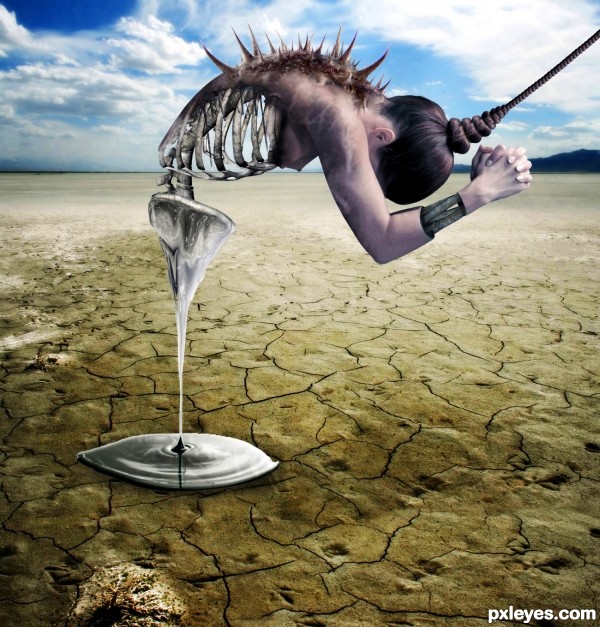
- I want to thank to Marcus Ranum (mjranum-stock) on DA for the nude model image
-Thanks to thank to markopolio-stock on deviantart.com for the skeleton image
- Thanks to http://night-fate-stock on deviantart.com for the desert image
- Thanks to sabinki on sxc.hu for the ripple image
-Thanks to dreamweaver69stock on deviantart for the crow image
(5 years and 3430 days ago)
Soften the hard edges on the figure...otherwise it's a fine image. 
Ok thanx:]
Very nice...Great imagination, but the blurred crow is distracting
I was not sure about the crow too..got rid of it...thanx
I think you should have done the arms the same way you did the back (symmetry).
Other then that....... IT'S AMAZING!!!!
highest score for me :3
ohhhhhhhh i love this  geesh some of you have incredible minds
just my opinion...this needs a little more color...saturate it a little and it will really stand out more
great i loveit
Thanks for your opinion...I changed the saturation
AWESOME !
 GL
GL
Lovely work, imaginative concept and great compostition! Definately high points from me!
Terrific composition, the top edge of your puddle is a little jagged 
Very good scene. Think you should remove the hole on the bottom left.
Whow!! GL 
I can't find any credit given to the nude model author... other than that... great image!
Opps! u r rite. Actually I put it in the wrong text column..Ok, just changed it..thanks for reminding
Amazing imaginary author...idea is top notch,and execution is perfect...I like a lot dripping substance...well done
superb creativity........
thumbs up for u
Nice 
just amazin n superb conceptulization out of the sources ..... the sliced n ripped handzzz r cool ..
the best part i luved is the drippen sub frm the creatures pelvic n d puddle beneath
gud job author
gl
truly terrific job.., Good luck
great work ........ 
Very innovative and truly awsome.....how on earth can u imagine such creations....keep it up 


great job  nice blending, gl
superb 
What I said on your "other" entry! Wow. You are really dangerous with sharp objects
Great work. You aré a winner
Sadness.....Pain.... Creativity....everything is here. Author, you have the imagination of an Artist. Thank you for posting....good luck.
Amazing! Great idea with making the back thorny! 
very good idea, good luck!
Congratulations for 1st..... Good luck in your future entries...
thank you
Gongrats on first place
Huge congrats buddy... lookin good 
thanx m8 :]
Congrats on a great win!
Congrats for all 
congoooooooooooooos 
Congratulations for 1st place
thank you :]
congrats on ur win...u really deserved it
Congrats, awesome work 
Congrats!!
Howdie stranger!
If you want to rate this picture or participate in this contest, just:
LOGIN HERE or REGISTER FOR FREE

Let It be Peace... (5 years and 3430 days ago)
Great message and nice execution! 
Hmmm... he got a pair of beautiful blue eyes! 
Howdie stranger!
If you want to rate this picture or participate in this contest, just:
LOGIN HERE or REGISTER FOR FREE
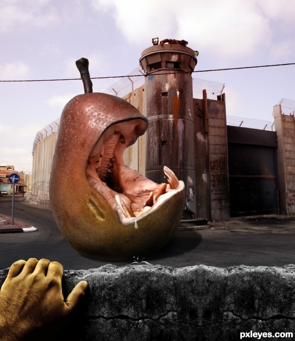
Haha!! Very nice You might want to change the hand's color. It's too yellow. Good Luck
Very nice work with the pear and the hypo author,but IMHO this creation would be way better with some other background...or even better to place pear-hypo is the water...just an idea...
gud job ..........
very nice...best of luck
Always love your work...... this is no exception, very well done author
sweeeeet!
Creepy pear
Congrats on second place!
congrats
Congrats!!
Howdie stranger!
If you want to rate this picture or participate in this contest, just:
LOGIN HERE or REGISTER FOR FREE