(5 years and 3569 days ago)
STOP. Don't hate me yet.
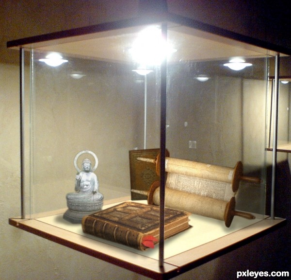
Pandora's box contains all the evil in the world, but once opened it traps hope.
Does the box contain hope or does it contain evil? I'm not the man to decide.
While not as cool as some of the other entrys I took JamesD's comment about hope/salvation and but a spin on it. (5 years and 3570 days ago)
hey this one is not nice
u called our religion is a evil product
this one should be burn
Well its up to you how you see the image, but Pandora's box traps hope.. so the relgious articles could stand for hope...
It's a good image, and does not portray ANY religion as good or evil. It is up to the viewer to see what they want to see...
excellent... finally something a viewer gets to decide on... well done! 

so what is that Pandora's box contains all the evil in the world
anyway dont bring the relgion as a joke
I see this image not as a joke or humorous image but as a statement piece... and an interesting one. It allows the viewer to determine the meaning, whether good or ill ... which is very clever indeed! I for one see these symbols as representative of the hope left in Pandora's Box. High points from me for ingenuity and originality.
Great view on theme author and i like that,also very very nice execution...well done
Howdie stranger!
If you want to rate this picture or participate in this contest, just:
LOGIN HERE or REGISTER FOR FREE
Please view full. (5 years and 3570 days ago)
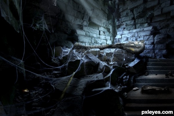
Great mood and lighting, but the feet look a bit too rounded, and it looks kind of "pregnant." I think you should reshape and refine the body a bit more.
The biggest problem is the darkness of the shadows. Lots of your details and work aren't visible even in the high res. You really need to view the sbs to appreciate the work involved with this piece. Really nice job and nicely written sbs. Good luck!
Stunning imagery ... everything about this is classy. The attention to detail, the quality of the cut, the blending; even the title all combine to make this an extremely impressive piece of art. Bravo! Goes to my favourites!
Great feel and nice detailed work. Isn't there a picture of a sarcophagus on its side available? this looks weird to me, the head doesn't look like part of the body and the small hand has a weird place if the sarcophagus is on his back. There's lots of work in the room that is almost not visible anymore, since you've got a really strong light you could create some strong highlights on the shiney objects to make them pop out of the image a little more. Good luck!
Thank you everyone for your comments and suggestions. Ressiv, after studying the body for a while I realized that the chest was too high in relation to the head. I pushed it down a bit and added some shading for the arm and hand. Let me know if he needs to be tweaked more. I also added the highlights on the shiny stuff to make them stand out more. Thank you for the advice everyone!
Fantastic Image! ... I`m with Nator..hi-res is a must....well done author 
Top entry for sure...good luck author
Congrats, really well done 
Congrats...
Congrats, really nice entry
Congrats!!
This is a great piece the lighting is awesome! I say add a small shine or light reflection on anything shiny or gold like. I love how you focus on the main stock image u had to use..
congrats
congrats 
Howdie stranger!
If you want to rate this picture or participate in this contest, just:
LOGIN HERE or REGISTER FOR FREE
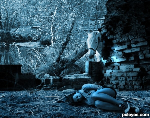
Thanks to: mqtrf, for the pics of river, horse, and debris from dead branches and grass.
Thanks to: Kphinney, for the pic of the sleeping girl.
The rest is PS. (5 years and 3571 days ago)
I keep coming back to this one and each time I like it more ... has a quietly haunting feel.
i really like the feel of dis image...........gud luck
Beautiful entry.., I like the blue tone... 
its beautiful .................. 
You were really happy on this compo, it's very beautiful and moody. I love the color as well. 
Very very nice creation...best of luck
Congrats on 2nd place 
Congrats George...
Congrats!!
Thank you guys.....
congrats george
Howdie stranger!
If you want to rate this picture or participate in this contest, just:
LOGIN HERE or REGISTER FOR FREE
No outside sources
Thanks to Jaskier for suggesting the source for contest (5 years and 3571 days ago)
It would look more interesting if you could include some color.
MossyB Thanks I added some color may not be right colors but does look a litte better than it was
Howdie stranger!
If you want to rate this picture or participate in this contest, just:
LOGIN HERE or REGISTER FOR FREE
Now... That what i call a masterpiece.....


super , good luck!
wow....very enchanting! ! !
yeaahhhh.......agree with anoop,......this is super,...how could you be that good.....LOLs,....and the winner is..................LOLs


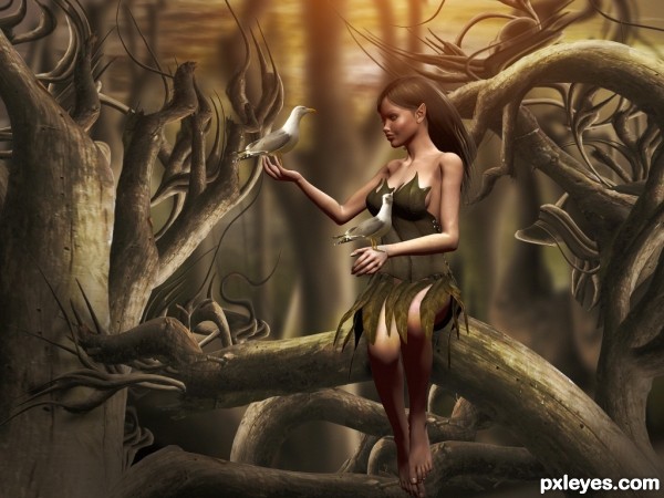
Very nice image! It's a little pitty you used a 3D program for the model, a picture of a great model would fit better in a photoshop contest. Small suggestion, the background has the same amount of blur all over, maybe you could create some more distance by blurring trees more to front a little less and blur them more further away, like in steps... Hard to explain Good luck!
splendid
I could tell you did this from looking at the thumbnail......it's well within your style. I would've liked to see a shadow beneath the 3d model where she's sitting. Other than that good job and good luck!
Truly lovely ... agree about the blurring ... a little more depth of field would make her pop and a bit of a shadow under would make it perfect ... but it is pretty close to perfect as is!
Bravo!
beautiful ..........
Perfection...well done
Congrats...
Lovely entry - congrats!
congrats & well done buddy
Congrats
Congrats!!
congrats
Congratulations!
Thanks for Your comments and votes.
Howdie stranger!
If you want to rate this picture or participate in this contest, just:
LOGIN HERE or REGISTER FOR FREE