Nothing happens unless first we dream.
(Carl Sandburg )
because of you my flower heart I dream ,and with you i will make our dreams reality. (5 years and 3438 days ago)

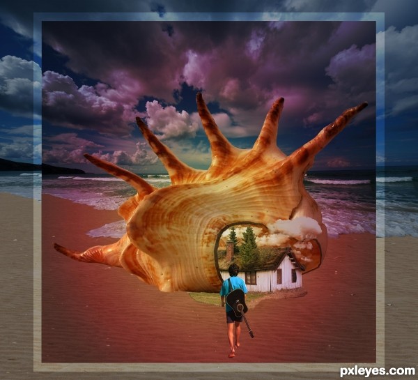
Music of the Seashell is the
'Song of the Sea' . Thanks to mrhappy8 at flckr for the image of the musician, and to CGTextures.com for the gorgeous sunset sky. Also, to oregonkat at flckr for the boat. Have added the star layer and cropped out some of the background in an edit to feature figure better. (5 years and 3439 days ago)
Wonderful approach author.. sbs is fantastic!!!
very nice rendering. Good luck
The blending is good, creates a peaceful scene.
Very beautiful... it really takes us to a magical and serene world.
Very nice work...gl
Howdie stranger!
If you want to rate this picture or participate in this contest, just:
LOGIN HERE or REGISTER FOR FREE

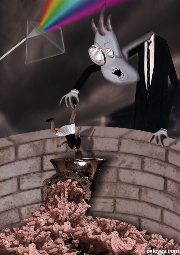
Set the controls for the heart of the sun.
One of my all time favorite Pink Floyd numbers...very hypnotic. (5 years and 3439 days ago)
Howdie stranger!
If you want to rate this picture or participate in this contest, just:
LOGIN HERE or REGISTER FOR FREE

I really wanted to have a go at drawing this, but seeing as its been drawn many times before I thought I`d give it a 3d like chop, hope I`ve done it justice. (5 years and 3439 days ago)
Nice work...good and creepy! I might have kept the meat as red as in the source, but's it's a great image. 
Just Lovely (well not lovely.. the work is lovely) I've always loved that monocle monster man great job and good luck
Nice Job Looks Creepy and Neat Too. 
I suppose the hand that is on the wall needs to be flipped... Nice work, though. 
Puuuuuuuuuuuuuuuuuuuuuurfect!!!!
Very very cool imagination,that fits for the perfect song...well done
Euuuu, Big Brother is getting cruel 
creepy!!!!!!!!!
Ha!! Love it!  Perfect rendition of the music video.
Howdie stranger!
If you want to rate this picture or participate in this contest, just:
LOGIN HERE or REGISTER FOR FREE

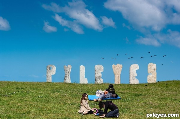
Spec Thanks to MShades for use of two of his pictures
found on Flickr photo sharing.com in the park album (5 years and 3439 days ago)
idea is fine -- execution needs some touch up -- all the holes need to have depth as was done in the "P" -- edges should not be straight lines as I doubt that stone would weather to a straight edge
Hey Thanks Alan2641 I did some touch up on what you said any better?
Author the touch-ups are still not quite right IMO, the edges are still too sharp and/or straight. You can try using the eraser with less opacity and fill adjustments. I would use it set at 10% and 10% so you can control it better. Good luck author
good thinking
Creative idea, but the letters need a lot more shadows on their under [ground-facing] sides. I would also consider moving the young adults to the left edge (with probably a horizontal flip and maybe having the kids in front slightly overlapping so the people form a single element) for a more-diagonal composition instead of having all the elements on the right-hand side.
Thanks all I did some readjustments but I maybe should have stayed away from the stone letters
cool idea...gl
Howdie stranger!
If you want to rate this picture or participate in this contest, just:
LOGIN HERE or REGISTER FOR FREE
nice concept, can avoid the frame
The size and the perspective of the house don't match the shore...
concept is nice n well done but cud have been much better
... thot that the frame is not necessary but felt it`s jst enhancin the effect but cud have been better if the all the borders were of ame proportions ... anyways i just admire the concept
really nice one
Howdie stranger!
If you want to rate this picture or participate in this contest, just:
LOGIN HERE or REGISTER FOR FREE