Photoshop Pictures: The (page 308)


results 1536 - 1540 of 2863

The all new USB Steammachine - created by robvdn


The all new USB Steammachine
Favs: 0SBS: 11Hi-resRank: 1/7Score: 58.8% (35)8167 views

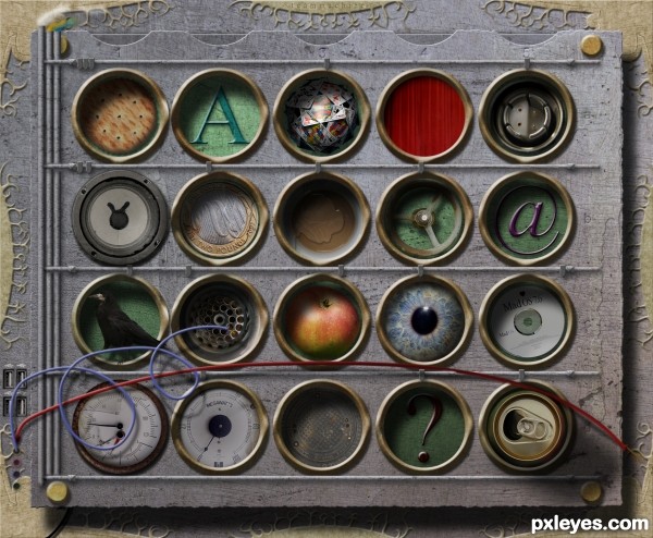
The lastest addition to your computer would be a USB Steammachine which you could hang on the wall. You can order anything from your lazy chair just by putting your finger in the designated hole and it will be scan your fingerprint so the system knows who ordered it. Ofcourse the background images can be replaced by anything you want!

Some objects are on top of the wholes because they are part of the system.

>> more sources in the SBS. (5 years and 3339 days ago)

10 Sources:

avatar Akassa
Akassa says:

That would be a really useful tool! A bit bad for our health tho xD nice idea.
Btw is it me or you forgot to add some shadows on the buttons? The majority has an intense shadow from up-left and some have a really thin shadow, since the buttons seem all equal to me (their shape) i guess the amount of shadows should be very similar to all of them.

author says:

Thanks Akassa, somehow there's things we overlook while being busy. Added the shadow

avatar erikuri
erikuri says:

A special tool for busy couch-potatos!
Very cool...

avatar nanaris
nanaris says:

good composition and nice idea, good luck!

avatar hsbee
hsbee says:

Congrats

avatar Disco
Disco says:

Congrats on a well deserved first place!

avatar madamemonty

Congrats Rob a very interesting work

avatar erathion
erathion says:

Congrats Rob...

avatar Geexman
Geexman says:

congrats rob, nice entry

avatar nasirkhan
nasirkhan says:

Congrats! Rob. Very nice work and well deserved.

avatar nishagandhi

congrats Rob

avatar erikuri
erikuri says:

Congratulations, Rob!

avatar spaceranger

Congrats!!

author says:

Thanks for the congrats all!

Howdie stranger!
If you want to rate this picture or participate in this contest, just:

LOGIN HERE or REGISTER FOR FREE


The Baby Dreamer - created by woodztockr


The Baby Dreamer
Favs: 0SBS: n/aHi-resRank: 6/7Score: 52.8% (0)4655 views

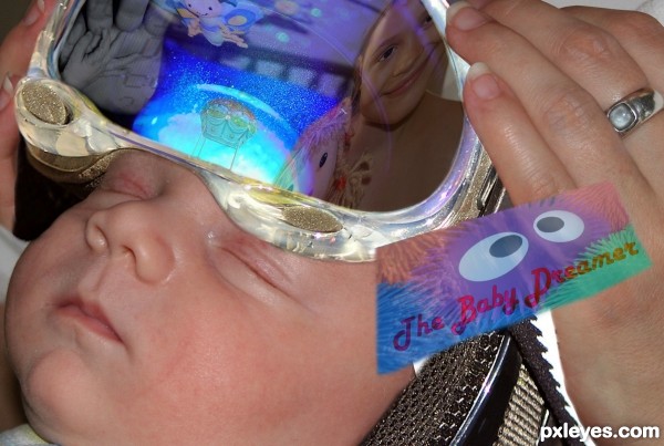
Ever wonder what your baby is dreaming... not anymore!

Introducing TheBabyDreamer

(5 years and 3340 days ago)

9 Sources:

avatar DanLundberg

Creative concept. I confess I don't get the floating distorted rectangle with the googly eyes and "The Baby Dreamer" text -- is this image maybe supposed to be an advertising piece for the product? I think the 'goggles' should cast more of a shadow onto the baby's head. The image in the 'goggles' isn't very interesting, at least to me, and while I admit baby dreams could very well not be very interesting, I think more compelling or more humorous would help in this contest.

avatar lobusdexter

nice idea, but I wouldn't put anything like this on my baby's head....

avatar gustimusprime

cool image author, reminds me of that scene in donie darko

author says:

I wouldn't either.... but what if it was a brain enhancing technology that ensured you child's future!?

There would be some debate!?

author says:

DanLunberg,

I baby's mind is the greatest influence on future development and how the current and primative of a species develops.... why wouldn't a baby's dreams... be interesting??????????

Unless you're stuck in a oneway mindset where the future is sure to repeat the past!?

avatar erathion
erathion says:

nice one...good luck author

avatar pearlie
pearlie says:

Very creative idea, author.

Howdie stranger!
If you want to rate this picture or participate in this contest, just:

LOGIN HERE or REGISTER FOR FREE


The Hug - created by Lamantine


The Hug
Favs: 1SBS: n/aHi-resRank: 7/7Score: 52.2% (0)6280 views

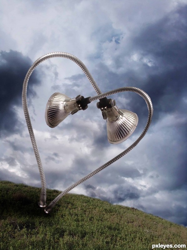
Im not very satisfied with it. Suggestions are very welcomed.

Credits to night-fate-stock for background. (5 years and 3340 days ago)

2 Sources:

avatar Akassa
Akassa says:

The lights on the metal are really twisted, since you duplicated the main source you got two light sources - one from the left and one from the right. I would applicate a bit more darkness to the bottom too.

avatar CMYK46
CMYK46 says:

There's no obvious light source, so the shadow is probably not necessary.

avatar IRONCOW
IRONCOW says:

I would add more contrast to the lamp parts. it will help it match the background. shadow wize I would just add some inner shadow to the lower side of the lamp parts

avatar Tuckinator

very nice idea!

avatar nasirkhan
nasirkhan says:

Simple but nice construction of heart

avatar erathion
erathion says:

nice one author...best of luck

Howdie stranger!
If you want to rate this picture or participate in this contest, just:

LOGIN HERE or REGISTER FOR FREE


The Edge - created by rufkut


The Edge
Favs: 7SBS: 9Hi-resRank: 1/7Score: 60.1% (35)15491 views

(5 years and 3341 days ago)

5 Sources:

avatar blindscientist

Love the feel of this one. Nice work on the blends, and SBS as well. Only thought would be that the shadows from the willow don't match the light source (they should be longer). Best of luck.

author says:

Thanks blindscientist I knew I forgot to do something thanks for pointing that out have made the change hopefully for the better.

avatar CMYK46
CMYK46 says:

Looks like grass on the surface of the water?

author says:

That's what it is CMYK46.

avatar CMYK46
CMYK46 says:

Ummmm...but why?

author says:

Why not?

avatar Akassa
Akassa says:

I think the edge sides of the willow are too rough, try to use the Blur Tool or if you want to do the hard way copy some of the top "leaves" effect.

author says:

I have made the changes you suggested Akassa. Thanks.

avatar erikuri
erikuri says:

Beautiful image!

avatar esdhee
esdhee says:

hey.., that's look like a cluster of moss on the surface of water... LOL

avatar sinnersaved

I say that freaken awesome lol....i wish i could do something even remotely like that lol very good job!

avatar Tuckinator

super work!

avatar madamemonty

Congrats, lovely work

avatar erathion
erathion says:

Congrats...

author says:

Thank you both.

avatar nasirkhan
nasirkhan says:

Congrats! for 1st place

avatar dekwid
dekwid says:

congrats.........wonderful......

avatar erikuri
erikuri says:

Congrats!

avatar arca
arca says:

Stunning!

avatar spaceranger

Congrats!!

author says:

Thank you all.

Howdie stranger!
If you want to rate this picture or participate in this contest, just:

LOGIN HERE or REGISTER FOR FREE


Walking the dead - created by Clinge


Walking the dead
Favs: 1SBS: n/aHi-resRank: 6/7Score: 56% (0)9732 views

Thanks to Felly1000, Pepo, Jascha400d,
Roppa uk & Dafeba for the very nice stock images ;-) (5 years and 3342 days ago)

6 Sources:

avatar woodztockr

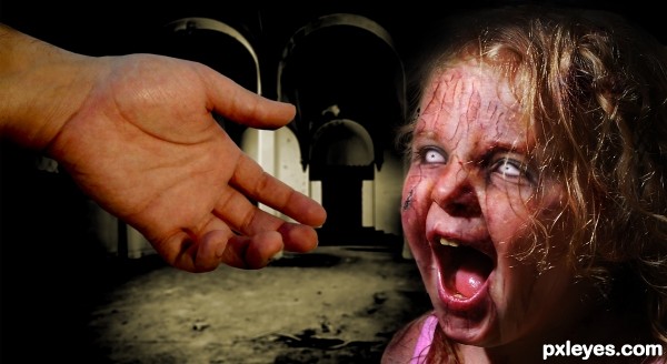
Has a nice childre of the corn and pet cemetary feel! dont like the pretty pretty chops!

avatar erathion
erathion says:

this is very scary thing...great job author

author says:

Thx erathion, woodztockr, please, what do you mean with 'don't like the chops??

avatar woodztockr

Author I meant I like your spooky scary photoshop (chop) and not really the others that make zombies like pretty... g/l

author says:

Ok woodztockr, i understand THX

avatar sunzet
sunzet says:

That spooked me! Convincing (as convincing as dead walking could be) Really nicely done.

author says:

Thx Sunzet

avatar Disco
Disco says:

Her colour is very healthy for someone who's dead. Just my opinion...

Howdie stranger!
If you want to rate this picture or participate in this contest, just:

LOGIN HERE or REGISTER FOR FREE