high resolution would be great, (5 years and 3492 days ago)
(5 years and 3492 days ago)
NIce idea!
cool idea!
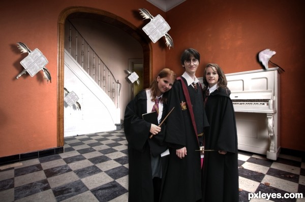
harry potter and 2 chicks...is that new tittle of the 8th book... ...i like it author...gl
Howdie stranger!
If you want to rate this picture or participate in this contest, just:
LOGIN HERE or REGISTER FOR FREE
(5 years and 3492 days ago)
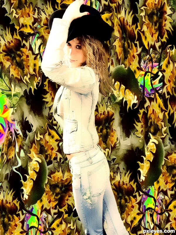
Interesting background, but the figure is distorted.
just fixed it
It's a very different use of the source, quite abstract; I like it. But girl's image is still a little stretched - when you resize an image, do it pressing shift key, image doesn't distort. And she's too much bright, maybe an adjust on contrast could help.
thanks im going to fix it
very nice work author...good luck
Mhm..
nice idea
Howdie stranger!
If you want to rate this picture or participate in this contest, just:
LOGIN HERE or REGISTER FOR FREE

(5 years and 3492 days ago)
good luck to you
Yep
sad
Howdie stranger!
If you want to rate this picture or participate in this contest, just:
LOGIN HERE or REGISTER FOR FREE
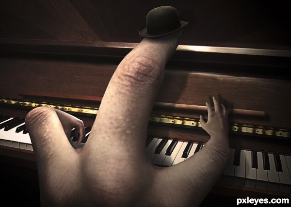
Well, here you go: the source photo was of a hand playing a piano. Unfortunately, I couldn't think of anything else, so I simply made the same thing: a hand playing piano. Only much more literally.
Comments and criticism are much appreciated.
Thank you very much to bas3ssen (http://www.sxc.hu/profile/bas3ssen) for the perfect bowler hat. (5 years and 3492 days ago)
I like this a lot. Well done author
ver very cool
swesome entry and great SBS
That's dedication and the first time (as far as I can remember) that I have given full marks! This is soooooo good. Top marks for SBS also....
Nice play with the hands!  Do you know chiromancy? Artists and creative people have your type (shape) of hands...
I just think left hand is a bit twisted in an uncomfortable position. But everything is very well blended. GL!... 
Thanks Erikuri  (And everyone else). Perhaps it may seem that way, but remember that this is the hand of a finger, not an arm.
  If you form a sharp arch with your index finger, it should look approximately like in the photo (aside from the hand attached, of course). And YES! I have heard of chiromancy. Thanks for the compliment.
  I play piano so perhaps my hands just evolved that way lol.
Very good work! really I like the mood of this work author.
The hat is really the finishing touch  !
!
GL
great job.......... 
Love this guy...good job! 
Creative work author 
nice ! g l
Very clever idea. Well done. gl
Nice idea I like it
Fantastic job author...very neat and funny...well done
Very cool creation.
Congrats on a well deserved win! 
Congrats for 1st 

Ben, my great pianist, congratulations! 
Nice work, congrats 
Congrats for 1st ............. 
Congrats Ben,this is really great work,funny,neat and well executed...and of course,well deserved first place...keep going with great works...
Congrats!!
Congrats!! 
Congratulations!
O w0w! you are so clever sweetheART pure magic lol! ;D
Howdie stranger!
If you want to rate this picture or participate in this contest, just:
LOGIN HERE or REGISTER FOR FREE
amazing, very good composition
super job ==great detail
Super top job.

 Congrats in advance
aWeSoMe WoRk..., yOuR sTylE iS nOw FaMiLiEr.... GoOd LuCk...
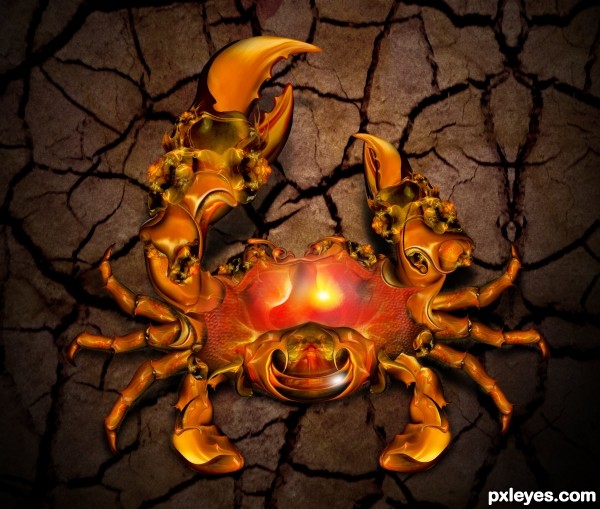
Nice Crab, GL
Like the colours.
omg this is amazing, nice work!
I hope this wins! Great Work! And still, it preserves the source photo in some way...
Stunning - well done!
Very very nice work author,great details...i have few nit picks,crab it self is lots more sharper then ground...and ground is to dark for highlights than u created on crab...good luck
salute for ur creativity
awesome
Wow...that's some incredible detail. Great work!
wow, amazing! GREAT!
Very beautiful and full of details; we see a lot of work, neat and well executed. GL!...
hehehehe........selamat ya.......suhu
Nicely done!.... very good execution.
superb .........
Could use more texture, but very nice work.
Well crafted crab.Very detailed,successful construction.And its a little shame,that You put Your crab on very uninteresting,dark background.If You take a look on the image,You see,that even though crab is well shadowed,compositon looks flat,chaotic and crab floating.You should try some kind of glossy,icy background(even with cracks) and nice crab ground shadows or reflections,because only this way,You can create pretty cool 3D illusion,which boost whole image to the different level.Try,if not for contest purposes,just do it for Yourself.It is worthy,because thats beautiful crab.Good luck
hahaha thanks jaskier
well done author . good luck
Source? Great technique =]
hahahaahah source ,,????
Nice Job
Looks precious
Now if you could make them easier to eat and not end up 80% on my bib... now THAT would be something... (I love crab when SOMEONE else de MEATS them...)
super duper job by the way... CONGRATS in advance
Beautiful work....
Congrats! for 1st Place
Congrats for the 1st. place, Chan!
Congrats Chan, another amazing work
congrats .......
Congrats...
Congrats my friend. I´m happy to see your Image on top
Congrats!!
Well-deserved win!! Congrats!
Howdie stranger!
If you want to rate this picture or participate in this contest, just:
LOGIN HERE or REGISTER FOR FREE