(5 years and 3630 days ago)
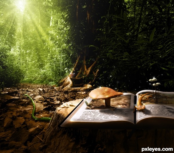
A story comes alive when you read it.
Please check high-res and used sources before voting.
Thanks certified su, TheTruthabout..., wblj, renaudeh, TexasEagle, Gare and Kitty, Armando Maynez, ::DEEBS:: is taking it easy and Christian Haugen for the images! (5 years and 3630 days ago)
great work ! g l
Love this image. Well done!
Nice image, GL 
Great creation,but IMHO this is more pop up book...i don't see this as OOB...good luck author
Great lighting & shadows...hope this is considered on theme! 
Well I can't really see why it's not on theme. The caterpillar/mushroom and salamander are coming out of the pictures in the book into the forest. It's just not the standard "stuff coming out of a frame into a room" image. I wanted to do something special with a story to it. Thanx for you comments!
hhahhaha one of the better in this contest!
nice shadow work
In my oppinion, this IS on theme, completely! Very beautiful work, with a fantastic mood. GL! 
Thanks all!
congrats for the 4th place
Howdie stranger!
If you want to rate this picture or participate in this contest, just:
LOGIN HERE or REGISTER FOR FREE
Only source used.
(5 years and 3630 days ago)
very nice! g l
Very Good image. Source well used, GL 
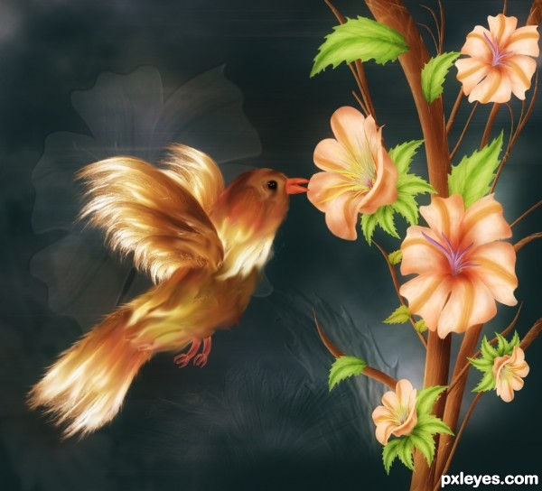
This is probably the ugliest bird I have ever seen. The flowers are nice though. The difference in style of the bird and the flower is to big, it doesn't really fit together. But nice colours!
My intention was not to create ugliest bird but anyway thanks for your comment. I have smudge bird and added some color to make it less "Ugliest".. 
What a clever use of source! 
beautiful entry
Can't help it, if I saw that bird in real life I wouldn't want to touch it. Just because it has human hair... Great changes!
I don't know for before author,but bird is very very cute,nice work with the flower...overall,well done...best of luck
Wonderful! Nice coloring! It's a very neat work. 
this is awesome!
Beautiful flowers. The bird's body is kind of long and feet not in right place. But overall it's nicely done.
Decent entry...
BUT lately you can find a smuged bird image, wich has nothing to do with the source in almost every contest. This is getting kind of old.
Don't get me wrong, its a good entry but its already been done so often..
Lovely Entry and love the colors.......G/L Author.
Oh very pretty!
Congrats for your third place, Nasir!
hi,....congrats again......
Congrats Nasir, I had the same idea but I can't finish my entry, glad to see you success with that idea, very well done!
Congrats!!! 
congrats Nasir
Howdie stranger!
If you want to rate this picture or participate in this contest, just:
LOGIN HERE or REGISTER FOR FREE
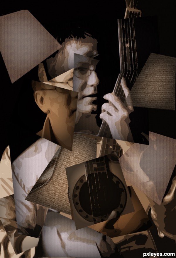
Well, I read the indicated tutorial, but I didn't follow it literally. But I hope it's nice...
Thanks to Hunta @ Photoxpress. (5 years and 3630 days ago)
Nice!......looks good to me.
yes, very good example of the theme... LOOK AT THIS IMAGE PEOPLE! great image author!
nice start
Interesting kick-off entry. The face and hand seem too 3D, however, as I think of cubism as really flat -- and likewise all the black creates very distinct background and foreground levels which isn't particularly flat either. I believe the texture in the tutorial was merely meant to reflect the canvas the image is supposedly painted upon. Thus I feel the multiple, non-canvas textures here say 'collage' more than 'cubism' (or maybe this is nouveau cubism?). Also, I don't see the guitar shape, so until I saw your title, I was thinking lute.
coool !! g l
Cubist is as Cubist does.. it is the pulling apart of any subject and reassembling in the abstract after analyzing of course... Great job... many forms.. many styles.. no strict rules..
(placing severe rules on cubism is like trying to put hand cuffs on a stream of water while encased in cement made from oatmeal)
Good luck author 
(a Lute and a guitar are BOTH Strings... they are in the same family and they would be placed in the same section in an orchestra)
I agree with Drivenslush. I should have been looser on the stringed instrument...but pianos are stringed instruments and just didn't want to go there  The moderators will have final say obviously. I think this is fabulous. Thanks for starting us off with a nice showing. BTW, I look at the tutorial as a guide for beginning PSrs (such as myself) and not meant as the driver of this challenge.
Synthetic Cubism was not so flat. Of course, this is NOT synthetic cubist work, but I saw some paintings in Wikipedia, and some of them are quite recognizable, inside Cubist context. Someone, correct me if I'm wrong. 
Author this is a fine piece of work. I see guitar written all over it, a six string classical one as a matter of fact. I do not know where the "lute" observation came from, hard as I try I can't see a lute in this picture. I actually like the textures and the way you have used them...KUDOS 
this maybe a master
I like this 1, and it just came to my mind the first time looking at this, this work maybe by a master just like RickyRuckus said,.....good luck... my fav is too

Thank you all, guys! But I'm still learning, you make me blush...
Very very nice clean work author...well done
great job, tia.. I loved it.... It s one TOP SEVEN... congratulations
Congratulations! 
Congrats!, very nice work 

congrats!
Congrats!!
Congrats! 
Congrats
Congrats!!!!
Howdie stranger!
If you want to rate this picture or participate in this contest, just:
LOGIN HERE or REGISTER FOR FREE
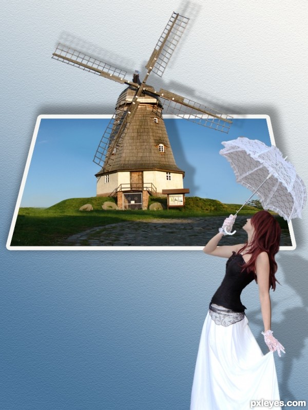
Thanks a lot for the stocks:
Mill: http://two-ladies-stocks.deviantart.com/art/Mill-131369475?q=boost%3Apopular+in%3Aresources+mill&qo=0
Model:http://lisajen-stock.deviantart.com/gallery/#/d1h1ag5 (5 years and 3630 days ago)
very cool
cool work author,but if u look windmill light comes from the left,so shadow should be on the right side,also it would be nice touch if u add some rain image to fall on the girl's umbrella...any how,i like this image because is nice clean chop...best of luck
VERY NICE ! G L
Actually the light is coming from the right, not the left. Unless you mirrored the image since erathion commented.
congratulations... It's one great job !!!
good one,and good luck
Your shadows are on the opposite side of the shadows on windmill; unfortunately you don't have time to fix them... But it's a nice work! 
Howdie stranger!
If you want to rate this picture or participate in this contest, just:
LOGIN HERE or REGISTER FOR FREE
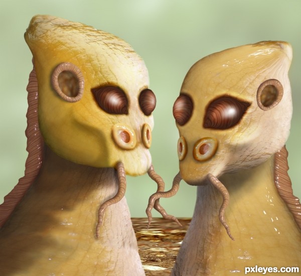
Nice Aliens author, slimy but sweet. GL,
hehehehe.. what a great Idea author... very squishy!
Very cool, they looks so real = )
Nice.
yess very nice . good job author ! g l
Haha, weird, and interesting. Cool use of the source! Lotsa luck, author!
Howdie stranger!
If you want to rate this picture or participate in this contest, just:
LOGIN HERE or REGISTER FOR FREE