(5 years and 3629 days ago)
3 Sources:
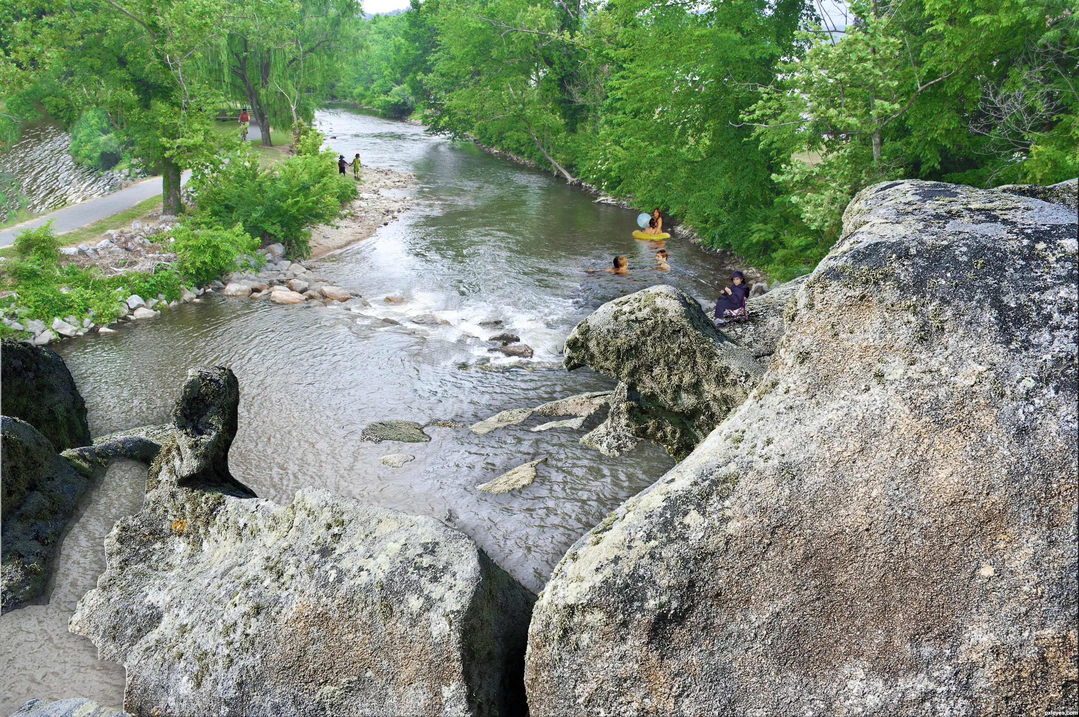
- 1: boy and girl
- 2: boy fishing
- 3: tubers
Only Source Image and Digital Painting. (5 years and 3629 days ago)
incredible work here

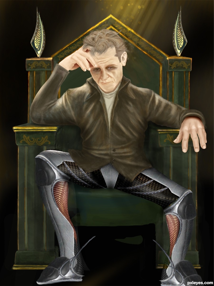
SO THAT's what happened to JAMES DEAN!!!.. he got old and grey and his head got bigger... and he's into kinky undergarments.. hehehe
GREAT JOB AUTHOR!!!!
Great drawing skills author,and very cool collision with metal elements,i only have to say,that he have very very small feet...
Superb image and idea. Impressive skill set, very well done author!
thanks a lot to all of u, further improvments will be added soon
@CMYK46, I have thinking that the leader of the galaxy needs no weapon, his weapon is his brain, beside his exceptional strength
LOL...must be a pretty puny galaxy. Wouldn't he have like, a big ray blaster or something?
Nice drawing! But this leader must be tired of being a leader... GL! 
wow so cool and nice to see u author
Great drawing skills. Nice to see your works again
i like it so mach ,good luck
Congratulations!
Congrats for your third place!
Congrats on your third place, welcome back to Pxleyes and hope to see you in the drawing contest as well, you have great skill
Congrats! for your 3rd place.
Congrats!!!
Howdie stranger!
If you want to rate this picture or participate in this contest, just:
LOGIN HERE or REGISTER FOR FREE
(5 years and 3629 days ago)
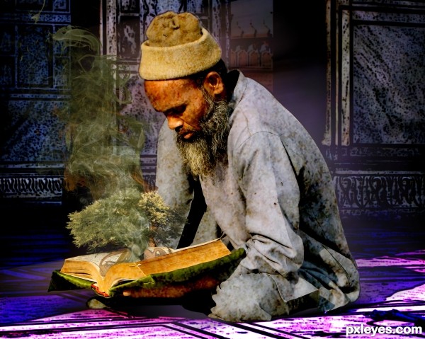
The idea is good,but the two style don't work well together....
the ground ruined it for me
Howdie stranger!
If you want to rate this picture or participate in this contest, just:
LOGIN HERE or REGISTER FOR FREE
(5 years and 3630 days ago)
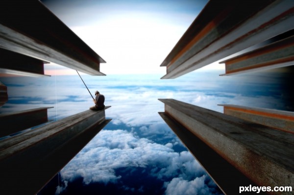
intelligent idea, good luck


Like your idea, you should post a high res version.
Very clever use of the source, I think the beams shadows are wrong for you image, the ones with the light face should be at the bottom and the dark face at the top.
very cool
Fantasy on the top... nice work!
I just love it!!!!
Good job with such a simple idea. For some reason this reminds me one of those movie company logos, where that small boy is sitting on the half moon and there were clouds and stuff.. Dreamworks or something, perhaps?
I don't think the top beams are needed IMO...
I love the mood here. Great imagination! Wish there was a hi rez pic.
Very nice work author...good luck
Congrats for your second place!
Congrats! for 2nd place, Great idea.
Congrats!!!
Congrats
Howdie stranger!
If you want to rate this picture or participate in this contest, just:
LOGIN HERE or REGISTER FOR FREE
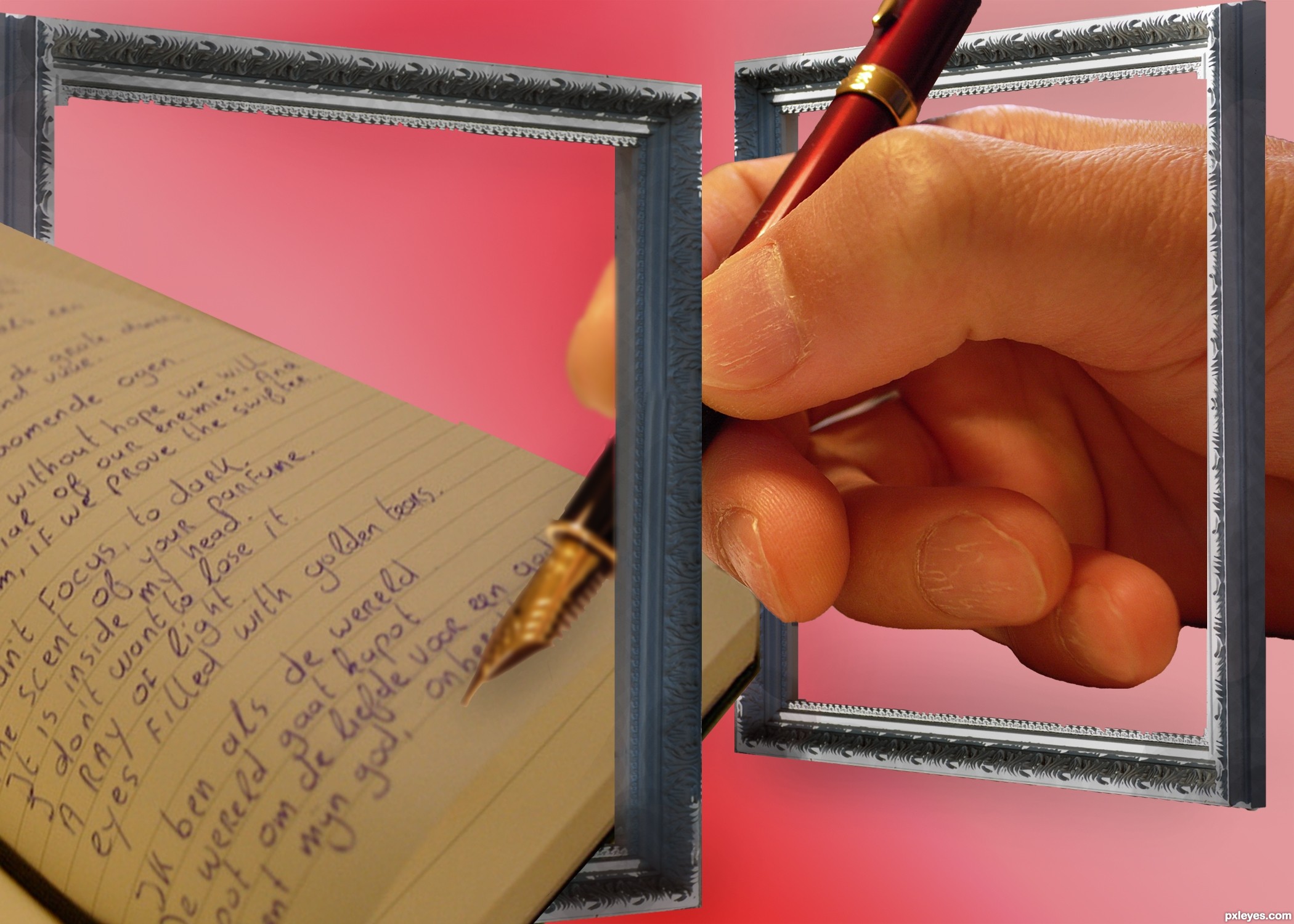
With thanks to: kthread for the picture frame, matsuyuki for the image of the hand and pen, and cone_dmn for the diary. (5 years and 3631 days ago)
very nice ! good luck
I would've likee to see the white level on the paper a bit higher and maybe a photo filter to pull it all together. Good luck!
IMHO this is not OOB image,this is hand that write through empty frames...any how,good luck author
the perspective of the frame that is nearest is wrong but other than that, cool image!
Pen point is in sharp focus, so the writing under it would be too...
Erathion is right; you need at least masking between frames and behind the small one to make the image look like OOB. Flip the big frame horizontally too, as Tucker said. A different color of background inside the frames will make the difference! GL!...
Thanks for all the feedback, CMYK46, I can't really do anything about the writing - it's as it was, so perhaps I should blur the nib of the pen a little? erikuri, will try your suggestion and see what it looks like - thanks!
try adding a white background tp the frame on right side, n as far as the pen is considered try blurring the tip of the pen , its a good entry, gud luck author!
Blurred as suggested by lots of folks! Thanks
mazing sweetheART ;} happy hippy hugglez
Howdie stranger!
If you want to rate this picture or participate in this contest, just:
LOGIN HERE or REGISTER FOR FREE
Photography and photoshop contests
We are a community of people with
a passion for photography, graphics and art in general.
Every day new photoshop
and photography contests are posted to compete in. We also have one weekly drawing contest
and one weekly 3D contest!
Participation is 100% free!
Just
register and get
started!
Good luck!
© 2015 Pxleyes.com. All rights reserved.


wow i love this 1
Thanks Tuckinator!
you must have put a lot of time into this. great job.
Pretty nice work, but the leftt side dark and big boulder doesn't fit into the perspective here very well. There is also a slight problem with the scale of the people when compared to each other. Walking kids and the one fishing could use a slight shadow, you can use the rock shadows as a guide, where the light comes from. To make it even more realistic, you could cast some shadows from the big bushes and trees on the left side of the river bank. (There is also a minor masking error on the left side of the cycling path.
i got rid of the bad boulder. put some shading and shadow on the kids and the fishing kid and fixed the masking boo-boo. but i gotta go to sleep now. i will try to address the rest tomorrow, if work and school permit before the deadline. Widiar, i do appreciate your comments, i really do. but i was so deflated (it is ok, i recover fast and you are right about what you say) in hearing them. I think when i work so long on these things i quit seeing them till you are good enough to point them out. then it is like a sore thumb... sticking right out - blaring at me! but, i do want to thank you for taking your time and giving it a good look over.
Already a lot better with the out of perspective rock removed. You could have blended it in with perspective tool and shadows perhaps, but takes a lot of skill and times, so obviously better choice if you're busy on your life (aren't we all). I'm glad you appreciate my comments and suggestions. And I know how you feel.I think we all sometimes (even best of us) make a picture for hours, then send it with full excitement, how good we did.. waiting some praise and then someone comes and tells how obvious flaws we missed.It is always a good thing to give the image "a rest" and take a new look with fresh eyes and mind.

But it's the whole point of this site I think.. to learn, give and take tips and improve our skills. Would be utterly boring to see 100 perfect chops every night with nothing to say but 'Awesome work dude!111' ..
Widiar, you are so right!!! I have been learning photoshop since january this year, each time i enter, i learn something (some lessons are harder than others!!!) one thing i have learned is that i love it! and another is that no matter how hard the critique is to take - no comments at all is much harder to take!
In high resolution u have big light source issue author...people in the water are in the total sun,and in your image there is no sun anywhere...also u could blend boy on the rocks a bit more,to change his color.Change mode to CMYK and play a bit with curves...i would ton a down magenta for sure.People are to big for the rest of the image,and they need some shadows...Sorry for the nit picks but idea is very nice and this could be good entry...good luck
There is sun where they are, the coloration of the water is the depth (in real life - look at the original in the sbs, note the trees close right no shade in the water, if you look over at the trailer on the far left the sun is directly overhead and the shadow is directly under it.) although even if you were to assume it were the trees the girl is to this side in full sun. i will work on the boy, thanks for the tip. i used some shading as widiar suggested on the kids and the fishing kid. as for the sizes i used the rocks on the beach right by the swimmers to get the size right, and the same for the others. i then used vanishing points to verify them with the distant ones. i also used the items in the original (to the far left) to verify so i have to gently disagree with you on size.
please dont apologize for the nit-picks, it is good that you took your time and looked so thoroughly at this piece. i truly thank you for your comments (and your comments are why i now take the time and such extreme measures to actually measure the people and the perspective now.) my next attempt i will add the steps taken to measure out things to my sbs,
Interesting image. But background image (river, running course) is cloudy, and fishing boy too. Given source and kids in the water are lit by sun.
hey erikuri! thanks for your comments. (btw... loved your "screwdriver"!!!!}
Congrats for your third place!
Congrats! for your 3rd place.
Congrats!!!
Howdie stranger!
If you want to rate this picture or participate in this contest, just:
LOGIN HERE or REGISTER FOR FREE