Photoshop Pictures: The (page 330)


results 1646 - 1650 of 2863

Kiss of the Countess - created by Warlock


Kiss of the Countess
Favs: 0SBS: n/aHi-resRank: 21/43Score: 55.1% (0)5415 views

I can see a couple pf people have beaten me to this idea.....not to worry need to pull my finger *** ** ** *** quicker next time. S.B.S will follow in the next day or two. Work is taken priority at the moment.

One of the images I have used requires to be notified I have done this.....with a link back to the site if they wish to take a look.

(5 years and 3352 days ago)

5 Sources:

avatar erathion
erathion says:

Very realistic work author...i like gray scale choice...gl

avatar erikuri
erikuri says:

She was so serene...
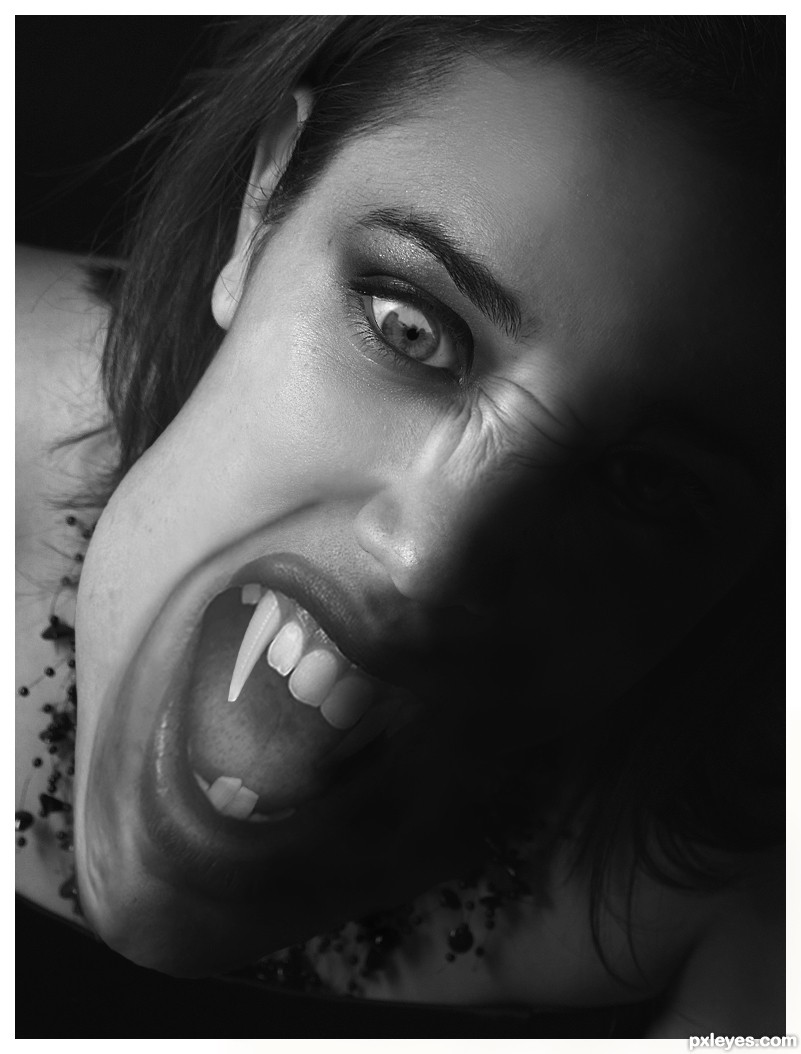
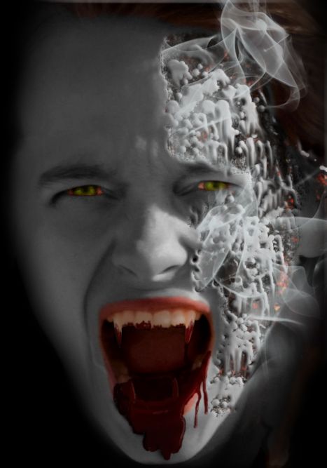
Author, there's a flaw in the dark side of her "jaw"; I particulary prefer natural proportions, but... GL!

author [banned] says:

Thanks for your comment erikuri but that really is of know help “flaw in the dark side of her "jaw";

What is the flaw, too big, too small, not in line, not dark enougth ect ect i can't fix it if you don't tell me what it is........

avatar Krystian
Krystian says:

you should fix the slight bump in her jaw (below her ear),..i think its what throws off the proportion a bit. otherwise good job!

avatar Tuckinator

nice job!

no avatar
gejopo says:

Really good job.....but her one fang is on a different tooth than the other one. gl

author [banned] says:

Made a few changes……

Many thanks for your comment Krystain, but I think this is a pretty accurate interpretation of what the face would be like if the face was elongated/deformed like this.

Many thanks for the comment gejopo, but I was unable to move the tooth back, as there is just not enough room to fit it in my chosen outside sources.

I welcome all comments good bad and the ugly, but I would like to point out that if you can see any details in the dark side of the face which is jet black. Then at best guess you monitor needs to be re-calibrated. I do this sort of work and 3D modeling on a freelance basis I can not afford for my screen to be incorrect.

avatar jawshoewhah
jawshoewhah [banned] says:

Whether the face is supposed to look like that in a vampire (although I don't think there's a specific vampire design guide to ad-hear to) but the mouse contrast is not looking good. I think in this particular design, color would have been a better choice, IMO.

avatar pearlie
pearlie says:

Great blending of the parts, author. And that is one heckofa fang!

Howdie stranger!
If you want to rate this picture or participate in this contest, just:

LOGIN HERE or REGISTER FOR FREE


Building The City - created by oasisman


Building The City
Favs: 1SBS: n/aHi-resRank: 5/43Score: 55% (15)11128 views

Comments welcome - Still learning this photoshop... (5 years and 3352 days ago)

2 Sources:

avatar Tuckinator

nice one

avatar erikuri
erikuri says:

Nice composition. But I don't know, I feel that hook's perspective is a bit odd comparing to the bars... maybe a slight adjust can solve it. GL!...

author says:

@erikuri Hadn't noticed that but now you mention it ... aaaghhh lol

avatar CMYK46
CMYK46 says:

Remove the shadow from the building in background.

avatar sunzet
sunzet says:

Nice idea, I like it a lot. Agrees with CMYK, remove the shadow behind the hook, and also - motionblur the hook a little, ´cause the perspective of it makes you feel that it´s swinging towards you. GL!

author says:

Added a bit of motionblur on the hook to 'fix' the perspective issue - thanks sunzet

avatar jawshoewhah
jawshoewhah [banned] says:

This is one of the better entries! GL!

Howdie stranger!
If you want to rate this picture or participate in this contest, just:

LOGIN HERE or REGISTER FOR FREE


High Above The City - created by Chuck


High Above The City
Favs: 0SBS: 6Hi-resRank: 8/43Score: 54% (0)6478 views

Spec Thanks toBill Jacobus1 for use of these three pictures found on Flickr.com under a Creative Commons license. (5 years and 3352 days ago)

3 Sources:

avatar erikuri
erikuri says:

The man in the forward is tad blurry. The man in the middle needs to be flipped 'cause of lighting source and the man on the left needs a shadow.

avatar neeraj55
neeraj55 says:

YESS ! GOOD JOB ! G L

avatar Tuckinator

very nice idea!

avatar oasisman
oasisman says:

Very nice idea. I'm not sure if the viewer is supposed to be looking up or not.

author says:

Thanks all

Howdie stranger!
If you want to rate this picture or participate in this contest, just:

LOGIN HERE or REGISTER FOR FREE


Gluttony by the Sea - created by Drivenslush


Gluttony by the Sea
Favs: 0SBS: 4Hi-resRank: 18/43Score: 50.1% (0)5225 views

source with my photos (5 years and 3352 days ago)

avatar erikuri
erikuri says:

He's a pig-fish face with cherries on the head! Committing a sin: gluttony. Eating what? Sashimi?
Just a small thing, author: you forgot to colored his knee, and some places you painted over, some places are lacking color. What a boring girl I am!
GL!

author says:

got it erikuri, thanks!!!

avatar neeraj55
neeraj55 says:

GOOD LUCK !

avatar Tuckinator

very cool author...hehe

avatar erathion
erathion says:

o my o my o my,how u achieve to create eyes like this author...very well done...gl

avatar nasirkhan
nasirkhan says:

Creative. Expression is great

avatar Warlock
Warlock [banned] says:

Creativity Scale Rating 10/10 how do you come up with these ideas........

Howdie stranger!
If you want to rate this picture or participate in this contest, just:

LOGIN HERE or REGISTER FOR FREE


The Frying Vampire - created by rufkut


The Frying Vampire
Favs: 0SBS: 7Hi-resRank: 29/43Score: 52.1% (0)6587 views

(5 years and 3353 days ago)

2 Sources:

avatar erikuri
erikuri says:

She got the sunlight! Nice effects!... But I'd prefer without all those blood, just a little was fine IMO.

author says:

Thanks for your comment erikuri. The reason for the amount of blood is that she has just bitten someone.

avatar neeraj55
neeraj55 says:

good luck !!

avatar DanLundberg

Cool idea, and post-prandial vampires would seem to be the ultimate in drama IMO. Necertheless, the fried-face portion seems more on top of than into the skin in the eye/nose portion—but maybe that's somewhat of a misread on my part because the smoke edges are just too strong.

avatar Tuckinator

well, the blood is very gruesome

avatar jawshoewhah
jawshoewhah [banned] says:

A higher res would have been nice.

Howdie stranger!
If you want to rate this picture or participate in this contest, just:

LOGIN HERE or REGISTER FOR FREE