Photoshop Pictures: The (page 332)


results 1656 - 1660 of 2863

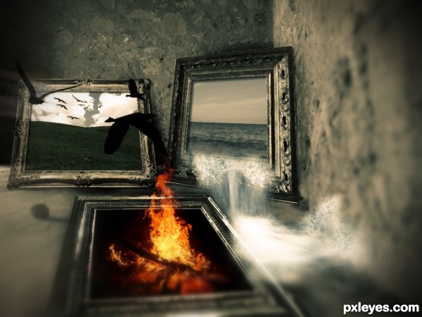
The Missing Element - created by iamlukas


The Missing Element
Favs: 1SBS: n/aHi-resRank: 20/50Score: 54.8% (0)7466 views

Quite a lot of sources : D
This picture wants to tell a message.
_______________________
Techniques used:
Color Adjustments, Gradient maps for the main "surreal" color effect.
the painted look of the pictures was made by using filters. some masking, quite a lot of perspective transforming. added a vignette, a gausian and radial blur for the edges.

Birds (brushes): http://www.brusheezy.com/Brushes/1473-Bird-Photoshop-Brushes (5 years and 3403 days ago)

10 Sources:

avatar Warlock
Warlock [banned] says:

It’s a very creative idea. But the blurring effect is a little to overpowering.....

author says:

Thank you very much! reduced the blur and I like it mor now.

avatar erikuri
erikuri says:

Very good!

avatar erathion
erathion says:

Very cool idea and nice final product.I like water frame very much,birds are nice touch too but fire demands a bit more work...play a bit more with fire frame perspective and maybe u could create dripping water effect in fire frame...any how this is very good work....best of luck

avatar Tuckinator

i like this

avatar serialkiller

perfect idea and it is nicely done! good luck, author

author says:

Thanks to all! (:
I will care about the points you saied as soon as I find some time, thanks a lot erathion!

no avatar
fatemah says:

wooooooooooooooooow Unbelievable

avatar jawshoewhah
jawshoewhah [banned] says:

Clever idea. GL!

Howdie stranger!
If you want to rate this picture or participate in this contest, just:

LOGIN HERE or REGISTER FOR FREE


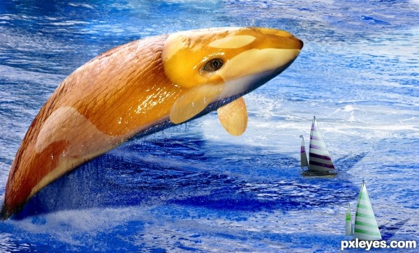
The Return of the SnailWhale - created by Widiar


The Return of the SnailWhale
Favs: 1SBS: n/aHi-resRank: 13/50Score: 54.8% (0)5551 views

(5 years and 3403 days ago)

3 Sources:

avatar erathion
erathion says:

Very nice work on a Whale,my only advice is to erase some parts of the white stripes with some soft brush,that would give realistic mark...Sailing boats looks a bit more unrealistic,maybe u could use some other image of the boat,ship or etc...Any how i like this construction very much,and i am sorry for nit picks...
Edit:maybe u could change color of the whale to,some kind of blue or greenish,then he would look very very realistic

avatar CMYK46
CMYK46 says:

Nice job! If it has bottom fins, why not the top fin?

avatar Kid
Kid says:

that's pretty creative lol , gj

avatar Warlock
Warlock [banned] says:

Nice work and a very creative idea. my only suggestions would be to blend the fin in a bit more and to give it less transparency Something of this size would not have thin or flimsy fins…..

avatar erikuri
erikuri says:

It's different. I agree about the fins.

avatar Tuckinator

lol cool image

author says:

Gonna think about the side fins. I kind of liked the little fish -like fins on a huge whale. But what comes to dorsal fin, I removed it as it looks much better that way - and there are several whale and fish species which don't have a dorsal fin. I want to save the shocking yellow colour, as I want it to be very different and look like a snail-whale instead of very realistic one. Thanks for all the comments, I think about the side fins.

avatar CMYK46
CMYK46 says:

I like the color & the side fins!

avatar Clinge
Clinge says:

Great job, like it GL!

avatar EmiK
EmiK says:

Very cute whale, looks so real.

Howdie stranger!
If you want to rate this picture or participate in this contest, just:

LOGIN HERE or REGISTER FOR FREE


coming out of the dark - created by jack2


coming out of the dark
Favs: 0SBS: n/aHi-resRank: 41/50Score: 46.8% (0)5443 views

(5 years and 3403 days ago)

1 Source:

avatar erikuri
erikuri says:

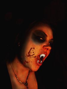
Author, image is too small; upload it in hi res, please...

avatar Tuckinator

hmmmmmmmmmmm....strange

avatar jawshoewhah
jawshoewhah [banned] says:

Sorry too small a high res to see good detail. Upload high res in future and it will seriously help your score. No high res? Then find one that is. Images that are of low quality are a bad choice to chop. Try to keep them at least 1000 px wide.

avatar solkee
solkee says:

Author, next time click on the sxc.hu image and download the high resolution image. Joining the site is free and you can download as many images as you want.

Howdie stranger!
If you want to rate this picture or participate in this contest, just:

LOGIN HERE or REGISTER FOR FREE


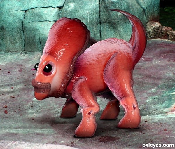
New Animal at the Zoo - created by Drivenslush


New Animal at the Zoo
Favs: 11SBS: 9Hi-resRank: 4/50Score: 61.4% (20)17192 views

source and my photos (5 years and 3403 days ago)

avatar jack2
jack2 says:

nice nice

avatar Tuckinator

very very cool

avatar erikuri
erikuri says:

It reminds me a kind of dinosaur, but with a soft and wet skin. The lips are very cute, the whole image is great. I just think the tail texture is a bit stretched; and if you look at the base of the rock and the ground over the right eye, you'll see a flaw resulting from cloning. Fixing them the work will be perfect!

avatar nasirkhan
nasirkhan says:

Very nice work

avatar EmiK
EmiK says:

LOL, cute, and well done. The only thing that I might think about changing is the eye lid on this cute little guys. I think it makes me look a little angry. But if you move it more to the top of the eye, it will change his expression. Just a thought. = )

avatar nishagandhi

wow cool work

avatar demi
demi says:

very cute,great job

avatar erathion
erathion says:

Fabulous creation.Looks like some small Dino creature to me...Best of luck author

avatar Warlock
Warlock [banned] says:

Wicked idea and work......color is great really makes it pop top job!!

avatar chromathoughts

very nice, gud luck

avatar genuine2009

cool

avatar chakra1985

Congrats!!!

Howdie stranger!
If you want to rate this picture or participate in this contest, just:

LOGIN HERE or REGISTER FOR FREE


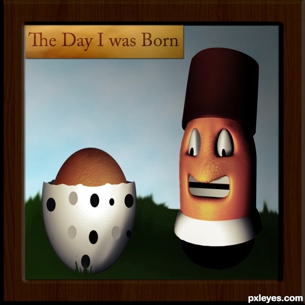
The day I was born. - created by tnaggar


The day I was born.
Favs: 0SBS: 7Hi-resRank: 3/50Score: 56.5% (25)11424 views

I've made a lot of work to get the final result and I'm very happy with it hope you like it.
Any suggestions are welcome
(The image is made from scratch no references used.) (5 years and 3404 days ago)

2 Sources:

avatar erathion
erathion says:

source links don't work and again to much 3D in photoshop contest...but i love the final result

author says:

1- I've fixed the links
2- About the 3d part I know I've used lot of 3D but I'm trying to learn how to shade.
The first thing I've done was to shade using the 3d images as a reference but I didn't get the result I wanted so I used the 3d images.
3-Next time I will try to work without the use of the 3d images or I will use it only as a reference.
4-Finally, Thanks for loving the final result.

avatar Tuckinator

not bad

avatar RichieMB
RichieMB says:

Congrats for 3rd

avatar nasirkhan
nasirkhan says:

Congrats!

avatar erathion
erathion says:

Congratulation on 3rd place and great work...keep going...

avatar Lelaina
Lelaina says:

Congrats for your third place, Tnaggar!

Howdie stranger!
If you want to rate this picture or participate in this contest, just:

LOGIN HERE or REGISTER FOR FREE