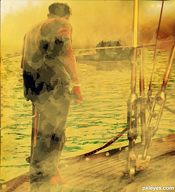
" The moment of afternoon" is the name of the paint which i was created through photoshop effects
thanks all sources (5 years and 3640 days ago)
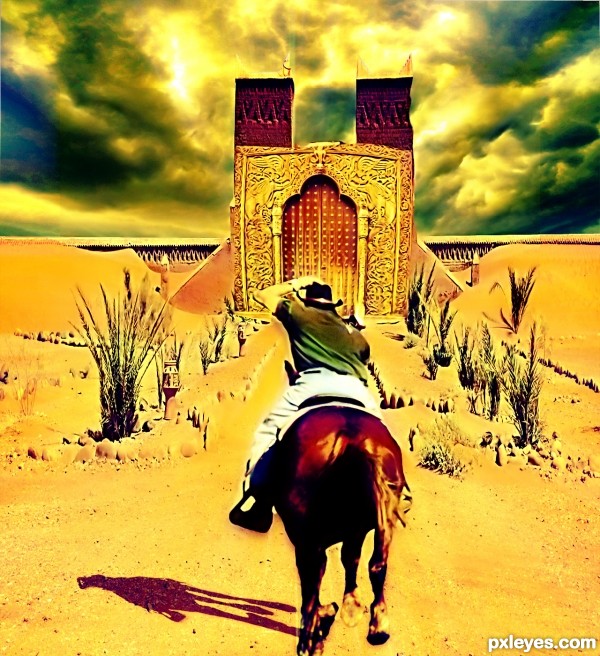
This cowboy finally found out the treasure of the desert after a long journey. He is rushing to the treasure which was hid behind the golden door, but what is waiting for him after that? next expisode? XD
besides, thanks for all the sources which inspired me alot (5 years and 3640 days ago)
Good job..!!
It’s a nice idea, the main door is a good source choice but could do with some refinement
Mostly the edges. And the shadow for the Horse & Rider is to small IMO and facing in the wrong direction, if you refer back to the original source (stone border) you will see what direction your shadow should be…..
very interestng
Nice. Love the sunny mood! 
Howdie stranger!
If you want to rate this picture or participate in this contest, just:
LOGIN HERE or REGISTER FOR FREE
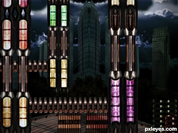
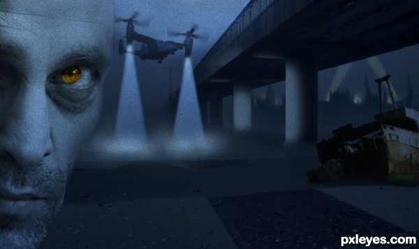
All buildings derived from source image. Used 2 external sources from which I built the bg skyscrapers and trees and created the night sky. See hi-res for details. (5 years and 3641 days ago)
nice image!
Pretty cool image, is looking a bit on the flat side, even with a night shot you would still get a sense of depth and a fair amount of contrast from ambient light .
Nice! Very futuristic image... 
Good job!!
Interesting, but I'm not sure why the decking from the source pic is there.
Actually I tried to make the deck a highway first - as can be seen from the SBS - but then I decided to make it just a futuristic yard, as I wasn't happy the way the deck distorted when trying to warp it to actual highway.. I thought it didn't look that bad nor weird as a yard, apparently it does, more or less 
i love it
very cool work...good luck
Howdie stranger!
If you want to rate this picture or participate in this contest, just:
LOGIN HERE or REGISTER FOR FREE
(5 years and 3641 days ago)
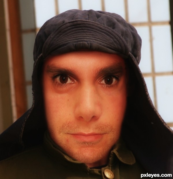
The blending is pretty ok, but if I compare to the skull, then I expect the nose and mouth to be lower. Good luck!
Thanks Wazowski, I have lower nose and mouth to match with skull and also update step08 (overlay with skull)
nicelydone
Nice, but the (our) left eye socket of the skull seems slightly lower than its mate, yet your reconstructed image has [oddly] a (our) left eye higher relative to its mate [even eyes might be good enough to not look slightly weird]. Also the (our) left side of your reconstructed face is fuller than the other while the skull seems pretty balanced.
Thanks DanLundberg, I have slightly rotate eyes and made some other changes to face.
Too bad I didn't see the changes you made, but the outcome looks very good into my eyes now. The jawline looks very good and believable, thou I would have figured the nose to be a bit more wider and heavier. Very nice blend overall, quite nice job with the skin toning too..
I still think your face needs even/same-horizontal-line pupils in order to not look weird/freaky/disconcerting [and which would be consistent with the underlying skull BTW]. As someone with an asymmetric physique, I'm guessing that people don't really notice because my eyes are level (and I have my clothes on  )
)
nice work...good luck
Howdie stranger!
If you want to rate this picture or participate in this contest, just:
LOGIN HERE or REGISTER FOR FREE
Thanks to Suat Eman, prozac1, Salvatore Vuono, Graeme Weatherston, Bernie Condon and Cecelia.
(5 years and 3641 days ago)
hmmmm, not a bad image!
Howdie stranger!
If you want to rate this picture or participate in this contest, just:
LOGIN HERE or REGISTER FOR FREE
this is not bad
Top work...good luck
Very nice!
Howdie stranger!
If you want to rate this picture or participate in this contest, just:
LOGIN HERE or REGISTER FOR FREE