(5 years and 3632 days ago)
3 Sources:
I had to edit my image due to copyright. I appologies for this guys. (5 years and 3633 days ago)
You can not use the other's drawing to chop, that's strictly prohibited!
Great job!! Good Luck =)
this is awesome!
wow
My grandson would rave over this - just as I am doing. Really great entry!!!
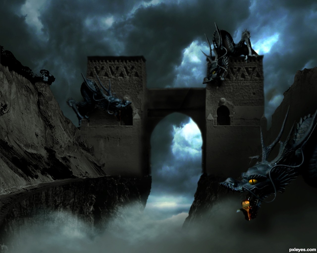
Pretty nice composition, but you should do something about the extreme blurriness of the castle itself. At least sharpen the edges on the top and especially the doorway, as the dragons themselves are pretty crisp and clear. It has a nice scale and colours, you could add some of that fog in front of the middle part of the castle and top, if you can't make it appear more clear. But I think you can at least improve it a little without a fog too.
Nice..!!!
Thank you all for you comments they are very much appreciated.
@Widiar- I have blurred the two dragons on the towers a tad but want to keep the rest as is thanks for your suggestions anyway.
Good concept & execution, but some background edges are sharp, some blurry.
Putting the dragon in front of the image made the image a lot better.
Congrats on the first place!
Congrats, well done 
Congrats for 1st
Thank you all. It came as bit of a shock to me when I found out my entry came first as this is the first ever for me. Thank you all again.
Congrats! for your winning 
hey, congrats for the 1st
Congrats on 1st place...
Congrats for your first place, Rufkut!
Howdie stranger!
If you want to rate this picture or participate in this contest, just:
LOGIN HERE or REGISTER FOR FREE
Thanks to Tilemahos Efthimiadis, Joyrex, Dave Hamster, Scallop Holden, Zeusandhera, Night_fate, Thomasje, Iversonic and Mimiliz for the lovely stock images ;-)
I found the inspiration for this work in a photoshop magazine of a friend. The name of the artist who describes a tutorial of something similar to this one is Adam Smith. Thx ;-)
comments are most welcome... (5 years and 3633 days ago)
Dunno why the wings are transparent, but it's a good idea & mood. IMO a bit texture heavy, but that's just me...good luck. 
Thx Cmyk46, i'm going to leave it like that for now but like i said, comments are welcome. I spend a lot of time on this one
woohoo, love it author its out there for sure :p
The scale is fantastic.. you can really tell you spent a while working with this one. I personally don;t like using textures much but i think you used them very well on this occasion. The silhouettes are a nice touch, but the building should cast the same strong shadows as they do.
Great overall work Good luck!
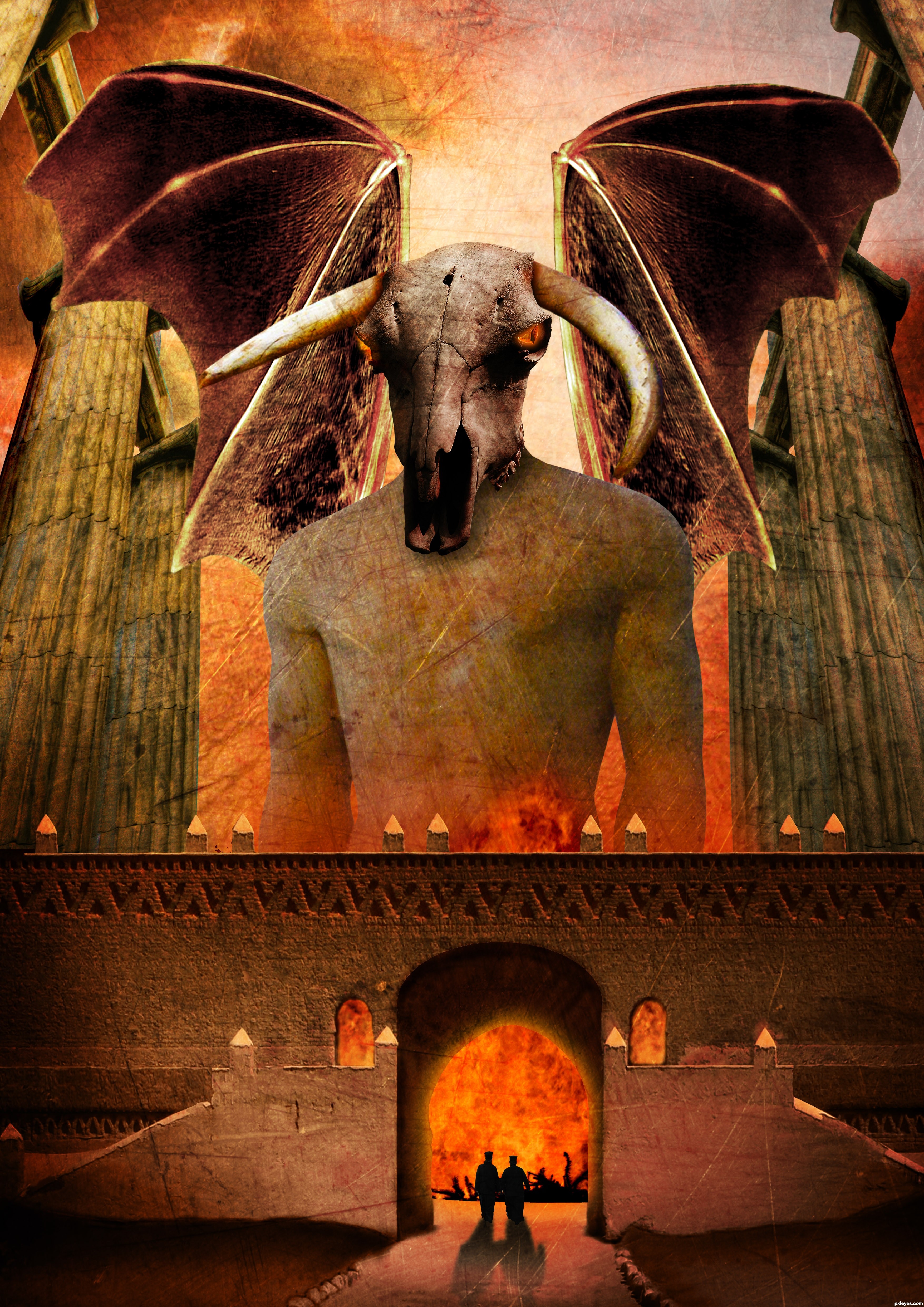
Pretty nice scale on the things. But I would make the wings a lot bigger and work with the edges of the wings, as well as making them non-transparent. Could add some bones/veins or something on them to make them more realistic. They look pretty much cut/copy/paste/too big pencil when cleaning the edges now. Or you could try inner shadow effect for the wings. There are also some bit careless masking of the edges. Work with the windows and there is a major left-over from a colour mask on the right edge of middle part.. some dark trash there. Nice colours and eye sockets, worth working a bit more..
Very nice entry, that reminds me an illustration about mythic creatures. GL!
wow, awesome!
Thx Widiar, i will do something about those problems
Good job with the wings, looking so much better now..
Thx for the nice comments
great concept author...good luck
Thx
Wish nobody to get to that gates
Yep, it won't be a lot of fun
Howdie stranger!
If you want to rate this picture or participate in this contest, just:
LOGIN HERE or REGISTER FOR FREE
I have painted this content photo , very easy , and beaty :D
Coments , or any critic , wellcome :D (5 years and 3633 days ago)
you missed a bit of smudging on the vase
It looks like a heatwave to me GL author.
intersting idea
thanx Jascha400d for source link...
everything looks cool, except the towers. they make me think of some weird horns...
Howdie stranger!
If you want to rate this picture or participate in this contest, just:
LOGIN HERE or REGISTER FOR FREE

Spec Thanks to Mikebaird for use of his picture on flickrphoto sharing.com
Spec Thanks to Carlitos for his picture on flickr photo sharing.com
Spec Thanks to Gregwake for use of his picture found on flickr photo sharing.com
Spec Thanks to Masterjack. Rogers for use of his picture found on flickr photo sharing.com
All these are under a Creative Commons license.
Also Thanks to Anteantic11 for suggesting source picture for contest. (5 years and 3634 days ago)
The surfing girl is in a wrong place, she'll never surf on placid waters like that! 
Surfer girl also has some leftovers around her legs from the previous picture.
Nice idea still needs a little work tho (why so pixilated) surfing girl has some white edges that need to be removed.
The water is very clear, I think we'd see a suggestion of the legs underwater, right now the water around the bathers looks too opaque. The reflections of the two on the left should be straight down and more disturbed by ripples IMHO.
Entries will not be removed by request. Once submitted they will remain unless removed for rule violations or other reasons explained in the rules and guidelines.
lol so what should I vote for this ??
Put a copyrighted photo on your image, then it will be removed immediately
Howdie stranger!
If you want to rate this picture or participate in this contest, just:
LOGIN HERE or REGISTER FOR FREE
Photography and photoshop contests
We are a community of people with
a passion for photography, graphics and art in general.
Every day new photoshop
and photography contests are posted to compete in. We also have one weekly drawing contest
and one weekly 3D contest!
Participation is 100% free!
Just
register and get
started!
Good luck!
© 2015 Pxleyes.com. All rights reserved.


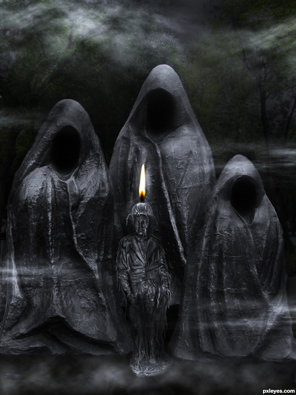
nice.a bit scary..
nice feel...
Great texture
Very eerie. Nice work
Creepy image indeed the three back statues would be receiving some ambient light from the candle flame.....
Very well done - love it!
The flame makes no sense.
creepy looking :P gl
Great dark mood-ed image...best of luck
Howdie stranger!
If you want to rate this picture or participate in this contest, just:
LOGIN HERE or REGISTER FOR FREE