Photoshop Pictures: The (page 336)


results 1676 - 1680 of 2863

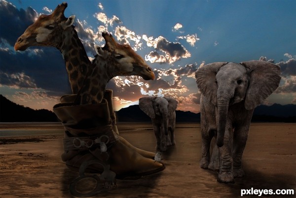
What Happened To The Ark - created by Christy


What Happened To The Ark
Favs: 0SBS: n/aHi-resRank: 8/11Score: 55% (0)6263 views

God has told Noah to collect the animals two by two, little did the animals know their ark was traded in for a pair of boots....occupied boots no less!

Thanks jaskier for the source!

Suggestions for this image are welcomed, as it is a work in progress.

Thanks for the suggestions.
(5 years and 3392 days ago)

5 Sources:

avatar ponti55
ponti55 says:

Very interesting idea! Just be sure to add some shadows under each figure and also pay close attention to the conflicting light sources.

author says:

Thanks Ponti! I am going to be working on it and I appreciate your suggestions

avatar bellamour
bellamour says:

That's an awesome idea, I never would have thought to do that! The background goes perfectly as well!

avatar Tuckinator

animals and boots need shadows

avatar Warlock
Warlock [banned] says:

Very cool idea shadow look a little bit to dark tho......plus watch out for white lines around the elephants they can be distracting.

avatar erathion
erathion says:

very nice surreal idea...good luck

avatar neeraj55
neeraj55 says:

cool ! i like it

Howdie stranger!
If you want to rate this picture or participate in this contest, just:

LOGIN HERE or REGISTER FOR FREE


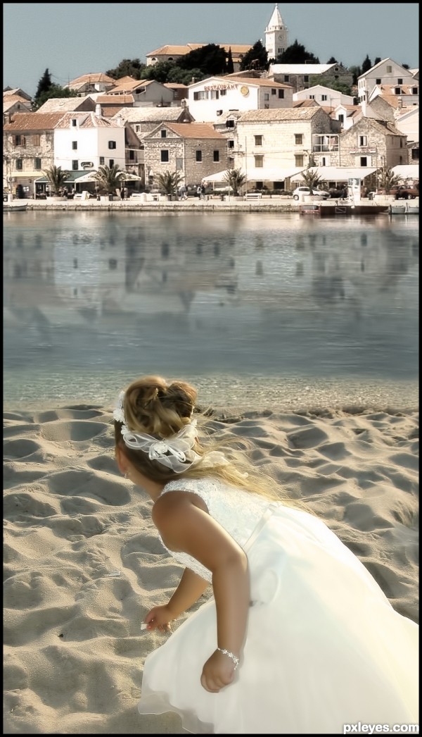
thats how the art began - created by nanaris


thats how the art began
Favs: 1SBS: n/aHi-resRank: 3/11Score: 56.4% (25)26755 views

(5 years and 3393 days ago)

1 Source:

avatar ponti55
ponti55 says:

Very serene scenery... very good blend

Well done

no avatar
vysakhk says:

well done...gud idea...lyk da blending...

avatar erikuri
erikuri says:

Really nice blend!

author says:

thanks for your comments apreciated!

no avatar

i really loved this one...

avatar erathion
erathion says:

Fantastic work author...best of luck

avatar langstrum
langstrum says:

It will much better if you just use 4/5 the height of that picture because the composition will be nicer if you push the girl higher, so she has a part on the river area. This can reduce the unnecessary space in the middle of the image, which is quite distracting and it takes time to roll down to the main focus of the image. Otherwise, that's a good blending work. Good luck

avatar jaskier
jaskier says:

Good blend.

avatar RichieMB
RichieMB says:

Congrats for 3rd

avatar nasirkhan
nasirkhan says:

Congrats!

avatar Lelaina
Lelaina says:

Congrats for your third place, Nanaris!

Howdie stranger!
If you want to rate this picture or participate in this contest, just:

LOGIN HERE or REGISTER FOR FREE


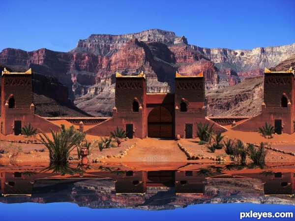
An Oasis in the desert - created by Chuck


An Oasis in the desert
Favs: 0SBS: 7Hi-resRank: 11/11Score: 51.3% (0)7330 views

Spec Thanks to AL Hikes AZ
for use of his picture found on Flickr photo sharing.com


Water reflection done with vm natural called lakeside reflection.

Thanks to Tapiona for suggesting source picture for contest. (5 years and 3393 days ago)

2 Sources:

no avatar
vysakhk says:

gud job...nice idea...!!!

no avatar
vysakhk says:

gud job...nice idea...!!!

avatar Tuckinator

cool idea the reflection is too distorted though

author says:

Ok Thanks guys I took the blur out I thought their was supposed to be a slight blur on reflections. I also took the bend of buildings in reflection because water is dead still no movement

avatar LEEBAOREN
LEEBAOREN says:

the sky colour looks wrong

author says:

What do mean sky color looks wrong? It's almost same as original on source.

no avatar
rubbhan says:

very good work......

avatar Chalty669
Chalty669 says:

@leebaoren, the sky isn't wrong it's your lcd monitor and the angle your looking at it. Move your head up and down to see that your screens color changes as you do so. I would suggest a displacement on the reflection though. Here is a good tutorial. http://photoshopcontest.com/tutorials/26/displacement-water.html

avatar CMYK46
CMYK46 says:

The buildings & mountains are far enough away that they wouldn't be reflected in the water, just the sky.

Howdie stranger!
If you want to rate this picture or participate in this contest, just:

LOGIN HERE or REGISTER FOR FREE


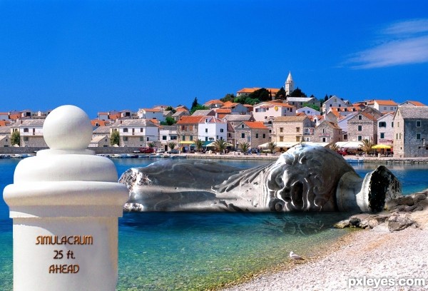
Damaged Done By the Nickera - created by Drivenslush


Damaged Done By the Nickera
Favs: 0SBS: 3Hi-resRank: 11/11Score: 51.6% (0)7234 views

source and my photos (5 years and 3393 days ago)

avatar erikuri
erikuri says:

Nice! It really looks like ruins in the water! I love the type font you used too, what's the name?

author says:

FONT: Snappy Service

avatar Tuckinator

nice idea author

avatar Mata
Mata says:

on left side, next to the "ball", I see mistake, fix it and you have great picture. Btw: In Croatia we use meters

author says:

got it Mata.. (err umm.. American invaders put up the sign LOL)

no avatar

looks quite nice.... especially the statue under water... good work author

avatar RAZ0R
RAZ0R [banned] says:

avatar erathion
erathion says:

cool...

Howdie stranger!
If you want to rate this picture or participate in this contest, just:

LOGIN HERE or REGISTER FOR FREE


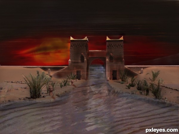
The way to the sea - created by neeraj55


The way to the sea
Favs: 1SBS: 4Hi-resRank: 11/11Score: 49.4% (0)5034 views

(5 years and 3393 days ago)

2 Sources:

no avatar

the reflection in the water kinda put it off the blue, nice thou

author says:

thanks for suggestions

no avatar
vysakhk says:

gud job...nice reflection nd ol...

avatar Tuckinator

this image is cool nice feel

Howdie stranger!
If you want to rate this picture or participate in this contest, just:

LOGIN HERE or REGISTER FOR FREE