"Loneliness is the most Terrible Poverty"
~Mother Theresa
Content aware and masking (5 years and 3646 days ago)
1 Source:
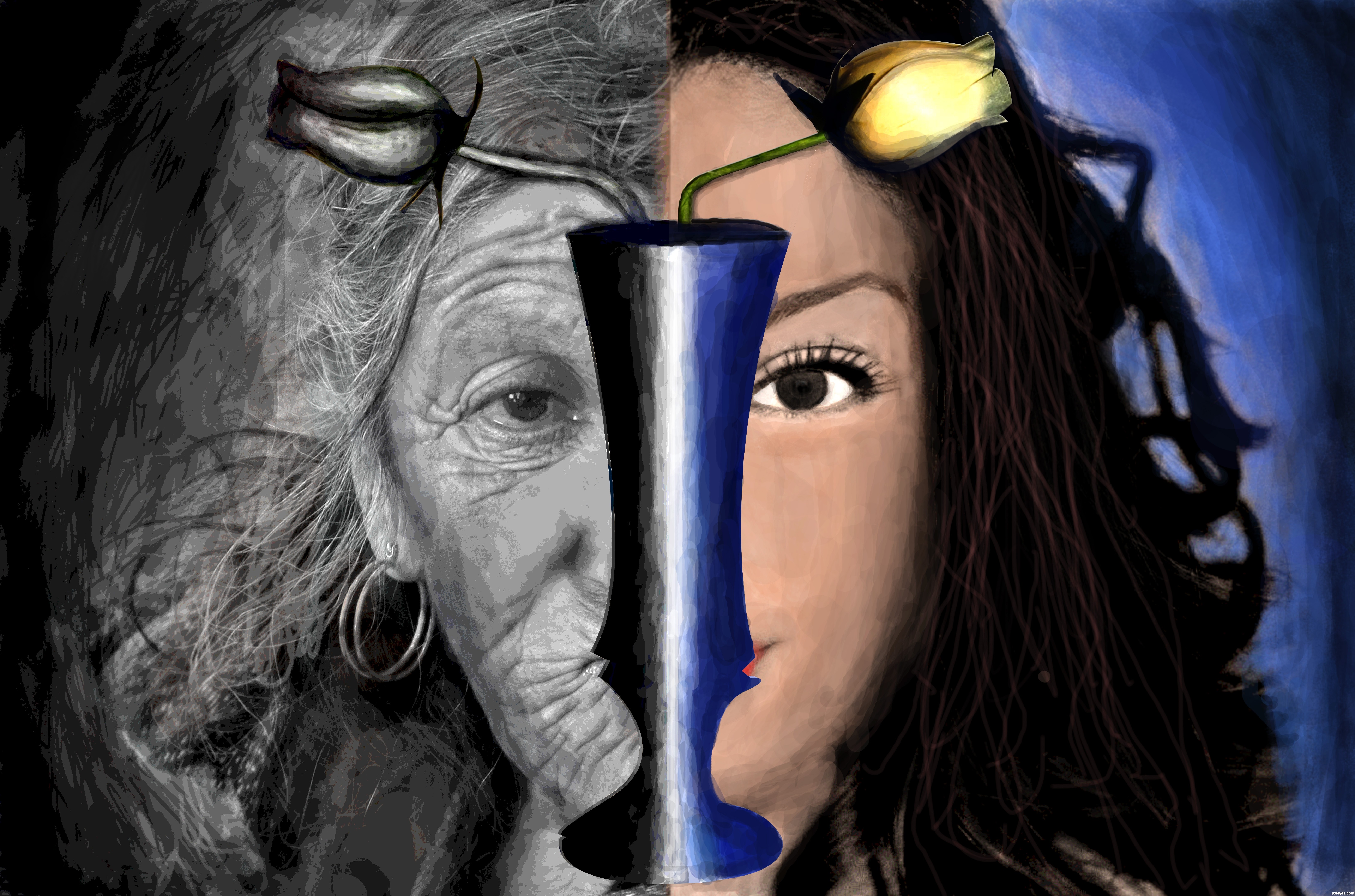
Two images were clubed part by part.Both of them were a bit posterized.Image on the right side was photo filtered with a variety of orange colour.Mainly brush tool was used to paint.Pen tool was used to select the vase.A little blur effect was given.
Sorry guyz nothing from source 2 was used. (5 years and 3647 days ago)
the idea is quite nice...
good work...
Please post your valuable comments. 
I think the blending of the two images needs attention where they meet in the middle. Lovely idea thought!
It's a nice idea, but I suppose source 2 is not valid (from blogs).
Source 2 is from blog. Please read http://www.pxleyes.com/blog/2009/06/how-and-where-to-find-legal-source-images/
I think you need to pay more attention to the size of the faces, it would be more effective if they line up well and look like the same person aged and un-aged.
thanq for ol da comments...
@raytedwell:-I thot tht when one gets old their face shrinks
Howdie stranger!
If you want to rate this picture or participate in this contest, just:
LOGIN HERE or REGISTER FOR FREE
(5 years and 3647 days ago)
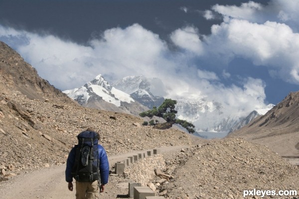
great pic author i think the path is a little too flat to be going up though
nothing much done with the source images, though u could have utilized it in a far better n convincing manner, good luck though 
thanks guys. pic is from the path to the top of Mt. Everest... def could have been a bit more ominous... might have to work on that a bit.
Howdie stranger!
If you want to rate this picture or participate in this contest, just:
LOGIN HERE or REGISTER FOR FREE
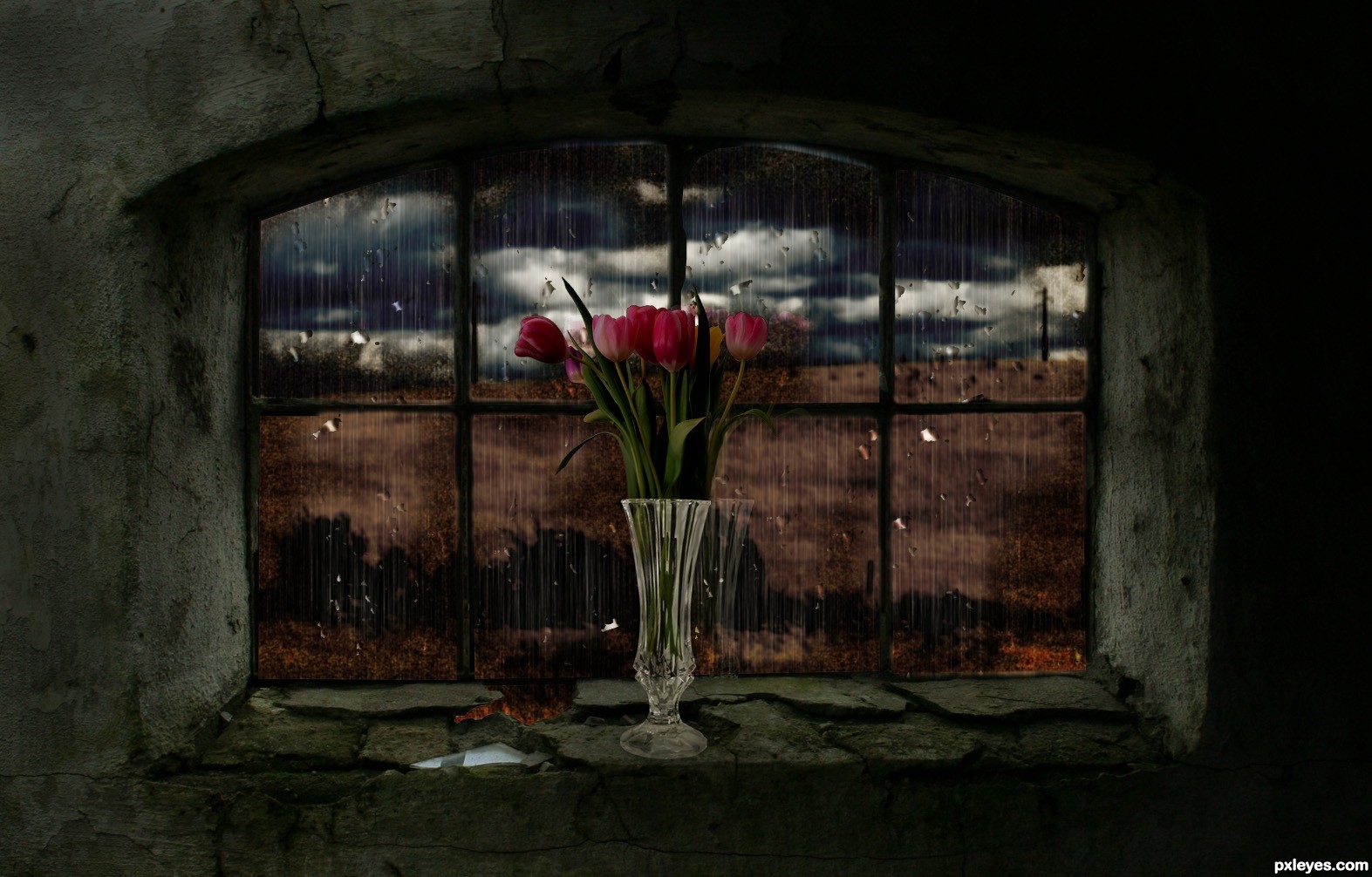
3 external sources were used. The rain and water droplets were created in photoshop and a couple of adjustment layers were also added. (5 years and 3647 days ago)
Nice rain effect and colours, but don't like the composition that much. I would prefer narrow and high window instead, or at least the vase be shorter and roses a bit more longer. Now the vase looks huge compared to window - and the flowers a bit short.
Widiar, thanks for your suggestions, I reduced the size of the vase which was a little to big for the window, thank again.
MUCH better now. You could try a _very light_ shadow for the window border, even thou the light in here is very ambient, to make the frame blend with the glass a little better. You should check out the rightmost part of the windows, the frame in the middle and bottom needs some masking work to make them even. This is already starting to look very good. (Nice work with the flowers also, now that I gave them a good look on hi-res..)
i like the mood!
nice...
Very nice job. Good mood to this pic
Howdie stranger!
If you want to rate this picture or participate in this contest, just:
LOGIN HERE or REGISTER FOR FREE
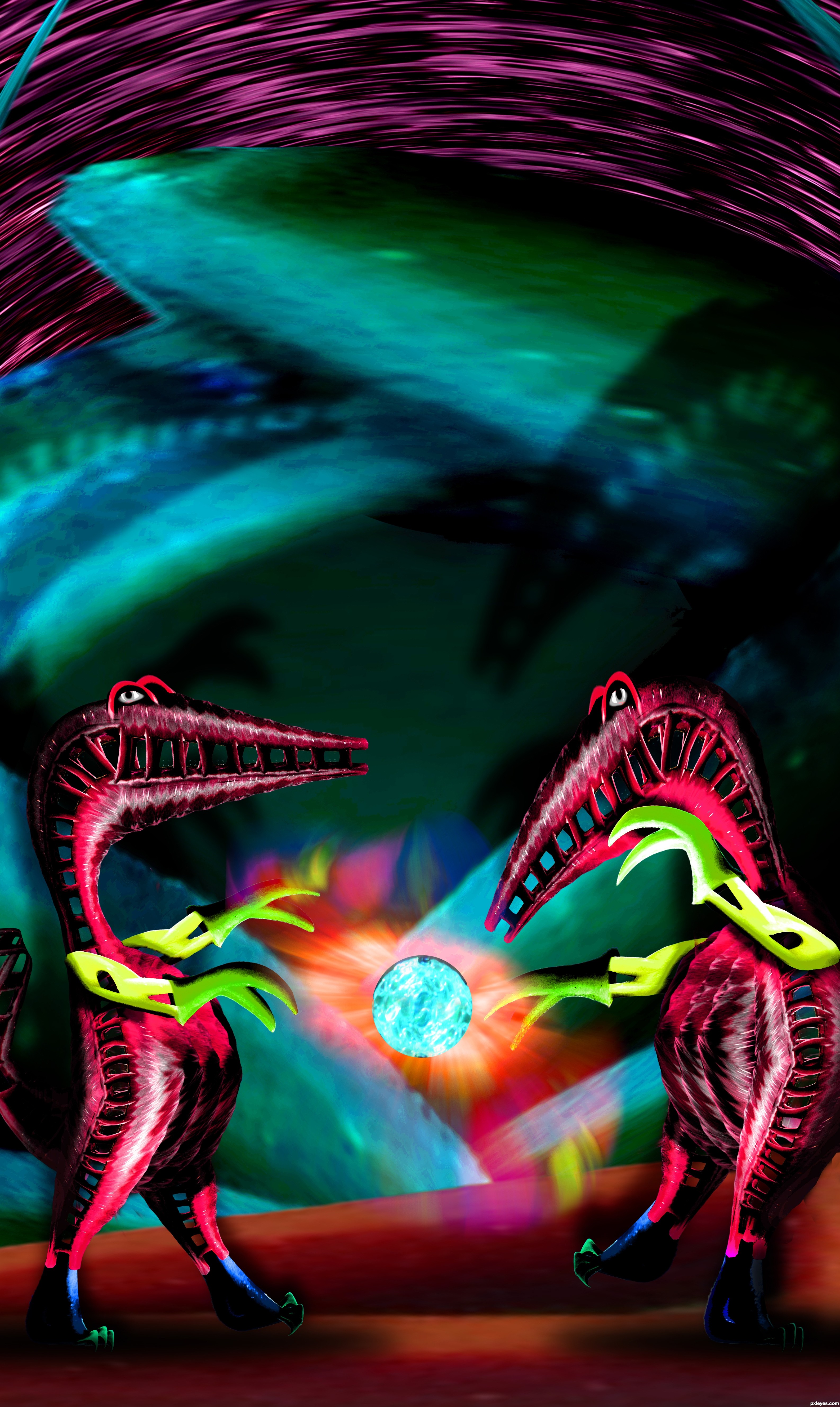
My Photo combined with source (5 years and 3648 days ago)
really creative!
Creative work author
Great plasma ball...lizard street fight...
Hadoo Ken!!! Really imaginative!
IT'S CRAZY !!!!
this is cool
Congrats!
Congrats for 3rd
Another winner!! Congrats!
Congrats, my friend Ernie...
Congrats! for 3rd place
woo hooo... congrats...
congrats Ernest!
Howdie stranger!
If you want to rate this picture or participate in this contest, just:
LOGIN HERE or REGISTER FOR FREE
Photography and photoshop contests
We are a community of people with
a passion for photography, graphics and art in general.
Every day new photoshop
and photography contests are posted to compete in. We also have one weekly drawing contest
and one weekly 3D contest!
Participation is 100% free!
Just
register and get
started!
Good luck!
© 2015 Pxleyes.com. All rights reserved.


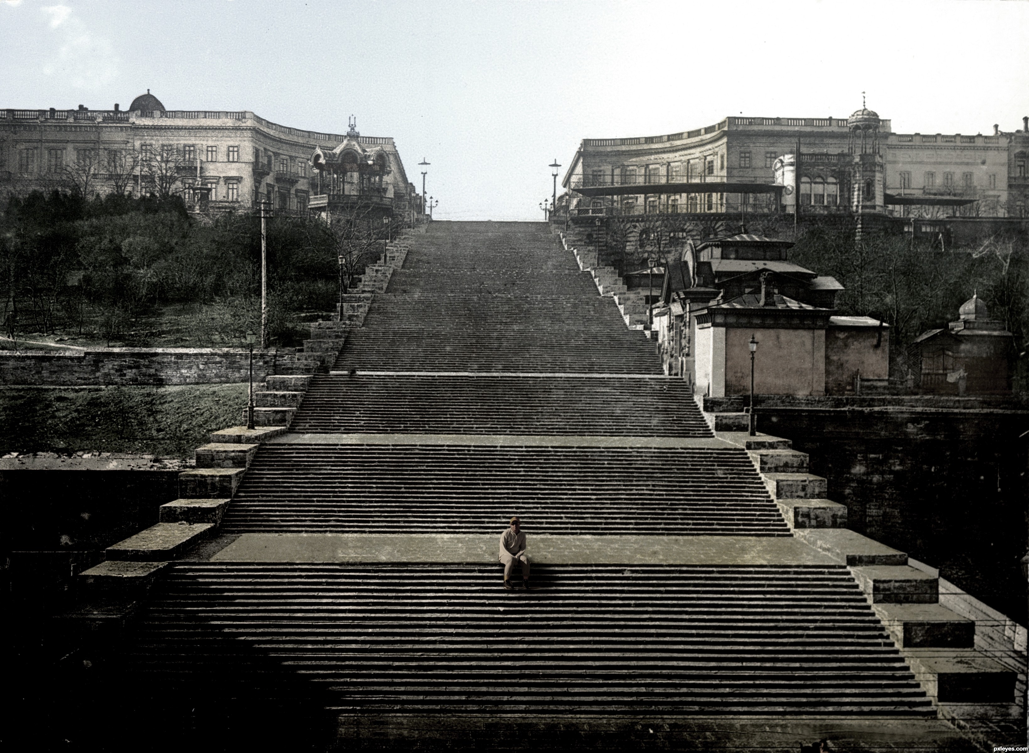
the guy is kinda hoovering over the step and he has the background yellow stripe through him.
We can feel really small looking at this image!

Author, man needs some shadows on the stairsteps, like the ones we can see on the left side.
just got it, used luminosity I think, and I lost his shadow, now it's back (thanks gals, big help)
Shadow needs to be longer with harder edges.
wow, author! im so proud of you! this is such a different style than what im used to come from you! great work and good luck, really
great job !!! congratulations....
Different style, but it works. Good job
Howdie stranger!
If you want to rate this picture or participate in this contest, just:
LOGIN HERE or REGISTER FOR FREE