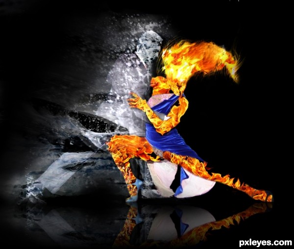
Born enemies become allies...
(5 years and 3644 days ago)
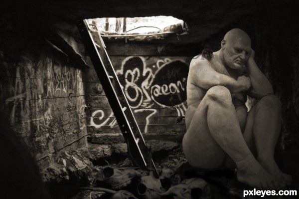
How Old Is the Big Man?, nobody knows,
Abandoned aged 4 with only his clothes,
He fed like the beasts he saw in the wild,
An accomplishment for such a small child,
Over the years Big Man grew,
Alone, in darkness was all he knew,
He didn't feel cold, he didn't feel pain,
He drank from holes that fill in the rain.
No need to be scared, Big Man is now gone,
He was thrown in a cell in ninety-one,
They said he`d be better behind closed doors,
Humanities way of hiding our flaws.
Big Man died in 1995,
RIP
(5 years and 3644 days ago)
Good image black and white works well you may want to fix the transparent mouse.......
Perfect! 
Nice, but what's the ladder for?
Fantastic...very strong and powerful image...best of luck author
great allegory
The more I look at this, the more I like it...I wish I had voted higher. Good luck, author! 
Thanks man, I don`t think it`ll place, but hey I`m satisfied knowing I did all the work in photoshop rather than letting a 3d program do all the work. Thats enough for me 
great!

Amazing! Love the graffiti background too 
And congrats for a great third place! Another great entry 
Congrats again... and again... and again... 
Congratulations again for 3rd place 

Congratulations !!!!
Congrats on this really thought-provoking entry.
Howdie stranger!
If you want to rate this picture or participate in this contest, just:
LOGIN HERE or REGISTER FOR FREE
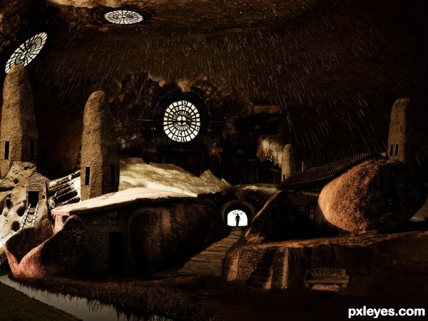
more than 10 sources were used to complete this pic, thanks for the source providers like the ones I mention here : garwee http://www.sxc.hu/profile/garwee , http://www.sxc.hu/photo/1024188, Obsidian Dawn http://www.brusheezy.com/Brushes/1473-Bird-Photoshop-Brushes (5 years and 3645 days ago)
A minor mask error/edge can be seen on the left side of the foreground building's roof, should fix that. Also a few rocks and roofs which could use a burn tool or something to hide a bit too bright edge.
I'm not sure about the very bright white light behind the wire windows, but overall this is very nice, clean and harmonic. I like the small windows and rock towers. Good job here.
thanks for the smart comment, widiar....very highly appreciated...
>LEEBAOREN,....thanks for the fav....
>lamantine,.....thanks for favoring this ....much encouraging....

coolness

Howdie stranger!
If you want to rate this picture or participate in this contest, just:
LOGIN HERE or REGISTER FOR FREE
source and photographs (5 years and 3645 days ago)
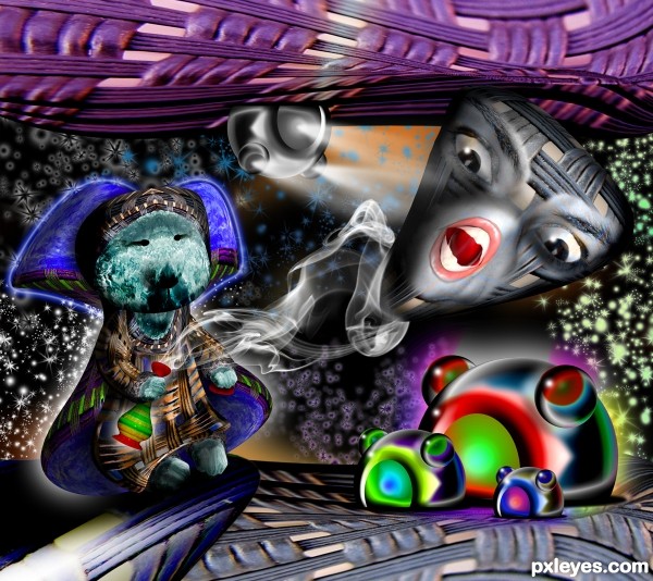
What are those three creatures? They seem fish to me, I like their  expression! Do I have three wishes too?
I like the three little guys on the right =)
the three little guys are just part of the plan.. (if you notice there is a gray one fastened to the ceiling helping to capture the Jinn with light beams)
Absolutely WILD, author! incredible work once again.
as EmiK i adore 3 little blokes...gl
Way to keep that source recognizable 
Very wild looking :P
Howdie stranger!
If you want to rate this picture or participate in this contest, just:
LOGIN HERE or REGISTER FOR FREE
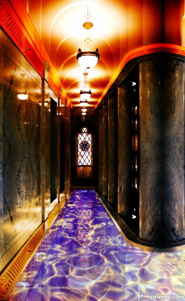
Check out high resolution for all the details, like lamp strings, reflections (walls, water), new ceiling etc..
A lot of work cleaning the picture and new ceiling and major use of perspective/scale/skew -tools and a lot of masking and colouring with ornament panels and stuff.
(5 years and 3645 days ago)
would look 1000x better if the pool had a bottom! excellent job though! plz post sbs soon!
With a "bottom" tiles it looked so crowded that all the reflections were in vain really. Just looked akward and messy. I decided to go with unknown depth and a lot of reflections -option. Thanks for your comment.
this is very nice
this is very nice
Love it  good luck!
Howdie stranger!
If you want to rate this picture or participate in this contest, just:
LOGIN HERE or REGISTER FOR FREE
Very nice, impressive =) Good Luck !
Quite interesting.. you should crop the image where the ice-man ends, so it doesn't look like a failed mask edge. And you should anyways soften some of those huge brush edges on the mask, especially on the icemans top and under his straightened leg. Cool composition.
nice work author and great choice...gl
EDIT: Softened the water around the man, and added a splash under the right leg, and some drops on the left leg. Also lightened the water a bit.

Burned (hehe burning a fire woman? wtf? lol) the woman a bit more, so it blends better... hope so...
Also crop the image as Widiar told.
@Widiar: Thx for the constructive comment!
@Erathion and @Vlado: Thx for the support! I appreciate it!
Looks good on high resolution too now - a lot better. There is still one minor problem with the mask of the firewoman's hair, right above the hairline. You should smoothen and hide that straight line and her awesome hair looks even better. (I'm sure I'm not the only one who digs her hair..)
EDIT: Made the changes to the hair. Smudged, so the line is gone.
@Widiar: Thx again for the comment!
nice
Howdie stranger!
If you want to rate this picture or participate in this contest, just:
LOGIN HERE or REGISTER FOR FREE