(5 years and 3510 days ago)
source and two of my photos (5 years and 3511 days ago)
Hi AUTHOR.... It's very interesting your SBS....
Where does your creativity come from, I'd like to know... What do you do to feed your imagination, author?
Changing the subject...
Mud on the feet? Where were you walking through? 

Amazing idea...best of luck
@erikuri... not sure where my imagination comes from.. but I can tell you it hurts... if I could give it away I would... gladly... and never turn back
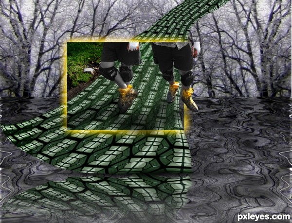
The legs are my neighbor's... he repairs peoples driveways and he gets the black fill EVERYWHERE, but it really looked cool with his knee pads and the yellow bootie wraps.. (He gets really really tan so I desaturated that part)
Best of luck to you........great entry

Wow what were you smokin' when you came up with this idea???  Great imagination. GL!

Howdie stranger!
If you want to rate this picture or participate in this contest, just:
LOGIN HERE or REGISTER FOR FREE
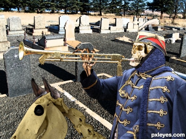
Behold, I shew you a mystery; we shall not all
sleep, but we shall all be changed, In a moment, in the twinkling of an eye, at the last trump: for the trumpet shall sound, and the dead shall be raised incorruptible, and we
shall be changed.
Thanks to Kyndelfire-stock, Fantasystock & Salsolastock for the stock images. Background was taken by myself and can be viewed in sbs.
Finished this one just as my photoshop trial ran out so I can't make any changes. (5 years and 3511 days ago)
Fun job! Not sure why the horse skeleton would still have ears, though...
To hear the last trumpet of course! Nah I just thought that the ears gave a bit more humor to a rather macabre image 
Very original idea, nice job. GL
Howdie stranger!
If you want to rate this picture or participate in this contest, just:
LOGIN HERE or REGISTER FOR FREE
source (5 years and 3512 days ago)

Hehehehehe...WOO-HOO!
Very... deep! Many interpretations for it... 
@ CMYK: your yell reminds me another person... hehehe! 
Erikuri, amazing, isn't it? 
Very artistic 
really good and a different approach....fav
Just fantastic...great selection of colors...best of luck
very much artistic
Fantastic colours.... very good !!!!
Trippy! GL!
WOOOO-  - HOOOOOOO!
Sweet
Howdie stranger!
If you want to rate this picture or participate in this contest, just:
LOGIN HERE or REGISTER FOR FREE
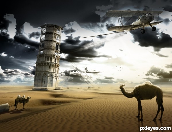
A reconstruction of the Tower of Pisa. This is how it became a leaning tower, they pulled it too far. The scene is surrealistic.
Please look at the used sources and High res before voting. Thank you!
11th source: Pilot
http://www.flickr.com/photos/toots/2075975006/sizes/l/ (5 years and 3512 days ago)
I airplane pulling on it is not really too realistic. I understand it was meant for a more surrealistic approach but surrealism really isn't the idea in this contest. It's more to really reenact and make it look like something that would have actually happened, but that is mainly IMO.
That's weird, your comments on the pyramid entry sound otherwise. IMO that's pretty surrealistic too. It doesn't say anything about surrealism in the contest goal either. I just used a fantasy approach on the contest goal that makes the image unique. But I don't make the rules in here, it would be really sad for all the work I put in it.
I do really like the surrealistic element, and i think you've created a fantastic image. Great job.. 
The camel at left should be bigger, and you've got 3 different light sources. The idea and color are good.
sweet entry, the mood is really nice. however the setting is somewhat confusing since Pisa is a little town in Italy = no camels and no desert. funny idea though... all the best author!
Thanks for the comments. CMYK; camel is bigger now, also changed few lighting problems on the objects. 
Great creation author...I have few nit picks beside Jaw's about the contest goals...First is,camel in left side of the image is in some kind of shadow,but look she's hump,bright sun,also u had to work on her shadow a bit more,especially part near foot.Second thing,camel's at right side are far the tower,but thickness of the rope is the same.Also,u have to blur them just a bit.Tower it self is positioned very well,but frame is not crop-ed that grate,u have lots of white halo there.Any how author,don't take this suggestion as attack,if u have time,made some correction's and this will be great entry...good luck
To me the left camel is floating a bit, I like the plane.
Good idea and chop Author.
Thanks for the comments, fixed a few things 
Coudn't resist, added some footprints for the right camel and a sandstorm in the background 
Very original take on the theme of this one, nice job with it. GL
Great.
Gefeliciteerd met je 2de plaats, Ressiv!
Congrats! 
Howdie stranger!
If you want to rate this picture or participate in this contest, just:
LOGIN HERE or REGISTER FOR FREE
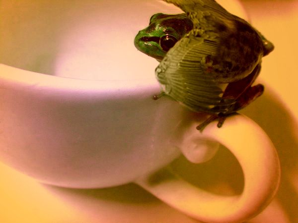
Original image. But why did you change the colors on the cup? The original white colors are a lot better. Also upload a high res
Very cute...
i hope u stay in the contest m8, mine is just removed ( a few hours before closing..) cause my image wasnt flying so good luck
Howdie stranger!
If you want to rate this picture or participate in this contest, just:
LOGIN HERE or REGISTER FOR FREE