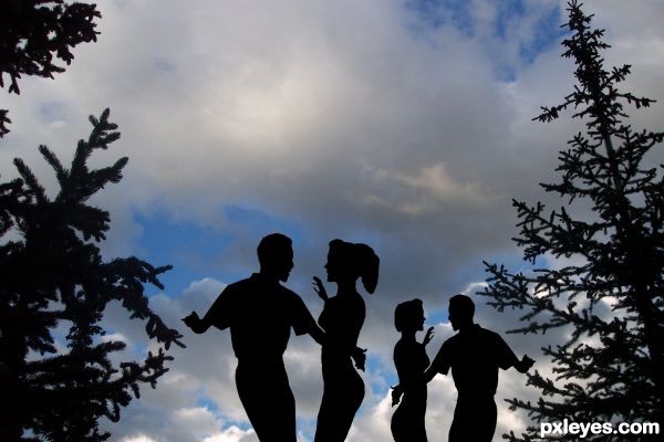
made my selection from the blue channel. replaced color with black, duplicate, and transform the dancers. background image is my own. (5 years and 3753 days ago)
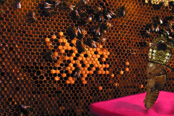
(5 years and 3753 days ago)
Great job author...don't forget shadow...good luck
Agrees with Erathion. Add some shadows to the table for the Queen of the hive. Light source appears from the top-right so place your shadow to the left of the Queen  GL!
GL!
thanks Nebojsa and Joshua  i added a shadow, hope its better
It's better GL!
Howdie stranger!
If you want to rate this picture or participate in this contest, just:
LOGIN HERE or REGISTER FOR FREE
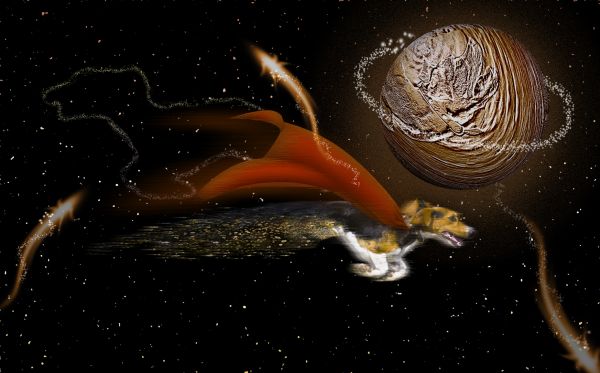
From the planet Pluto and flying through the constellation of Bowser. Used only the source image. (5 years and 3755 days ago)
 ! They say that Pluto is not a planet anymore...
very nice work, looks like Pluto is in the chocolate quadrant of the Bowser constellation. 
nice work...good luck author
Howdie stranger!
If you want to rate this picture or participate in this contest, just:
LOGIN HERE or REGISTER FOR FREE
(5 years and 3755 days ago)
wonderful idea ! gl 
Brilliant idea and awesome picture!  And the first entry, too!
Very well done.. and a fantastic idea!
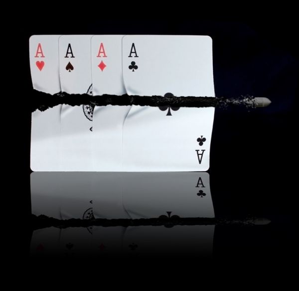
Nice work on splitting the cards looks very realistic -- One question should the cards on the table be a reflective as the table itself?? Looks a bit odd IMHO
Edit sorry did not look t the source see what you mean still a great job
I know what you mean alan but this is down to the stock image i started with . so i worked from that ! 
A question, if the cards are on the table there should there be a reflection on top of them??
PS look at the source image
thats cool author.. and yea its not in your hand about the source image.. but can you try to reduce the opacity of that reflection.. I guess you can... 
More realistic than this, only a real situation! 
cool  gl
gl
Cheer Nator i'll have ago at that in a couple of days !
awesome entry good luck author...
Cool! Apparently your source image from topfer has the king of hearts etc. under a sheet of glass which is kind of odd. But topfer also has a pic of the aces without any under-glass cards which probably would have been less distracting. Also, I think a crisper bullet would be more compelling.
awooooooovesome
this is cool
I agree with Nator here.. this looks perfect.. and a lot better.. high votes for sure..
Great job author...good luck
damn that's good.. can i use this for my desktop background?! 
keep up the good work!
Not original but very well executed. Well done 
@ langstrum i think you should google high speed photography bullet card.
BTW i fired 1 or 2 of these http://blogs.birminghammail.net/technobabble/800px-SA-80_rifle_1996.jpg since i was in the british army and i'll tell you i never saw fire coming from any part of this SLR. research, research is the word here donkey !
i really like this one and have seen this done by a pistol sharpshooter.
Great job Author
One of the best I've seen GL!
Excellent job, by far the most realistic! GL & well done
congrats bad boi!  knew it was a winner!
congrats Reap! 
Congrats dear Reapy roo! Good job!
Congrats 
Congrats!!! 
Congrats Reap, awesome work 
Congrats. Great work 

congrats 
congrats....... 
Thank you everyone .. thanks for all the FAV votes too 

Congratulations! 
Congrats! 
Congrats! 
Woot! great chop Reap 

very convincing 
Howdie stranger!
If you want to rate this picture or participate in this contest, just:
LOGIN HERE or REGISTER FOR FREE
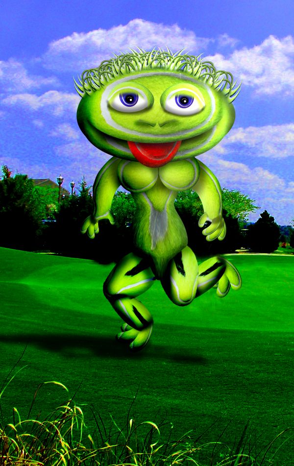
my photo and source (5 years and 3756 days ago)
Great...110% fabulous...well done author
amazing ! 
BOOBIES!!!!! 
i like the idea is really good, but it looks distorted cuz of the extrem liquify and warping, maybe try to manipulate the form of the ball instead of the liquify..cuz it makes loosing quality, great job 
Awesome with the provided source, you've used so much of it.
Sky is incredibly pixelated...you should at least blur it a bit.
It's not INCREDIBLY pixelated.. it's just over saturated (DONE ON PURPOSE) (and we all know what happens to blue skies when you over saturate them) and the pixelation is ONLY visible in High Res.. which means when I send this to print It will be just fine and I'll sell lots of her because she has boobies)... lighten up CMYK.. I'm not trying to win.. and you know I never take your suggestions. Out of Principle.... SMOOCH
manboob!!!!
Well, I'm a woman, and I have to admit... she has a gorgeous pair of headlights!!! 
It has to be you...
The pixelation is plainly visible in low res, which is why I mentioned it.
CMYK no it isn't.. print it you goob...LOL...(without back light from a computer screen the print version is quite lovely) I'm an unique creation... (pixelation would never be a hangup) print it and learn.. heheheh
and thank you J0sh and Erik..you are both inspirations smooches galore
 this is disgustingly funny
eeekkk !! it's a gherkin monster
Howdie stranger!
If you want to rate this picture or participate in this contest, just:
LOGIN HERE or REGISTER FOR FREE
Nice background too...
hey author.. I feel that there is something about the perspective.. u know.. the pine trees and the silhouettes.. they are not going in sync.. its just my opinion.. I hope you got my point.. Good Luck with it.
iquraishi is right...there are 2 different points of view.
Nice image, very well done. Good Luck.
Howdie stranger!
If you want to rate this picture or participate in this contest, just:
LOGIN HERE or REGISTER FOR FREE