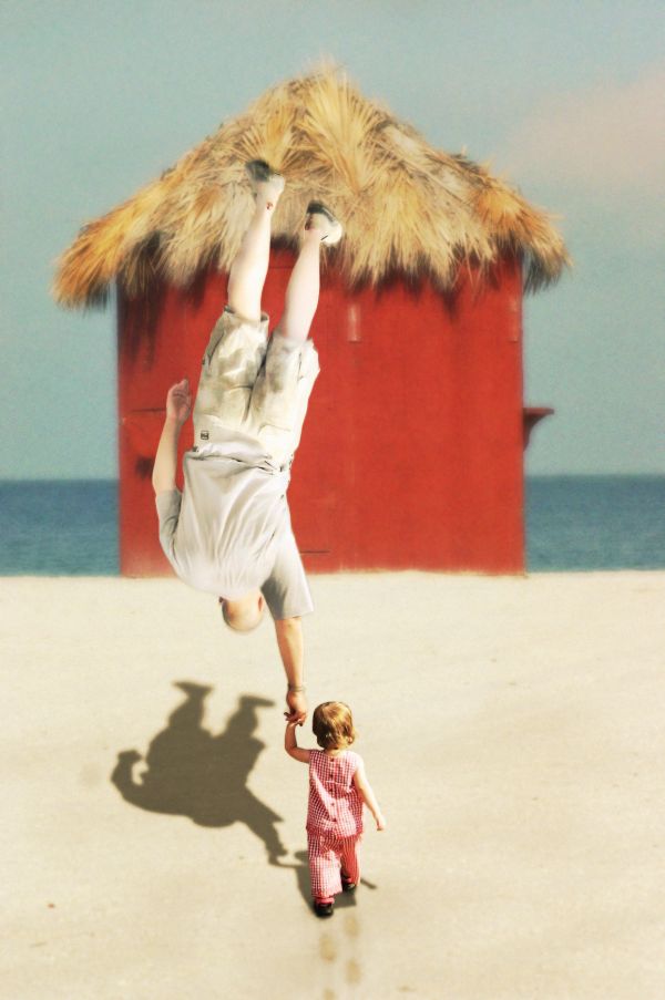
Even though daddy is big, baby Huey has the strength to raise him above his head.
Thanks to SCervino and Grunow at SXC for use of their wonderful stock! (5 years and 3636 days ago)
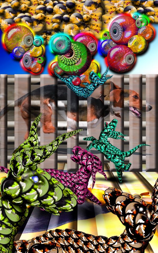
All Source (5 years and 3636 days ago)
you are sooo weird... yet so creative??? I wonder what it looks like inside your brain LOL.. GL....
inspiring creativity. what drugs are you on and where can i get some o.o haha greatjob.
Great imagination...Upper balls are fabulous...great job author
Eyeballs and pshycodelic dogs! Your brain must be a blender-mixer-steamroller-roller pin!!! 
do you like mushrooms?
nice one 
Does Mountain Dew mixed with Vodka count? (only when I don't have work the next day) 
haha gonna try that sometimes...will try to quell my curiousity.
You always thinks different... Nice to see this... GoOd LuCk.....!!!!

mountain dew and vodka woot! I have pondered this too jello. Hope it is good vodka 
Howdie stranger!
If you want to rate this picture or participate in this contest, just:
LOGIN HERE or REGISTER FOR FREE
maybe,
the shadow could be wrong
but I've tried, (5 years and 3636 days ago)
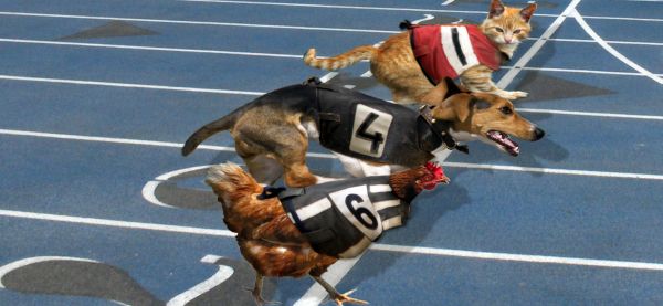
 Considering it is probably in the middle of the race - the chick is really fast ;P
Nice idea  hehe nope the cat's going to win it's going to eat that chicken why do you think it's looking at it? hehhe good luck author.
nice -- a bit of work to remove the whiteish edges of the chicken feet would help
funny. don't know about the shadows though...
On your mark...get set...GO...great idea and work author
People, look at the kitty's face! 
Nice!
This is way funny, good job
very cool idea
good work ....like this...!!
Feet on chicken need a little work (I can see the old background where they were clipped)
Howdie stranger!
If you want to rate this picture or participate in this contest, just:
LOGIN HERE or REGISTER FOR FREE
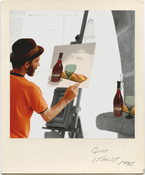
sorry guys didnt have time to do full sbs
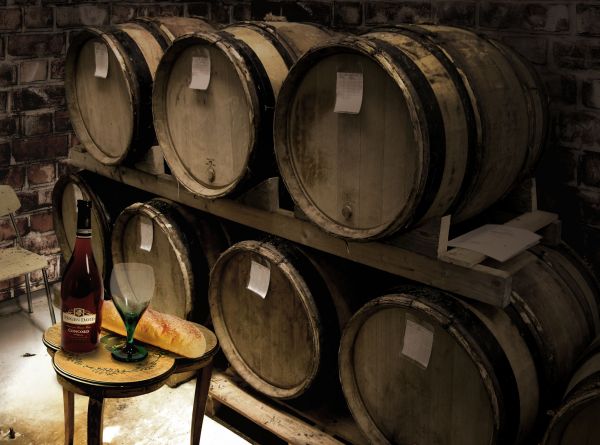
1. used distort and perspective tool on main source and placed it in artist source, applied dry brush filter and added edge to make it box canvass.
2. used clone tool to extend shelf, cut out wine etc and added them to shelf.
3. cut out using pen tool with slight feather on the selection around everything in colour, inverted selection and desaturated to make b&w. (5 years and 3637 days ago)
why there is no shadow on the bottle and the glass?
Very interesting idea, but it needs some slight shadow under the source image... 
I agree about the shadows...idea is great...good luck author
I really like the idea you had for this one. Very creative usage of the source. Good Luck!
agrees with shadows but unique idea. GL!
Howdie stranger!
If you want to rate this picture or participate in this contest, just:
LOGIN HERE or REGISTER FOR FREE
(5 years and 3637 days ago)
Very good... Wine tasting time!
nice done
Damn...lots of wine can put in this cup...LOL...gl
Very effective usage of the source, I love it! Gl
Congrats for your second place, MjongE!
Congrats! for 2nd place and thanks for your all congrats. 
Howdie stranger!
If you want to rate this picture or participate in this contest, just:
LOGIN HERE or REGISTER FOR FREE
That is really cool, however, I wish the baby were in the same focus as the rest of the picture. Everything has a nice Gaussian blur to it and that baby is just crystal clear. Evening out the tones and sharpness of the three main items would really add to the painterly quality of it. Nice job overall though for sure!
thanks elinoree! for the bg part i was attempting to create a bit of depth by having distant objects less in focus... and the baby is in focus becase it is the main object, as is the dad, jsut the dad is swaying slightly in the air which is why he is less in focus... guess if i have to explain it i didn't do a good enough job showing it ;] Thanks for your thoughtful input!
lol... funny
The idea is good, I really like it, but execution needs some improvements. Looks like you're hiding some mistakes on the layer of the father by blurring. You can say it because of the DOF, it's alright, but I can't imagine the father is not in the same plane with the child (because the his shadow is as sharp as the shadow of his kid). Moreover, the right hand of the father needs to be recovered, looks like he loses fingers. Just my opinion, don't take it offensive. Good luck, author
no i was not covering up any mistakes... all blur added was simply for effect... i think i can stand to blur the father's shadow a bit more... thanks for your comments!!! ;]
i like this...
Nice one...gl
what a great idea funny
funny
I think a better source image would have eliminated a lot of your problems to begin with.
she's on steriods!!!!!!!
Howdie stranger!
If you want to rate this picture or participate in this contest, just:
LOGIN HERE or REGISTER FOR FREE