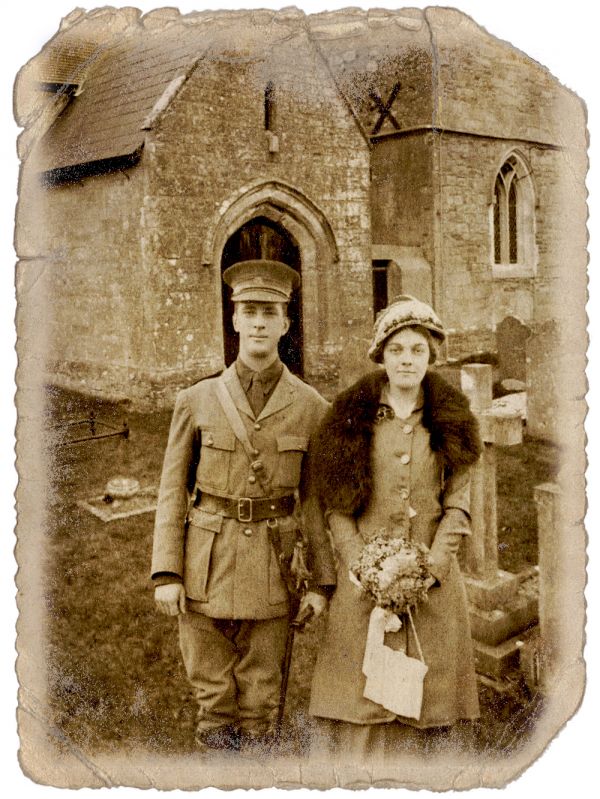
Love in the good old times.
Used vector masks to cut out the couple and many different blend modes.
Thanks, slafko on sxc and the Australian War Memorial Collection on flickr. (5 years and 3766 days ago)
- 1: Photo Paper
- 2: Couple

Love in the good old times.
Used vector masks to cut out the couple and many different blend modes.
Thanks, slafko on sxc and the Australian War Memorial Collection on flickr. (5 years and 3766 days ago)
(5 years and 3768 days ago)
this is good but in High Resolutaion you can see some hard edges on the top of eyes , my screen is kinda bright so i can see them
great eyes sophia! uploading fix. thanks a lot
eyes fixed as well  thank Erikuri
EDIT: Oh LORD.. I really should have watched the movie.. LOL.. I didn't know they didn't have beards ..hehe
gave him a shave and enhanced the eyes more (the white marbling reduced)
This is all quite new to me.. I'm not very good at copy work or mimicry
Is the white of the eyes yellow too?
Try to work on a beard,Na'avi people dont have beard...and yes Sophia is right,a bit more work on the eyes would be nice...Good luck author,try to fix that because work have potential
Hilarious...especially love the shirt.
good
looks like a nice boy.... avatar meets blue oyster club.............. 
good job.. but the pose the Pleather/pvc shirt.. this is a prerequisite for na'avi porn... bow chica bow wow.. lol gl author
naughty Jello (Stewie) Pudding.. hehehe chica bow wow WOW!!!
are you sure thats not you????? what a sexy stud bwahaha .. and if this is really your boss makes me wonder what you do for a living LOL.. gl 
very good
good 
Howdie stranger!
If you want to rate this picture or participate in this contest, just:
LOGIN HERE or REGISTER FOR FREE
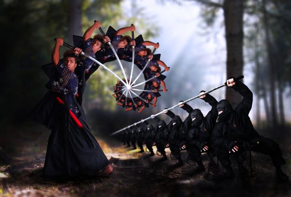
This is not exactly the droste photo that you usually see. Just the man on the left I used this effect. I wanna use droste to depict this fighting to be more dynamic. Hope that's not off topic.
Credits to Marcus (Deviantart) for his models and angel1592stock (Deviantart) for the forest. (5 years and 3768 days ago)
Excellent! 
Very nice and good effect!
nice XD
Nice work especially on the ultimate fighter. The spiral makes him look as having a scorpion's tail 
grt work man
very creative interpretation on this.
very nice work...good luck
very good
nice job!
Thank you for all the comments, I didn't expect to get many supports from you like that 
You deserve all the supports! 
Very cool and one of the most original I've seen GL!
should have been higher ranked imo...
Thank you, inanis, your comment encouraged me much. I'm usually in this situation, so I just try again to make the voters desired
Howdie stranger!
If you want to rate this picture or participate in this contest, just:
LOGIN HERE or REGISTER FOR FREE
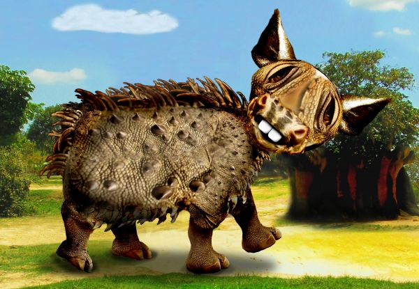
SBS enroute (5 years and 3769 days ago)
How cute...great job author...good luck
It looks like an armadillo with a donkey face! 
lol... cool


 Never have I seen an iguanadonkey mutant with rhino's hoofs!
nice and cool character!
nice!!
Howdie stranger!
If you want to rate this picture or participate in this contest, just:
LOGIN HERE or REGISTER FOR FREE
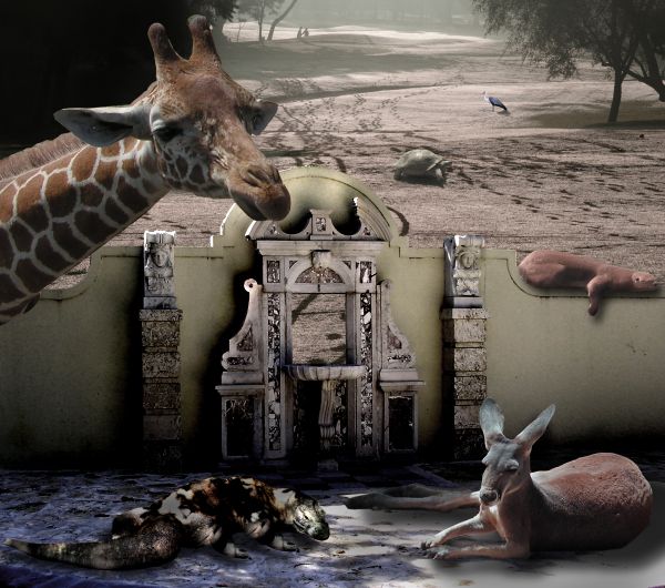
Noah left the gate open and the boys went out to play
Source and my Photos (5 years and 3770 days ago)
Gate only looks half open...wonder how the tortoise managed to jump over it...3 different light sources.
Yeah I agree with cmyk, Nice image, it seems you put lots of time and work into it but the shadows dont ad up, also, one would imagine the turtle in the distance would be tiny, nice image apart from those annoying factors. Good luck author 
I'm going blind (third up grade of glasses in the last six months) so I really don't see things the way others do (when I work in these colors it's all very blurry to me and I can't really make out things very well) but I do try and that's all I can do...
as to the shadow work... while they may make people crazy on the tech aspect, I did arrange the animals so that they were all on the same angles... as to the shading I really like to SEE the images I place so you'll see me highlight a lot of faces to see their features (especially the dragon)
As to the Tortoise.. he's about the size of rider lawn mower and he always comes up to me to be petted (actually he likes my Mother and she loves to pet him through the fence)
We get yelled at all the time (I have a year pass to the zoo) but they are vegetarian...
I'm pretty sure I won't win... (actually I'm sure of it now) but the picture was made for my Mother and that's what I'm most proud of...
Thank you very much Barnacle... always love the advice.. but in these colors I have a snowballs chance in hell trying to fix it... but it is cute though,,, smooches
Besides it's fun to see you know who pitch a fit.. it used to upset me now it just flies off my back.. like the Tortoise that has super powers and can fly 
Hey, I am sorry to hear you have sight problems, It is difficult to believe after seeing your portfollio, congrats. If there is one thing i learned since being here it is that "shadows make an image", without them, nothing blends. If they are wrong, the image just doesn't feel right. I am sure you know this but I'll mention for newcomers benefit  . The stats say you are the most talented artist here and I am not going to agrue with that, so congrats on that too
  . Now down to business.... The shadow from the Komodo is going a different direction to the tree's shadow, the shadow above the gate/door goes in a different direction too, without any obvious difference in light sources. The turtle may be a giant turtle, but in the distance, can he be as big as the; up-close sloth on the wall ?

Hey Geoffry the giraffe say's, big legged turtles make this "Rockin' World Go Round" lol the tone on the giraffe is alright by me.
Fixed the shadow on the lizard.. try to get to the tortoise tomorrow if I get time (the tortoise weighs about 700lbs and is about 3 1/2 feet off the ground and the otter (sloth) is only about 4 feet in length but I'll see if I get time... You were a great help Barnacle.. thank you for allowing me to borrow your eyes...) I'll try to work on it more if I have time 
Don't let the komodo dragon go out, it's very dangerous!!! 
You get surprising me ever! 
fun image! too much burn and dodge used... none of the elements come together as one whole... the lizard appears to be floating off the ground slightly... GL!
Great Creativity, and I can definitely understand sight problems. I seem to have more and more of that myself. Good Luck to you on this creative usage of the source image.
Howdie stranger!
If you want to rate this picture or participate in this contest, just:
LOGIN HERE or REGISTER FOR FREE
Pretty realistic! Nicely done...
Nice work...gl
great job adding and aging the photo...
Nice work, I think you overdid it a bit on the graininess, but it still works.
If you didn´t know it was photoshoped from two photos combined you would for sure think this was an original. But now I know - and still it´s hard to see - wich defines Very Good Done!!!
great well done
Nicely done.
well done!
Congrats, beautiful work
congrats !!
Congrats for the 1st place..
congrats
Congrats for 1st. Although I feel about the same with the grainess.
Howdie stranger!
If you want to rate this picture or participate in this contest, just:
LOGIN HERE or REGISTER FOR FREE