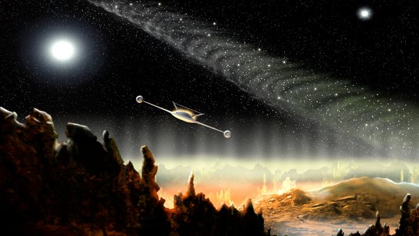
I'm trying out a lot of new ideas here. My first space scene, my first go at creating a space craft from scratch, and first go at trying to work with 2 separate light sources. As always, all comments welcome. (5 years and 3706 days ago)
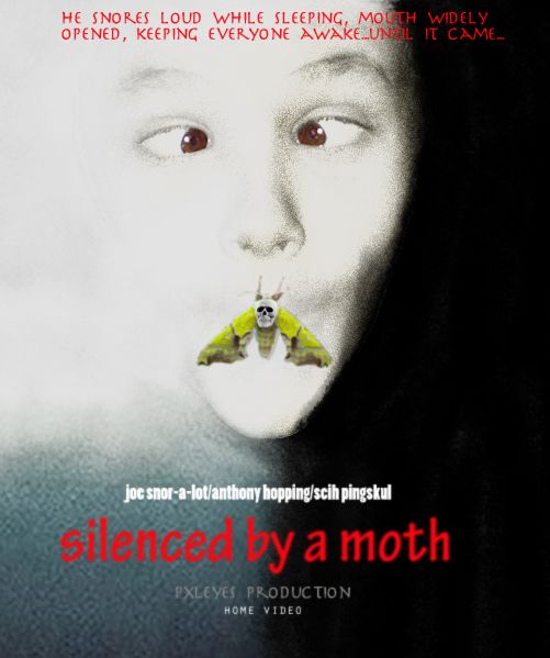
1. select and place the head of the boy in a background w/ a black and white gradient color....clone the mouth away.
2. desaturate the head and make a sepia tone.
3. color both side of the poster white/black accordingly and the lower left dark blue.
4. use a soft brush around the face, white on the left and black on the right side, to have a fade effect.
5. add a film grain filter
6. use dodge on the left side of the face to remove film grain and lighten face.
7. use burn tool on the right face to darken.
8. select and put the moth on mouth. make new layer and color the mouth then set them to 'linear burn'.
9. put skull on moth and place text. (5 years and 3707 days ago)
LOL! xD
This movie looks pretty awful! But the poster is compelling nevertheless. (Quibble: I think I would delete the "was" from the movie title.)
'was' removed lol. thanks!
very nice...lol...good luck author
Check your spelling, red type is blurry.
thanks CMYK46! i overdid the blur on the red text. i blurred it a little to further blend in the image.
Looks better, author, but it's "snores".
hahaha thanks again...english is not my native language so i appreciate it if you guys let me know early =)
Congrats for 2nd
Congrats for 2nd!
Congrats! 
Congrats for your second place, Ricky!
Howdie stranger!
If you want to rate this picture or participate in this contest, just:
LOGIN HERE or REGISTER FOR FREE
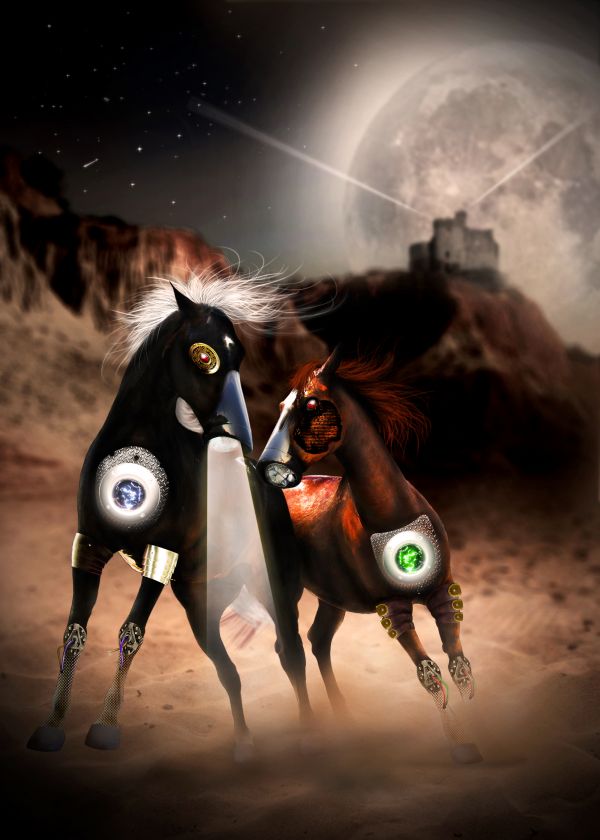
The call of mother nature....
Great thanks to the stock images of authors I listed in the source links
Another authors are also credited:
tigg-stock (DA) for the armor (http://tigg-stock.deviantart.com/art/Arms-and-Armour-stock-4-101817769)
cosmos-resources (DA) for the castle brush
(http://cosmos-resources.deviantart.com/art/Castle-Brushes-30869372) (5 years and 3707 days ago)
really strange.. in a very wonderful way.. good job!!!!
love the play with the imagery
Thank you very much Drivenslush 
very unique entry...this one is one of my favorite in this contest...good luck author for the ideand and for the execution...
nice
i agree with nator. Aslo, imo i think the other horse should have its light on to....
thank you all for comments. I will reduce the brightness of the light, but the horse on the right I intentionally turned off the light. I didn't mention about the story in the description. These horses are war horses and they were modified to server the war. One day they try to escape and two of them help each other. If you notice in the High-Res, you will see the right one has some injures and there are some cracks, indicating the lightbulb was damaged. Half of the face was damaged, too, so you can see something underneath the natural skin.
Unique! Great imagination 
Howdie stranger!
If you want to rate this picture or participate in this contest, just:
LOGIN HERE or REGISTER FOR FREE
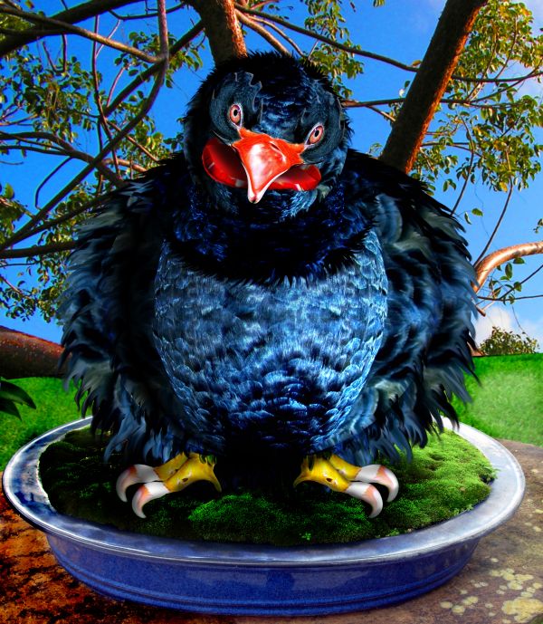
my photos and source (5 years and 3707 days ago)

 got to love this one
Hey Chappy... may I smooch you into next xmas LOL... thanks for all your support
Super...
Awesome interpretation of source image!! Very Creative results. Best of Luck to you
Love this!! Really needed a chuckle this morning. Great work! GL
very very good congrats
Very sloppy in high res...
Fantastic work...facial expression is fabulous...good luck author
CMYK.. no it isn't... but nice try.. (it's called a smudge tool for a reason genius (your moniker not mine) You really should try producing some of your own work.. it would be a big help in the commenting area.. but then hunting down sources is such hard work isn't it?
You really need to stop making things up.. it's getting a bit.. well obvious your just searching for wrong things just to have something useless to say on entries where you dislike the author... just the truth man.. you really need to be placed and I'm the only one not afraid to do it .. smooch
oh lord here we go again.............. author and cmyk I'm going to bang your heads together .. the work isn't sloppy.. it is kinda cartoony but not sloppy.. gl author
Was talking about hard edged bands at top & bottom of body that are obvious in high res, and need blending. The smudge work is fine. No need to flip out.
BWHAAA HAAA HAAA... genius LOL,, Print version is just fine, and Now I'm going to keep them because they are endearing now
It's better be careful, it looks angry! Can get confused between finger and worm... ;D
very good 
Ha Ha Ha very funny one ! also very good blending ..good work
Wow! This is Mr Nice Guy  Does he bite?
Congratulations on the top-three place, Earnest! 
Congrats for 2nd
Bad dog..down boy...he he he  Congratulations!
wow congrats!!!! 
grats on 2nd place!
Congrats for 2nd!
Congrats! 
Congrats for your second place, Ernest!
congrats 
Howdie stranger!
If you want to rate this picture or participate in this contest, just:
LOGIN HERE or REGISTER FOR FREE
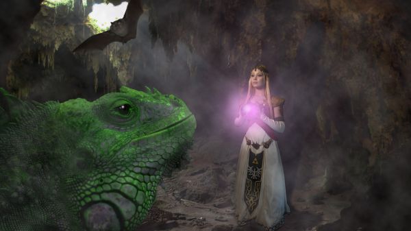
Thanks Jessicajil,carianoff,Wikimedia (5 years and 3708 days ago)
very nice congrats and good luck
Nice external images (i.e. the princess, from Flickr!!)  . Entry is well constructed too, perhaps I'd change the direction of the shadow for the princess (looking at the rest of the image). Good luck!
Really nice image, well executed.
Very nice work...maybe u could add some parts to the iguana to looks a bit more like a dragon...some horns maybe or something like that...open snake mouth could fit too...good luck author
This looks amazing!
Congrats for 3rd
Thank you very much
gratz
congrats for 3rd!
Congrats! 
Congrats for your third place, Filantrop!
Howdie stranger!
If you want to rate this picture or participate in this contest, just:
LOGIN HERE or REGISTER FOR FREE
The things at the ends of the wings are at a funny angle...maybe make them round insteas of rectangular, and parts of the wings look transparent...over all, nice job.
Yes, I agree with CMYK... In the way it is, space craft aerodynamics will be harmed...
Thanks for the comments. Blurred edges were actually radial blur on a separate layer to suggest movement, but you're quite right, they just look a bit messy, so I have removed. I have tidied up the shapes on the ends of the wings, but may completely redo them as they still do not look perfect.
nice work...u did good job with a sky and aircraft...but ground don't fit 100%,try to use some overlay and color layers...good luck
I think this is really great
nice work!
Just a couple of minor adjustments for anyone who hasn't yet voted. Shapes on wingtips changed, as suggested by CMYK and minor adjustments to horizon/space blend.
Nice idea!! ; )
Definitely high vote fom me after changes...great imagination and execution. Good luck!
Great!
Congrats for 2nd
congrats
Congrats on 2nd!
Congrats!
Thanks to all who commented & voted!!
Congrats for your second place, Fezjez!
Howdie stranger!
If you want to rate this picture or participate in this contest, just:
LOGIN HERE or REGISTER FOR FREE