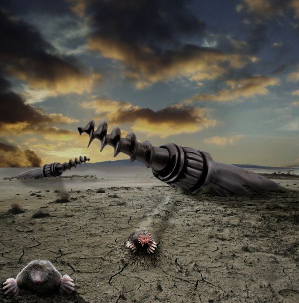
They attack at dusk because their weak eyes can't stand the daylight. Why they can build highly advanced drill attack ships but never invented sunglasses remains a mystery. (5 years and 3709 days ago)
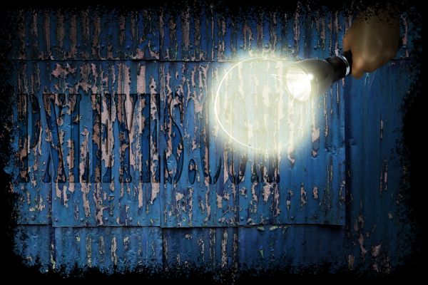
If we never invented smaller lightbulbs then a normal one, how would common things look like?
I cut out the lamp and was trying to make it transparant.If you look at the letters you can see it. I decided to try and add a flashlight. From there i made it up as i went along.
I had a really warm and bright colored one at first, but i like the grungy effect it's got going now (5 years and 3710 days ago)
 maybe you could increase the bulb's opacity a bit
I can't see the original source here...
The source is the bulb of the flashlight, transformed a couple of times.
Well it looks more like a torch than a bulb...
Howdie stranger!
If you want to rate this picture or participate in this contest, just:
LOGIN HERE or REGISTER FOR FREE
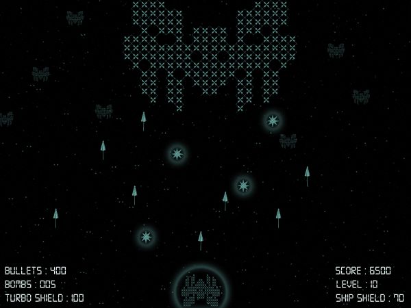
old dos based pc game ; concept - space invaders (5 years and 3711 days ago)
?
ummmmm what is this??? seriously!!!!!!
I think it's a wrong sreenshot xD
????????
I'm wondering what part of source image has been used in this entry.. hello author can you upload an SBS to show us..?
Maybe its a puzzle :-b
Highscore unlocks the SBS =)
lol @ Duke
yea Duke.. lol.. hey i got it.. the author used the blue yellow closed beach parasol and created a pattern by aligning them.. just have a close look in the high resolution.. phew.. mystery solved, without making a highscore..  hehe...
Good idea, but very very poor use of source.
Clever but very subtle use of the source. It's too bad you couldn't of provided source links or an SBS because more than likely this is just going to disappear tomorrow.
Rather smart I think!
thanks guys for all your comments. i have provided the sbs for this entry. if i have to write the entire steps of creating the big mother ship then it would have been more than 50 steps. so i have given an overview of the steps. hope u all understand. anyways everyone is saying that its a very poor use of source. well maybe. but atleast its not semi-nude.!

Howdie stranger!
If you want to rate this picture or participate in this contest, just:
LOGIN HERE or REGISTER FOR FREE
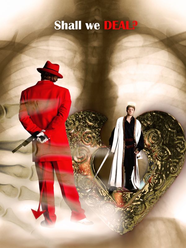
What is happening inside our chest? Can we be both sin and saint? One deal can decide that...
This is the idea of showing the nature inside, so the appearances of the characters are not important, not need to be the same person.
Please check the Hi-Res before voting. Thank you very much, hope you like it.
Thank to Marcus Ranum for the awesome stocks of models, atomicpixel (Deviantart) for the X-ray image of the hand, isostock (Deviantart) for the X-ray image of the chest, and aestchen (Deviantart) for the metalic heart. (5 years and 3711 days ago)
great!
Idea is great...work is very nice too...Its shame about the models...its would be better to have same person as good and bad
Is that a halo on the background guy's head? We should be able to see it better against the background. Maybe if it was yellow or something...
Thanks for your comments  . It's not the problem of the models because I can choose the same person, but I prefer this angel, his expression is good, and also I'm getting bored with the idea of manipulating one person to be good and bad, this piece is something new. Thank CMYK46, your observation is correct, I'll try to make the halo visible.
Even we try to walk the right way, we are humans. And humans aren't perfect.
Halo looks like a donut now...it should glow...
Really  )? Ok, one more try
forgive me author, but if you read the goal of the contest is to show two opposite sides of the same person. good luck
@cterraza: no problem, maybe I didn't interpret well so you misunderstood. Do you see the X-ray image of the body and the hand in front? This means I want to show something happends inside us. The angel is on the heart (just the symbol), defending against the devil. Who wins will stay there, but we don't know, maybe they can live in peace. And you know, this is art, not anatomy, just the way of expressing my idea.
The appearances of the characters are not important ??? I beg to differ. Why not upload a blank image and just tell us a little story. You can't go for a swim without getting wet !!. Nice try tho. This is an art competition, not a .... what the is going on in your head competition. We cant guess you lol. And even when you explain... we still dont know what this is about :P
OMG, my words are bad, right T_T?
Your words are fine mate. 
the skeleton hand is kind of distracting ;O
I think the skeleton hand adds depth. IMO, don't change a thing  It's a pretty original idea and pretty well executed. GL!
Howdie stranger!
If you want to rate this picture or participate in this contest, just:
LOGIN HERE or REGISTER FOR FREE
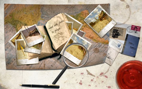
beach, old photoes on an old desk with map (5 years and 3712 days ago)
Love this so much...reminds me on front page of some web sites...great work author
Very kewwwwl :P
Very nice! The coffestains contribute to the real feeling as well as well as all the other details. This is really one of my favorites over all.
cool
Definitely unique!. GL!
I like the subtleness of the shope in the picture! Overally well done!
nice idea and work! 
Congrats!
thankyou
congrats! kathyw... nice chop, nice result 
Congrats for your first place, Kathy!
Congrats on 1st palce kathyw 
Congrats, really well done 
Howdie stranger!
If you want to rate this picture or participate in this contest, just:
LOGIN HERE or REGISTER FOR FREE
Nice image -- like the star-nosed mole
nice
Nice entry, good job.
Love it!
Great use of the source nice picture
Yeah really great !!! Good luck author !
If you wanted to make this really scary, you could have them coming up out of a perfectly tended yard where someone has worked really hard to get rid of the weeds, dandelions and stupid, freaking bind weed. But I may be personalizing this a bit. The sky is striking. I really like it.
Heheh IDt8r.. really nice entry author! Well blended image... Great job!!
Fantastic.....! and i agree with idt8r...
Fantasticcccccc.....
very good work!
very nice work...very unique idea...looks like great futuristic movie poster...good luck author
Nice work!!
Awsome, fanatastic, marvellous........favourite!
the mole on the right, further back, is much sharper than the one closer, but good chop and even funnier concept.
Apocalyptic! Stunning image
Congrats, terrific work
Congratulations buddy!! Well done.. super creative.
congrats on 1st place!
Congrats for 1st
Congrats, well done!
Congrats dear! That's the Bob skills I know and love!!
Coongrats
congrats!! on your first place....
congrats !!
Congratulations!
Congrats!
Congrats for your first place, Bob!
Congrats, I voted high for this one.
congrats
awww so cute funny description
Howdie stranger!
If you want to rate this picture or participate in this contest, just:
LOGIN HERE or REGISTER FOR FREE