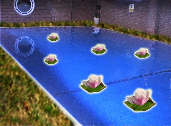
To create this I have used: blending options, filters, masks. (5 years and 3796 days ago)
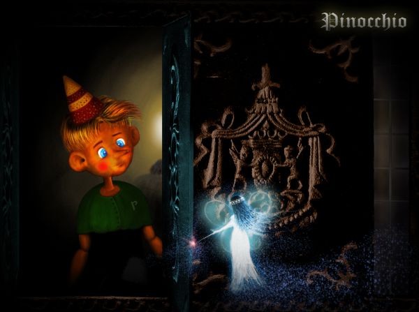
Dedicate to my childhood...
Just the source was used. The remaining is painting. (5 years and 3796 days ago)
very good
excellent job and brilliant result... good luck... I don't really think you need the lettering since it's in the title already... unless you used the letters to balance out the brightness of the fairy.. just a really nice job all round
EDIT.. I figured that was why it was there... GOOD LUCK!!!
Thank you demi, Drivenslush. @Drivenslush: yes, you're right, I use that for balancing the brightness of the fairy. After finishing, I realized that the light of the fairy is a little bit too strong, so... ^^
Nice image, GL 
I love the drawing portion of this one, I just wish that the source and drawing fit together a bit better, but it's very nice.
Thank you Clinge and annabat. @annabat: it's true, they don't fit well, I tried some ways but not desirable. Hope that I can fix them before the deadline.
Yeah, have to agree that your painting and the source/rest of the image don't blend very well. The source looks just blurry and noisy now, you could try to keep some clarity on the source even if filtered. Your Pinocchio is awesome btw.. gonna check this out later for voting.
add a bit color to source image parts and u will have great final result...good luck author,this is very nice work
More works on the source, including the coloring like erathion mentioned, were done. Thank you very much Widiar, erathion for your suggestions.
Great work!
Beautiful! Pinoc looks so cute here 
good job 
Congrats for 3rd place !!
Congrats for your third place, Langstrum!
Congrats
Thank you very much, I'm trying to do better ^^
Howdie stranger!
If you want to rate this picture or participate in this contest, just:
LOGIN HERE or REGISTER FOR FREE
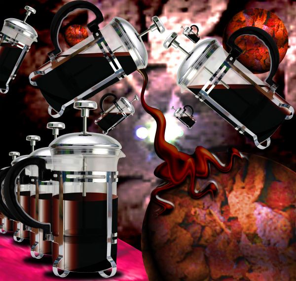
source only (5 years and 3797 days ago)
Nice....
Very creative,like the chocolate inside....gl
hee hee 
can I have some of what you're smoking???!!! 
Howdie stranger!
If you want to rate this picture or participate in this contest, just:
LOGIN HERE or REGISTER FOR FREE
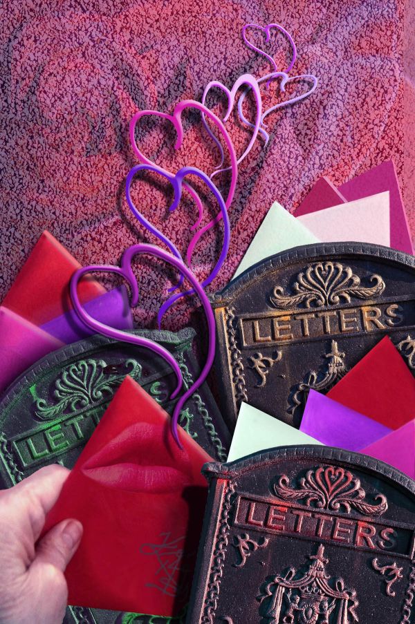
Thanks to clarita at morguefile for the lips; Thanks to chille at morguefile for the roses used for the background. The hand and valentines are from my own photo. I made the heart brush myself. (5 years and 3797 days ago)
Simple but nice....
Cool work!
I definitely wouldn't say simple. Nice image. GL!
nice job 
Howdie stranger!
If you want to rate this picture or participate in this contest, just:
LOGIN HERE or REGISTER FOR FREE
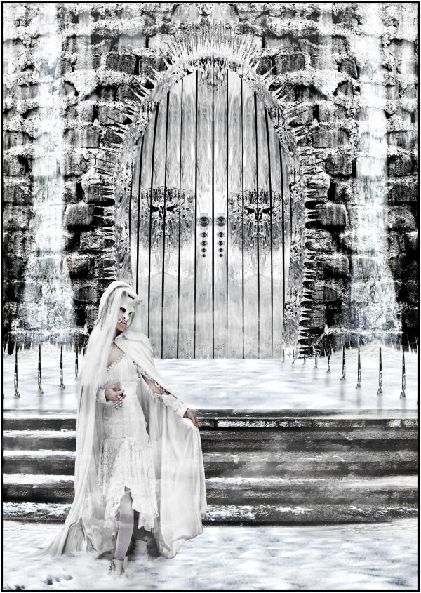
Credits and thanks to:
http://eyefeather-stock.deviantart.com
http://mithgariel-stock.deviantart.com
http://javierzhx.deviantart.com (5 years and 3798 days ago)
Nice work! Well blended.. (are her legs supposed to be slightly transparent?) Good job overall!!
Great composition...nicely done!
I would have prefered a bit more colour for the bacgkround too, now it feels like it's completely black and white against her skin, even when it's not. You should remove the light transparency from the body/leg.. I wouldn't mind if the cape is a little bit transparent thou. If the spike reflections are actually shadows, you should check the orientation. Good work here..
Her legs are covered with some kind of white collants.... it's not transparent
pretty cool job
The blend is beautiful and the work too.....
Beautiful winter picture! 
very cool ,nice ambient! 
Howdie stranger!
If you want to rate this picture or participate in this contest, just:
LOGIN HERE or REGISTER FOR FREE
u need to add the link for the source image
pool image is my own
Very arty
nice idea
nice....
Howdie stranger!
If you want to rate this picture or participate in this contest, just:
LOGIN HERE or REGISTER FOR FREE