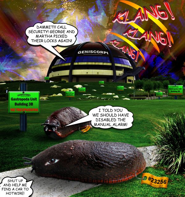
source and my photos (5 years and 3815 days ago)
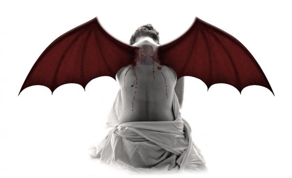
(5 years and 3815 days ago)
Source 1 does not lead to an image.
it was the users profile page. I 've replaced it with the page of his image. Thanks
Very nice finish but I cant make out the tattoo :S
I can see where Barnacle is coming from. If more of the original tattoo wings were shown, it would improve the realism but I noticed that the wings you used might be pre-manipulated.
Good idea, but personally, I would zoom to the tattoo itself and make little wings come out ...  GL
GL
Thanks for your suggestions. I have fixed the tattoo and the original wings are now showing.
Howdie stranger!
If you want to rate this picture or participate in this contest, just:
LOGIN HERE or REGISTER FOR FREE
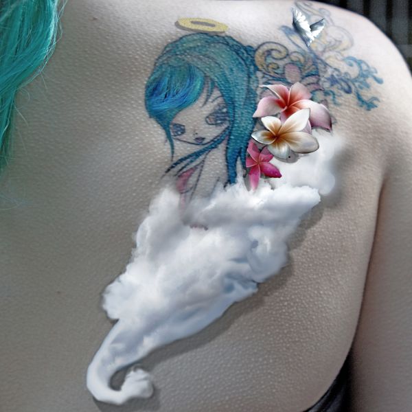
Permission slip for use of tattoo image is in the sbs section.
Thankyou to
Tigg_Stock@DeviantArt.com (5 years and 3815 days ago)
Oh this looks so sweet and fluffy  great job author.
I like it... but im not thrilled about the blue bit in the top right section... other than that its really nice! 
thats her hair, i shall chop it out for you  brb lol
EDIT: Hair is now gone 
You've chopped out the left side... I meant the curly thing diagonally right of the wings... but OK LOL....
ahhh ok lol.... there are toooo many blue things in this image.. will have a look at it again now ( gives me an excuse to not do the dishes lol)
EDIT: have chopped out the other part and put the hair back in  I kinda liked the hair in it, it made me feel like the girl in the tattoo was the actual person the tattoo was on
Thanks for all your help JamesD, it is always appreciated mate 

Very cute, maybe try keep the clouds inside the original lines of the tattoo? and I would remove the bird wings, they look a bit "alone" up there.... otherwise very good  GL
GL
Howdie stranger!
If you want to rate this picture or participate in this contest, just:
LOGIN HERE or REGISTER FOR FREE
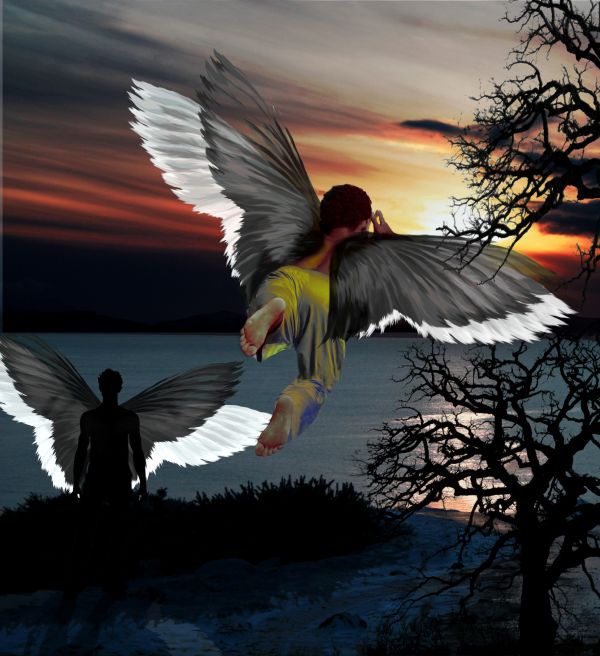
A lot of images with the same idea it seems.. but as I finished this one already, gonna submit it anyways - took a lot of work.
I cleaned the tree picture and removed the girl from the sunset image. Made several pairs of wings with slight adjustment with rotation/perspective tools. Made an invert for white wings. Made the black wings a bit transparent with masking.
Made a new foot/leg and pants for the flying boy with pattern tool and coloured the pants with gradient map tool.
Used duplicate layers to alter sunset image colours and enchanced them by hand (more red, etc..)
Finally added a bit unrealistic but fun shadow/halo wing effect for the silhouette man.
* update **
Added a shadow for the bushes also, as Langstrum suggested. (5 years and 3816 days ago)
nice try, but I think the higher tree branch should be behind the wing or you can delete that one. Moreover, the bush also needs the shadow as the man standing in front. The opacity of the tree is quite low, so it's not stick to the scenery. GL
Thanks Langstrum. I added the shadow for the bushes, but there are 2 different trees for the picture, one in front and one further away, behind the boy. So I'm gonna left that one, thou I see you can think it's the same tree.
The perspective of the tree becomes a little bit of hinderance to the wings as the guy flying looks behind from the perspective whereas the branches of the tree are behind the wings in the picture.....Otherwise nice work....
The wing is coliding with the tree....lose the tree! overall, good chop!
I'd still like to point out, in my mind and eyes there are two trees, and the boy's wings are in the middle.. the lower section tree is also further away from the boy.. so no collision - yet . .?
Congrats! 
Howdie stranger!
If you want to rate this picture or participate in this contest, just:
LOGIN HERE or REGISTER FOR FREE
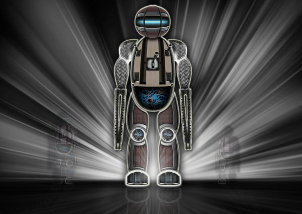
(5 years and 3816 days ago)
I see the glowing effect in some areas makes the composition of this robot less connective, especially the foot. Overall, it's quite good
that was the idea. To connect them only with the glow
Nice one, GL 
Very cool :P
looks like a fabulous, creative entry to me 
great,gl
thanks everyone!
nice work! 
Well the robo looks disected which gives a nice effect...Beautiful work...
Very nice robot and the image looks good in high res 
Howdie stranger!
If you want to rate this picture or participate in this contest, just:
LOGIN HERE or REGISTER FOR FREE
very funny,i like the whole idea...
Good concept....
LOL,funny !
ahahahahaha....very funny! Nice1
Howdie stranger!
If you want to rate this picture or participate in this contest, just:
LOGIN HERE or REGISTER FOR FREE