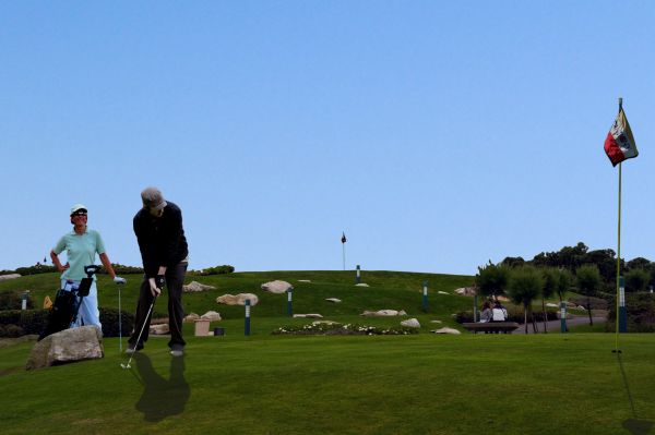
Created in Photoshop 7.0. All sources are mentioned. (5 years and 3816 days ago)
- 1: New Sky
- 2: Golf flag and hole
- 3: Golfer 1
- 4: Golfer 2
- 5: Female Golfer

Created in Photoshop 7.0. All sources are mentioned. (5 years and 3816 days ago)
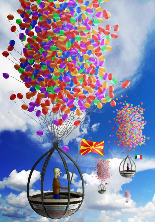
Have you ever tried a baloon race?
(5 years and 3816 days ago)
reminds me of that new animation film "UP" ... funny and interesting work, well done 
all these balloons are gonna make CMYK go into VF.. haha! .. nice work author  maybe a bit more work on the men would go along way to getting better votes
Very good, well done & GL 
Don't we need the source for the balloons? :-b
VF? Might be better to put real people in the gondolas, but good idea...
just for you Bob ... http://en.wikipedia.org/wiki/Ventricular_fibrillation
Reminds me of Terry Gilliam a little bit. Funny.
Inspired by "UP"? ... good work (the guy looks like Bevis :S sorry , had to say it  GL
GL
Agrees with using real people, rather than the cartoon people you've created. Everything else is so real looking already. It would fit better.
great,gl
wow...great...macedonia,italy and states...world cup in baloon races...
Concept is nice.....
Howdie stranger!
If you want to rate this picture or participate in this contest, just:
LOGIN HERE or REGISTER FOR FREE
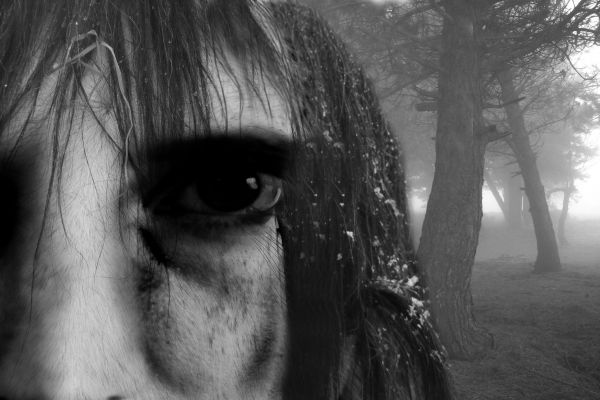
sorry couldnt think of nothing better and thought i would do a grunge face hope you guys like it :) (5 years and 3817 days ago)
nice,gl
Its scary.....Good one...
It's the eeeeeeeeeeeeeeeeeyeeeeeeeeeee ...uouahahahahhhaha! 
Howdie stranger!
If you want to rate this picture or participate in this contest, just:
LOGIN HERE or REGISTER FOR FREE
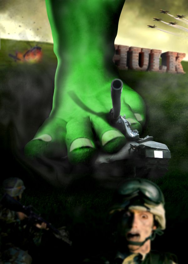
He's coming back, much stronger!!
Credits to:
razorboi (DA) for the soldier with gun
artiefartsie-tjitsie (DA) for the scared face
FantasyStock (DA) for the aircrafts
loewenhoehle (DA) for the helicopter
Nemesis_19 (DA) for the soldier
Digitalhomicide (DA) for the tank
theflickerees_stock (DA) for the batterfield background (5 years and 3817 days ago)
Make the toenails green too...
I think the townails are okay as they are now.... AWESOME ENTRY!!!
@CMYK46: I decided to make the white nails because I think it's more realistic
Author, I colored many Incredible Hulk comics...his toenails are a lighter green than the rest of him...
really? I didn't notice that. Okay, I will fix that, thank you.

 Yep, looks better!
great job 
This is one of my favourite entries.. i need to keep coming back to look at it! Super creative.. great use of source.. great SBS... this is really inspiring! Great.. GREAT job!!!
thank you very much ponti, this is the best words I've received since I joined Pxleyes
This entry should have done much, much better.. it's a shame it went unappreciated.
Thank you, it was quite upset to me because I spent so many hours for that work. Anyhow, joining the contest we can't predict correctly everytime. I'm trying and I hope the other works will be appreciated.
Howdie stranger!
If you want to rate this picture or participate in this contest, just:
LOGIN HERE or REGISTER FOR FREE
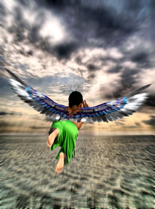
Thank you to Coda for the Angel Wings photo and Grant McDonald for the Changing Sky photo.
Just a basic edit using quick selection tool, flip, masking, hdr and added motion effect. (5 years and 3818 days ago)
A bit too much blur, esp. on the figure...
Though the overall image is blur its nice to see that you have made his feet a little blur as well...
Cool...
Howdie stranger!
If you want to rate this picture or participate in this contest, just:
LOGIN HERE or REGISTER FOR FREE
this is a good idea, I think you would benefit by checking the scale of your golfer in the background though. Good Luck with this, it's a nice looking image. Edit: removing the golfer in B/G is an improvement. As for the shadows well my opinion is that they do not need to be as long possibly...
Good work, just try fixing the shdow a but, by locating the direction which the light hits, 2nd, get rid of the man walking in the distance... or rescale him.. GL.
I removed the golfer but I am not sure why you see the shadow as wrong.
hmmm idea is great,work too just few minor observations...woman is to bright for this lighting,shadow is to define,with this lighting u cannot have that define shadow...if u fix that u could have fantastic work...very realistic image
I made some changes.
Howdie stranger!
If you want to rate this picture or participate in this contest, just:
LOGIN HERE or REGISTER FOR FREE