Photoshop Pictures: The (page 43)


results 211 - 215 of 2863

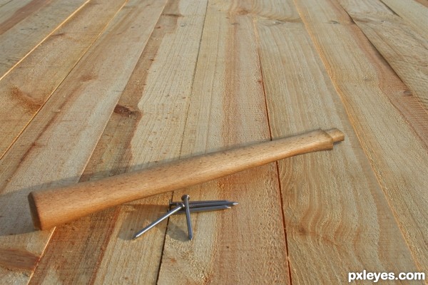
Hitting the Nail on the... Nevermind - created by elemare


Hitting the Nail on the... Nevermind
Favs: 1SBS: 1Hi-resRank: 2/20Score: 67.1% (33)13274 views

Many thanks to photographer mrdisaster - an appropriate name, considering the current condition of the tool from his photo. :)

Only one screen capture is included in SBS, to show the various layers. This illusion was achieved by selecting nearby areas of unshadowed wood and patching the pieces together, skewing, changing perspective, soft erasing edges to blend. The dowel was made by duplicating the hammer neck, shrinking it, then applying a little burn to create shadows. (5 years and 2613 days ago)

1 Source:

avatar CMYK46
CMYK46 says:

Everything's good except the shadow on the "dowel" part is on the wrong side. See light source.

author says:

Thank you! Added the little shadow. But what I was looking at is matching the original shadow from hammer head and the bottom of the handle extending straight left as well as back/up from the mid-lower right light source. So that was not supposed to be a shadow cast by the dowel side (although that's what it looked like), but the tip of the dowel casting a shadow backwards toward the handle. Any other suggestions to make it look better?

**Update** I think I figured it out - rather than angling the shadow from the tip, I squared it off and moved it lower / farther away from the tip.

(5 years and 2613 days ago)


CMYK46 says:

PS: Great title!

(5 years and 2613 days ago)


avatar DanLundberg

Totally believable!

The contest description asserts that "Humor is a big factor here." The lack of an 'amusing' element/aspect could prove to be a weakness in the final rankings. But I admit I have no idea how to add funny to this.

author says:

Well, I guess the joke's on me, then. I can't always be good AND funny.

(5 years and 2613 days ago)


avatar spaceranger

You don't have to be hit over the head with a hammer (pun intended) to see the humor in this. Together with the title you got a smile out of me. Nice work as well!

avatar pixelkid
pixelkid says:

Nicely done and unique idea!

avatar loopyluv
loopyluv says:

This is actually very well done!!!! Great skills and cloning! well done Author!! high vote from me GL

avatar lolu
lolu says:

Congrats !

avatar spaceranger

Congrats, well done!!

Howdie stranger!
If you want to rate this picture or participate in this contest, just:

LOGIN HERE or REGISTER FOR FREE


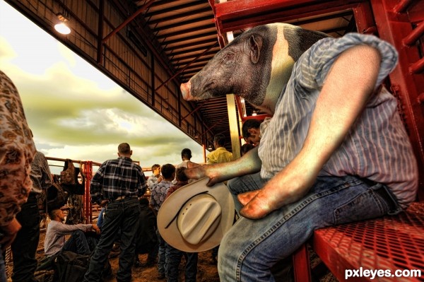
...at the Rodeo - created by Drivenslush


...at the Rodeo
Favs: 0SBS: n/aHi-resRank: 5/20Score: 64.6% (15)10189 views

(5 years and 2613 days ago)

2 Sources:

avatar rjapzdesign

cool work..cant mess with him..lol

avatar Glockman
Glockman says:

Not bad, the hat looks kinda glued to his hoof and you missed a spot under his left hoof. still one of the better ones.

Howdie stranger!
If you want to rate this picture or participate in this contest, just:

LOGIN HERE or REGISTER FOR FREE


The Journey - created by tnaylor21286


The Journey
Favs: 1SBS: 6Hi-resRank: 2/20Score: 67.6% (33)17414 views

(5 years and 2615 days ago)

3 Sources:

avatar CMYK46
CMYK46 says:

As with most of these entries, there would be lots more missing from the body.

avatar Glockman
Glockman says:

Looks a bit more like it is exploding then disintegrating

avatar spaceranger

Congrats!!

avatar lolu
lolu says:

Congrats !

Howdie stranger!
If you want to rate this picture or participate in this contest, just:

LOGIN HERE or REGISTER FOR FREE


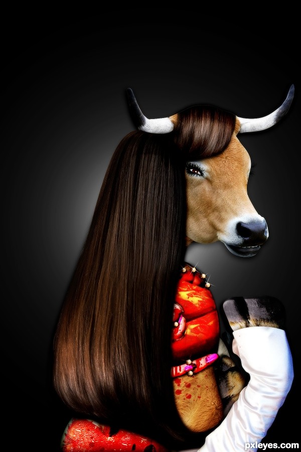
Forget Fur! This Fall-- - created by MisCapasVivas


Forget Fur! This Fall--
Favs: 0SBS: 8Hi-resRank: 5/20Score: 62.8% (15)10033 views

fashion's gone for a more, "bloody fresh & fur-free" look. Get your hooves on these Meat Shawls before "supplies" run, out! ;) (5 years and 2615 days ago)

6 Sources:

avatar lolu
lolu says:

love the idee but it would be better without the background, only the head and hair with a simple background can be super cool !

author says:

Thanks! I thought the same but didn't want to stray from my original vision but am going to reenter the simpler version as I like it better!

(5 years and 2613 days ago)


avatar CMYK46
CMYK46 says:

This version could use some softening of the edges.

author says:

Thanks! I figured too but far too late lol. I havent shoped in forever so hopefully next time I'll be more careful/ patient

(5 years and 2612 days ago)


Howdie stranger!
If you want to rate this picture or participate in this contest, just:

LOGIN HERE or REGISTER FOR FREE


In the Soul of Ustad Ahmad Lahauri - created by Drivenslush


In the Soul of Ustad Ahmad Lahauri
Favs: 0SBS: n/aHi-resRank: 4/20Score: 62.8% (20)23108 views

Main Creator of the Taj (5 years and 2615 days ago)

2 Sources:

No comments yet... Be the first!the, Soul, Ustad, Ahmad, Lahauri

Howdie stranger!
If you want to rate this picture or participate in this contest, just:

LOGIN HERE or REGISTER FOR FREE