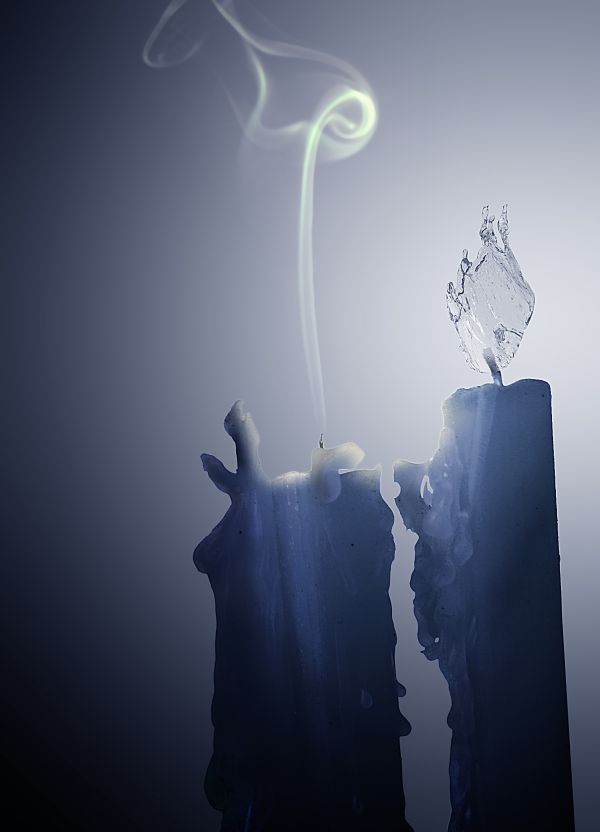
Edited: I thought on adding a flame, but finally I decided to add the smoke, I think is better to show the final of the fight.
Thanks for suggestions guys. (5 years and 3828 days ago)
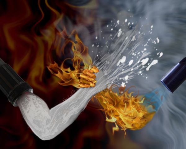
Created in CS2. All sources have been mentioned. Please view in high resolution before voting.
I have made some major edits since I first entered. I think it looks much better now. (5 years and 3828 days ago)
nice
very original 
I am thinking that something is missing. Any constructive criticism is welcome but suggest some techniques so I know what to do.
nice thought.. that hand of water could have been better 
Shivthink: that's not contructive criticism and I disagree.
Maybe some water splash around the water arm?
That's what I was thinking as well. I was thinking maybe some fire around teh hand or even maybe some steam where the two meet. Thanks for the suggestion 
Yes author, that would improve it 
fire against the milk....lol
Edits made.
Maybe some more water source images or bubbles etc overlayed on the arm with added transparency? Just for a bit more depth? Steam?? Keep at it..
i think you should add some more water around the arms and not just in front  n
n
Actually, I've given up on this entry. I've already been outdone. Vote now I'm not making anymore edits.
you should. i like this better than ur copycat 
Thanks MaXed but I don't think they copied it. I originally got teh idea from a drawing of nature and time arm wrestling, but I appreciate taht . Thanks. At least it took the top 8 slot. 
Howdie stranger!
If you want to rate this picture or participate in this contest, just:
LOGIN HERE or REGISTER FOR FREE
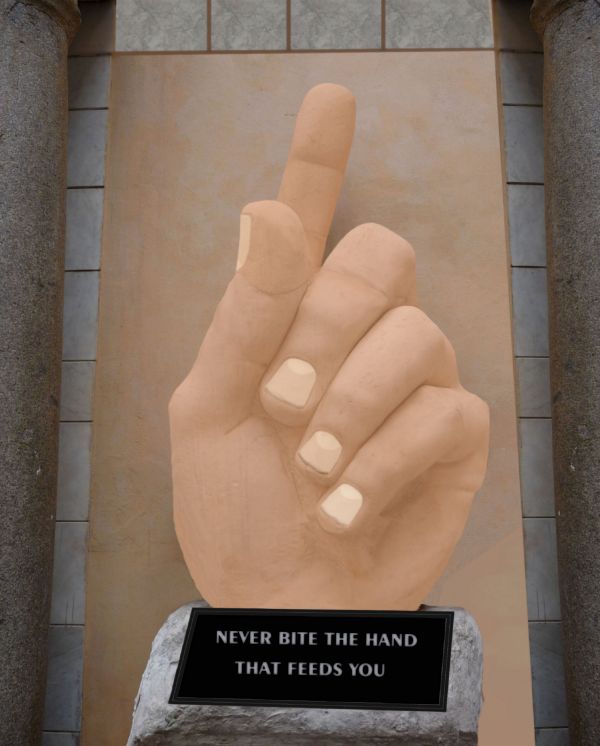
no out side sources used (5 years and 3829 days ago)
You forgot to put the word "hand" in the plaque. It looks very flat.
Thanks! Boy do I feel stupid...lol
Howdie stranger!
If you want to rate this picture or participate in this contest, just:
LOGIN HERE or REGISTER FOR FREE
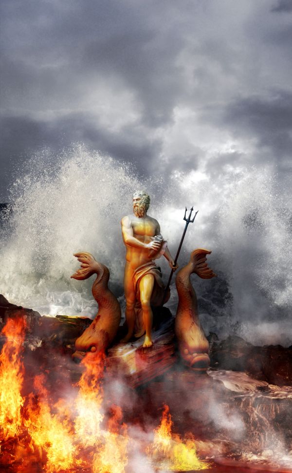
The world's oldest fight has no winner yet and there have been no truce til now...
...
Sky thanks to mara-sky-stock http://mara-sky-stock.deviantart.com
...
Some changes were made. I added steam seeing that lava meeting water generates steam :-)
I used smoke brushes to make steam... No remarkable work here ;-) (5 years and 3829 days ago)
Not bad, but missing a couple of sources: sky & background.
Ooooops! Forgot the sky behing the sky... Fixed  Background is the whole image "Waves" that I blended with the sky behind it....
very good
Very well done and a good theme match.
Very nice representation 
Very nice and on theme... good luck.
And congrats for another third place, Divair!
Congrats on your placement! 
Congrats on your placement! 
Congrats 
Howdie stranger!
If you want to rate this picture or participate in this contest, just:
LOGIN HERE or REGISTER FOR FREE
(5 years and 3829 days ago)
SO?
good idea, but it looks too unrealistic for me to vote higher
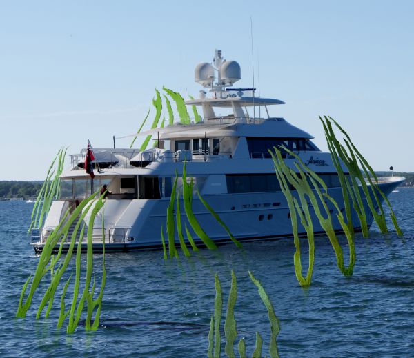
I think you should lose the one behind the boat. It seems a lot larger than the rest even though its further away.
Sooo what are these supposed to be?
i need to understand first what did u intend to make in this??..jus using any external souce image and then addin those plants around it..i mean i don get the meanin at all..
Howdie stranger!
If you want to rate this picture or participate in this contest, just:
LOGIN HERE or REGISTER FOR FREE
nice
that's when you know it's too cold :P good job
not an original idea, but well done
A nice idea but IMHO not really on theme. You are supposed to show how fire and water are fighting each other for dominance.
Maybe if you put a fire flame on the other candle??
I agree with Jawshoewhah and i think Raytedwell's suggestion of adding a flame would really change this image for me. I'll hold my vote for now.
Ok, thanks for comments and suggestions, I´ll try to add the flame
Enhorabuena amigo
Congrats for your second place, DML!
Thanks friends!!
Congrats
Howdie stranger!
If you want to rate this picture or participate in this contest, just:
LOGIN HERE or REGISTER FOR FREE