
(5 years and 3753 days ago)
(5 years and 3754 days ago)
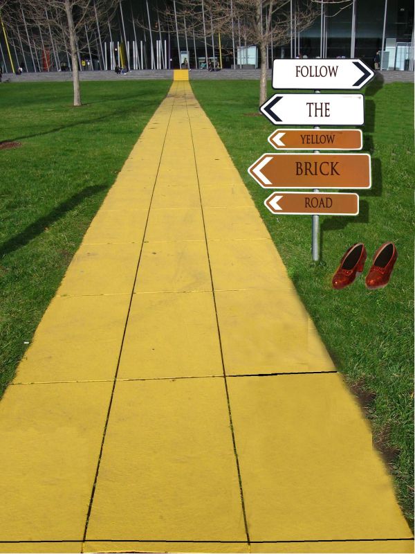
Good idea, but try to make the post look like it's actually in the road, not just pasted on top...it should have a shadow, too.
agrees with cmyk. You should also place the signs more off to the right.
Bravo, Wonderful, Fabulous, is there anymore to say?!?! 
Wow I get brozed but yet you used my suggestion. By the way, the shadows on the sign are wrong. They would be like the one on the left but try drop shadow, not whatever you did. Also shoes need a lot of work on the edges and a shadow too.
well honestly speaking i don see any logic in this..you've jus written one simple note in a direction board which is going all places..you could have used the source image in a much better way..
Don't take my comments on this as rough criticism, just constructive, well meant suggestions.Good imagination on this, but there are several things that you could do to improve on it. I think the shoes have been mentioned by others, and the cloning on the grass next to the pathway needs to be cleaned up a bit. Changing the signs to point all the same direction could really be a plus. Overall you did have a good concept, it's your execution that needs some improvement.
Those kids of yours must really be occupying your time but the sign shadow is not hard to create. I wish you at least tried,, 
Howdie stranger!
If you want to rate this picture or participate in this contest, just:
LOGIN HERE or REGISTER FOR FREE
(5 years and 3755 days ago)
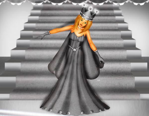
Really lovely entry. I like the way her skin, face and hair contrast to all other grey colouring! 
very sweet!!! quite the darling (and what Cornelia said 
Great work!
nice use of source and nice SBS
very nice,like the texturing!
Congrats nice work 
Congratulations on the first place! Beautiful little princess 
so cute congrats
Congrats for your first place, Chakra!
Congrats
Howdie stranger!
If you want to rate this picture or participate in this contest, just:
LOGIN HERE or REGISTER FOR FREE
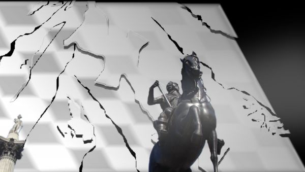
The king's power shatters everything in his path.
only source image used (5 years and 3755 days ago)
I don;t really understand the image, but good luck.
It is a glass chess board shattered behind the pawn (left) and the King (right)
Howdie stranger!
If you want to rate this picture or participate in this contest, just:
LOGIN HERE or REGISTER FOR FREE
(5 years and 3755 days ago)
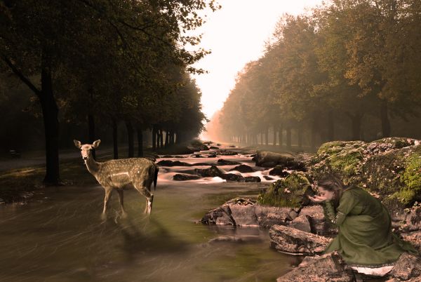
Good idea, but light on deer is opposite the original light source...
Fixed it a bit.
No, you'd have to flip the deer to change the light so much. Light source is from upper left.
Well it looks like to me the light source is coming from the center.
Does it? Is that why the shadows are on our left & the highlights are on our right?
CMYK is right about the shadows. I was going to say somethng earlier about the right rocks and girl layered in but it seems you've improved that.
OK Thanks for all of your suggestions! I flipped the deer to match the light source!  And Nator, the image looks kinda poor without the girl... But I guess it was IYO :P
The girl is fine, IMHO and I think you did a fine chop.GL! 
]
Howdie stranger!
If you want to rate this picture or participate in this contest, just:
LOGIN HERE or REGISTER FOR FREE
hahuahu i like this nice idea.
sad that not more people got the Yellow Submarine reference to the glove... maybe had you colored it blue and such... freakin awesome though!!
Howdie stranger!
If you want to rate this picture or participate in this contest, just:
LOGIN HERE or REGISTER FOR FREE