(5 years and 3827 days ago)
3 Sources:
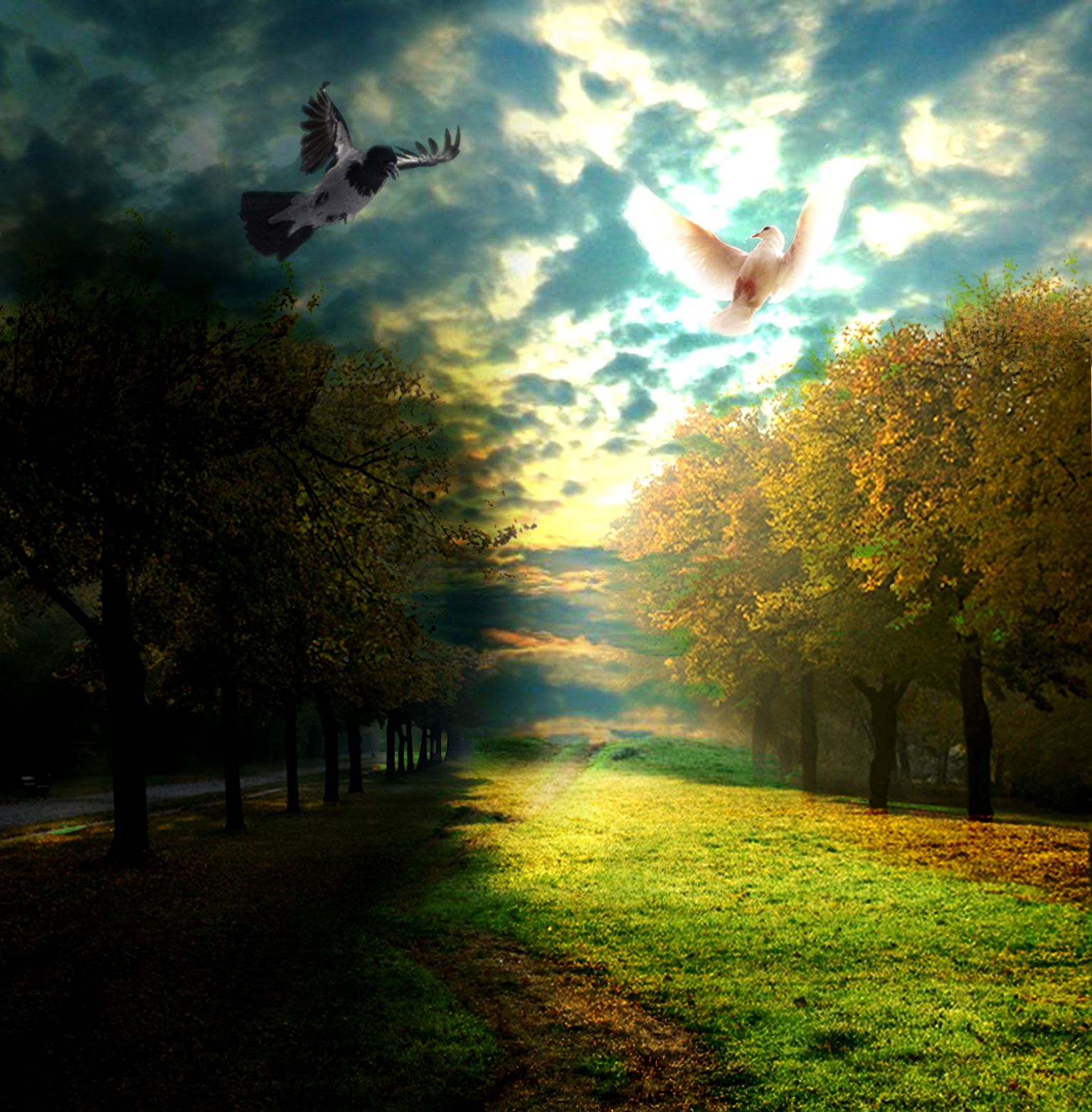
- 1: road to heaven - thanks fd
- 2: pigeon
- 3: crow
(5 years and 3829 days ago)
very nice. Great idea
nice one!
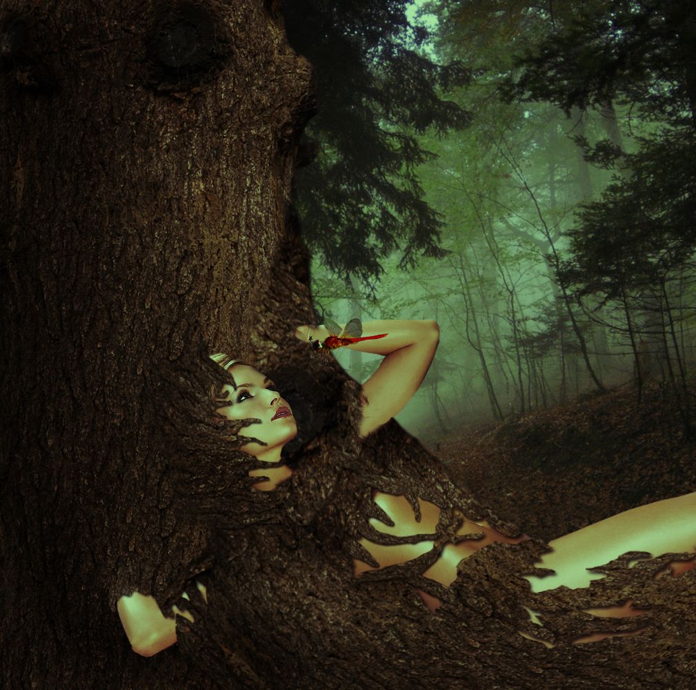
She doesn't look like she's unhappy being eaten by the tree. Maybe another "victim" source might have been more appropriate, but it's not a bad concept.
maybe it feels good to be eaten by a tree CMYK46  some people find pleasure in odd things ;o lol lol lol
Awesome image. Great balance of elements (sex appeal, source image, beauty, nature, color). Love it.
great work 
Congrats
Congrats for your second place, Jaescoe!
Howdie stranger!
If you want to rate this picture or participate in this contest, just:
LOGIN HERE or REGISTER FOR FREE
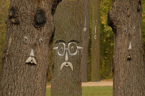
Only source was used. (5 years and 3829 days ago)
Only source? Gotta have a SBS then...
Unique idea but why not add some more tree men in the backround?
some of the trees you added seem really streched... try to take the original tree and use the erase tool to make your shapes.
nice
Howdie stranger!
If you want to rate this picture or participate in this contest, just:
LOGIN HERE or REGISTER FOR FREE
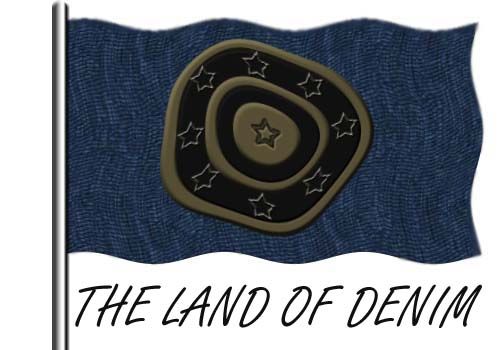
no external source image is used (5 years and 3829 days ago)
This must be a flag but honestly the only thing that makes this entry a country is your title. If there are outside sources useed, you must link them or say otherwise on your description or SBS...
It's an interesting idea, but the central circle is too distoerted...try playing around with this and I think you'll have a better result. Good luck! http://www.photoshopcafe.com/tutorials/dispmap/dispmap.htm
It you used a displacement map, you could give your flag more depth. There's lot of tutorials for it online. http://www.youtube.com/watch?v=Z6G5g3YpSII hope that helps
But where is land? :O
Why didn't you use that suggested technique? It would have greatly improved your entry using a displacement map. You must have run out of time....
Howdie stranger!
If you want to rate this picture or participate in this contest, just:
LOGIN HERE or REGISTER FOR FREE
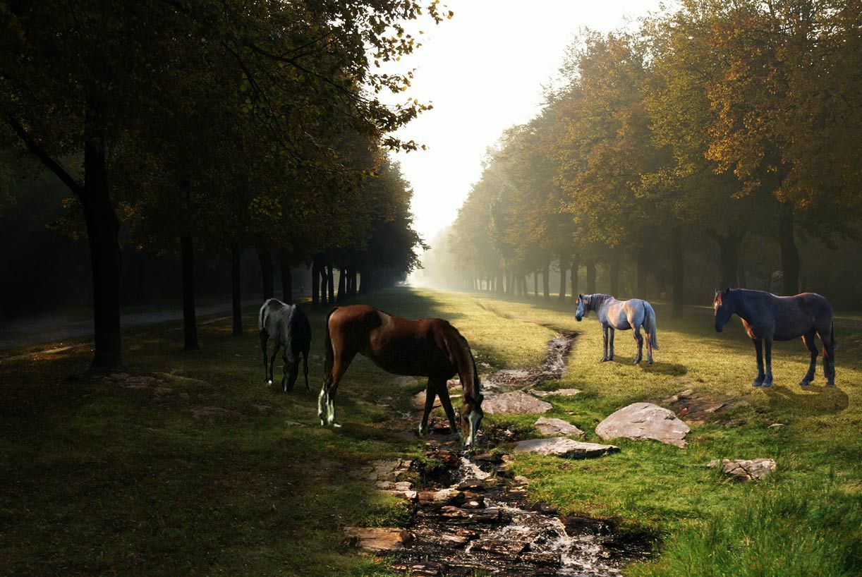
Thanks to Lelaina for the picture of the creek.
Thanks to lastblack for the picture of the horses.
Thanks to zambyoo7 for the 2 pictures of the horses (too) (5 years and 3829 days ago)
Nice job...shadow of black horse needs adjusting.
REALLY nice blend! some of the lighting is a little off on the horses, but very pretty, and you have a great eye for composition.
very nice done
The white horse on the left shoultnt really have a shine from it, its in the shade.
Maybe change the horse on the left completely because its also out of perspective.
I will check the details you suggest to change later. Thank you for comments.
I would remove the horse in lower left corner. The lighting is wrong, the perspective is wrong and it does nothing for an otherwise great composition. 
very nice entry good luck
Image of left horse removed.! Thank you for suggestions
Horses look very small to me, and i feel like the shadows should also be softer, but it's a great blend, especially the stream. Good luck!
Howdie stranger!
If you want to rate this picture or participate in this contest, just:
LOGIN HERE or REGISTER FOR FREE
Photography and photoshop contests
We are a community of people with
a passion for photography, graphics and art in general.
Every day new photoshop
and photography contests are posted to compete in. We also have one weekly drawing contest
and one weekly 3D contest!
Participation is 100% free!
Just
register and get
started!
Good luck!
© 2015 Pxleyes.com. All rights reserved.


very nice work !
Nice idea, but too blown out...
The two birds are a cool concept. Constructive criticism would be that the bright clouds might have too much contrast and brightness.
i hope it`s better now.. thanks
Love it!, i really dont know why, but the skyline doesnt fit whit the image, maybe replace it whit another image?, try to figure out something
Howdie stranger!
If you want to rate this picture or participate in this contest, just:
LOGIN HERE or REGISTER FOR FREE