(5 years and 3840 days ago)

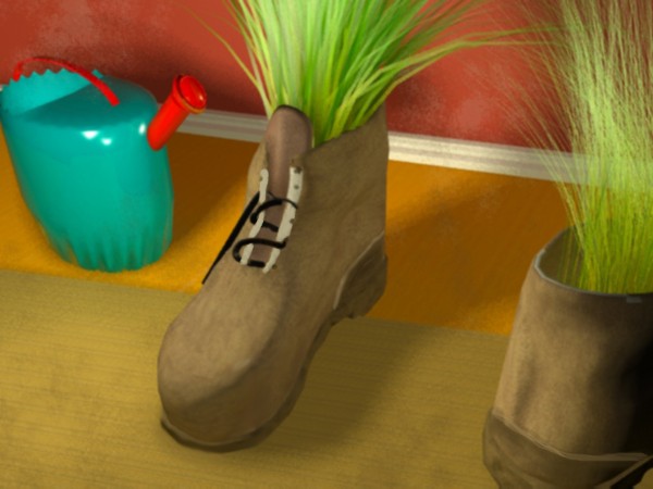
Made with 3DS Max.
Render with mental ray.
Post edited with Photoshop.
No external sources.
Materials are default Arch & Materials from mental ray including the wood map. (5 years and 3840 days ago)
Watering can is kinda tiny...
CMYK has got a good point.
Thanks, fix it. Still not very big cause is a toy watering.
Very creative work 
funny image. looks good
very nice 
Howdie stranger!
If you want to rate this picture or participate in this contest, just:
LOGIN HERE or REGISTER FOR FREE

(5 years and 3841 days ago)
Your guide is very difficult to see, perhaps try it on a darker background. The image itself is very nice!!
the idea of the neon light is good but the choice of the font color combined with the background color is bad. I would suggest to add a shadow to the text so it can pop out a little or to go with a darker backround. Good luck anyway thought
how is this? is it better???? should i put something back...
Glass part looks good, threaded base should be metallic...
Go green, turn your light on? .. Isnt it like better to turn your light ofF?
this is suppose to be one of those light bulbs that are better for you. I forgot what they are called, but the ones with the curl in them.
great 
Howdie stranger!
If you want to rate this picture or participate in this contest, just:
LOGIN HERE or REGISTER FOR FREE

Thanks to zixii -- Flickr,
rocket ship -- Flickr.
(5 years and 3842 days ago)
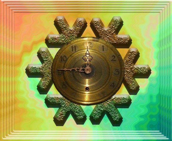
Nice clock ineed 
Thank you Akassa. 
i think it looks too blury. and maybe go with a different background color? Good luck anyway
Graphopoly. Blurry??? I just checked at high res, looks just right to me...
Good luck author... nice idea
well done
It's not blurry. Different parts of the image are in different resolutions which... I guess could appear blurry, but I don't see it. GL!
very nice 
Howdie stranger!
If you want to rate this picture or participate in this contest, just:
LOGIN HERE or REGISTER FOR FREE

(5 years and 3843 days ago)
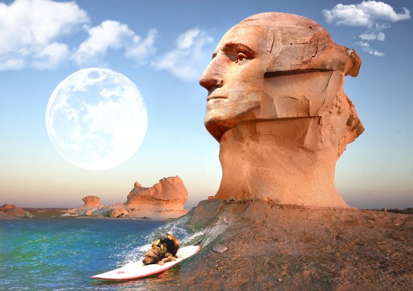
Conflicting light sources, but interesting...
Tells a story. I like it!
overall image look great. i think it could use some work on the shadows but other than that is fine. good luck
very nice 
Howdie stranger!
If you want to rate this picture or participate in this contest, just:
LOGIN HERE or REGISTER FOR FREE
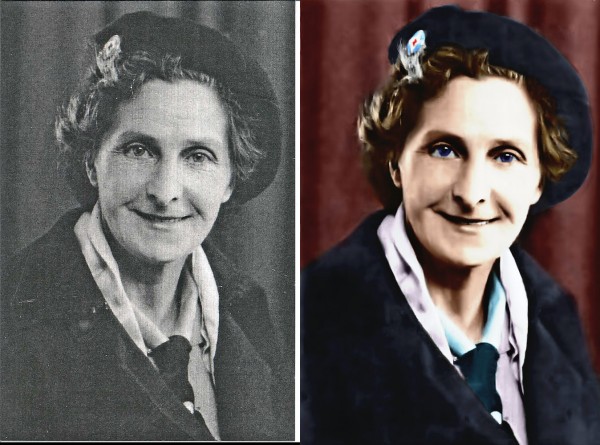
Nice work except for the blur...
Yeah, a lot of details were lost with the blurring... But besides that it's good! =)
nice work, just a little dark imo, well done.
The only thing that looks off is the unnatural color of the eyes. I feel you gave it the blur to soften some of the irrepairable damage. Makes sence. This is still one of the better restores I've seen so good luck to you.
not much is wrong with the original but i will say that the film grain is the most challenging so you get some props for that. gl
very nice
Howdie stranger!
If you want to rate this picture or participate in this contest, just:
LOGIN HERE or REGISTER FOR FREE