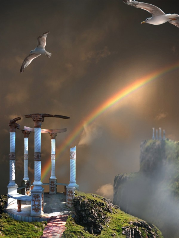
Thanks to:
Lelaina..for the pic of the hills.
mqtrf for the pics of seagulls and sky.
The rest is PS. (5 years and 3875 days ago)
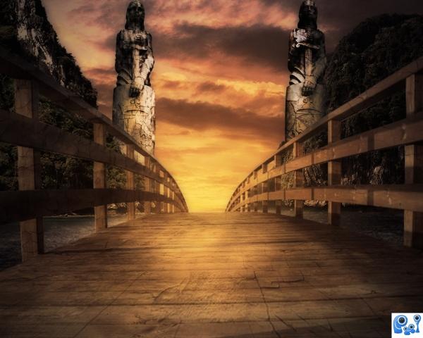
Thanks to Falln-Stock for her wonderful statues (5 years and 3875 days ago)
Nice idea and good colours, but the bridge is blurrer than the statues and I think you should place the mountains and statues lower and reduce them since the bridge is curve and its end probable is lower than the horizon...
I'd flip one of the statues & pay more attention to light & shadow, but nice image...
Definitely flip one statue. They'd look much better facing the opposite way.
Thank you very much all of you, i used dodging and burning to apply light to the figure on the right. Thanks 
nice sbs author !! G/L
reminds "The Neverending Story" - one of the films most affected me in my youth.. i love step 13 in SBS - it's greener and more interesting than final result
I love the feel about your image author. good use of source. 
Congrats for your first place, Matteo!
congrats Matteo! 
congrats! for 1st place.. Very nice color 
congrats
congrats! for 1st place.
Congrats!!
congrats 
Howdie stranger!
If you want to rate this picture or participate in this contest, just:
LOGIN HERE or REGISTER FOR FREE
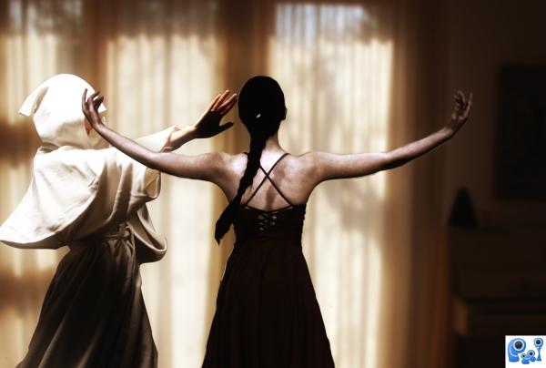
touched for the 31st time... (5 years and 3875 days ago)
'like a viiiiirgin' 
31st time is the charm?
RayTedwell you are right.
Glizzta I picked actual misheard lyrics from http://www.kissthisguy.com/3587misheard.htm 
i think the colour change was a great choice... love the finish.
Howdie stranger!
If you want to rate this picture or participate in this contest, just:
LOGIN HERE or REGISTER FOR FREE
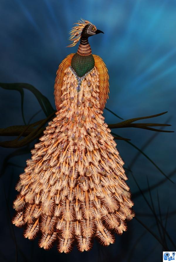
Source only (5 years and 3876 days ago)
Awesome!
Very Nice!
Beautifully done.
awesome 
Very creative entry,wel done!
Thanks to all for the nice comments and support! 
Congrats again another beautiful piece
Howdie stranger!
If you want to rate this picture or participate in this contest, just:
LOGIN HERE or REGISTER FOR FREE
(5 years and 3876 days ago)
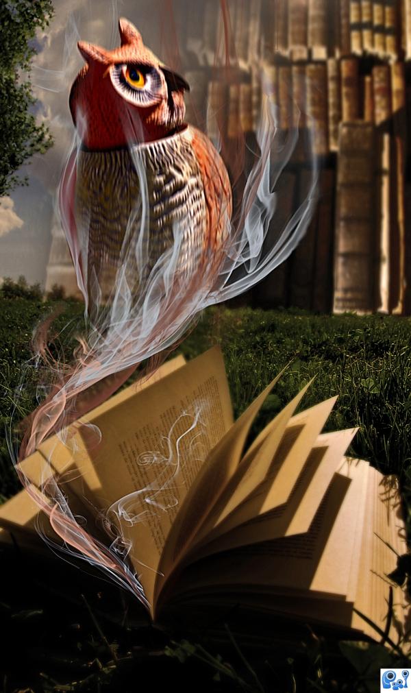
Very nice idea, the image is a bit blurry, other than that - great job!!
thanks ponti, I sharpened it a bit!
Very interesting idea!
Great work! 
Light on book is from upper left. Light on owl is opposite...owl is still blurry.
Play with sharp filter and tool a bit...I love idea..gl author...
The idea was that since the owl is 'smoking' out of the book, it can not be sharp, so I applied the motion blur to it!
Very cool.
The URL for smoke brushes is: http://nowdownloadall.com/servers.asp?pb=4&PID=ad188885-f0de-4cf1-a513-22bebf2bce5b&q=Smoke_Brushes_Set_1_by_Falln_Stock.abr
Howdie stranger!
If you want to rate this picture or participate in this contest, just:
LOGIN HERE or REGISTER FOR FREE
Good mood, but no high res version? Please fix link #1.
very nice work on the lighting
Thank you for your comments....I've tried loading the High Resolution several times, but for any reason, does not do it.... sorry. Link # 1 fixed.
the white thing looks fake, because it stands out too much
Kayaklovegirl: I think it should be a kind of highlights over the pavilion, (if it is the "thing" you talk about). Thank you for comment.
Your high res version is probably too high. Make sure it's less than 2500 pixels wide. Anything much bigger than that might give you issues.
Try to fade the background mountains and make the foreground less faded(fog not in the right place), thats a standard rule to give an illustration depth.
Thank you jawshowwhah, HIgh Resolution works now. Sander, thank you for the tip, I will do that.
Good blend of different sources.. good luck!!
nice choices of stock images. seagulls/Albatros are an interesting touch.
Beautiful!
Great mood.
Thank all of you, for your comments....
Howdie stranger!
If you want to rate this picture or participate in this contest, just:
LOGIN HERE or REGISTER FOR FREE