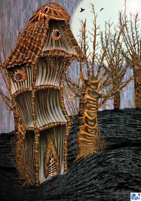
used contest picture (5 years and 3880 days ago)
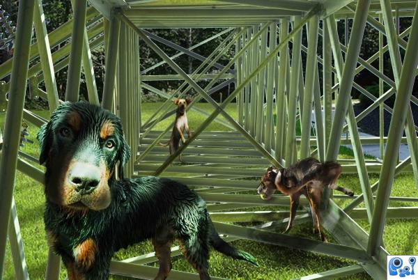
Who else can use these beams better than a dog? (5 years and 3880 days ago)
cool, really funny, I like it.
Nice lighting & shadow...
I like this very much...excellent lighting...would be really cool if you had longer blades of grass covering some beams. 
Great work...fabulous dog's playground....gl author...
In high res, it needs a little work. For one thing, the dog in front is a little green. A gausian blur would have helped your beams layer look more clean cut, since I noticed a lot of choppy edges.
Very nice shadows.. pretty much perfect! A great use of source.
Nice colors...and a good job... good luck
My fav on this contest. Good idea, humour, blend, color... I love it..hope will be where it deserve...on 1st
Nice work...I agree with Jawshoewah's comment...but overall its pretty nicely done.
Thank you everybody for your valuable comments. I'll try to avoid the errors you pointed out in future works.
Edges need a lot of work but, love the dogs. GL
Howdie stranger!
If you want to rate this picture or participate in this contest, just:
LOGIN HERE or REGISTER FOR FREE
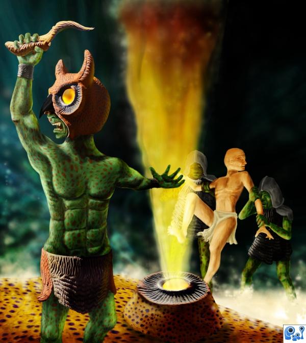
Hitch hiker's handbook tip 42: In case you see a warning sign saying that you're about to enter an area where some unknown hostile tribe lives who were so unfortunate to get a curse some centuries ago...then do NOT ignore that warning!
Only source image and photoshop. For the guy in front I looked at 2 references (one to see how a body looks like, other to see how a lifted arm would behave). See SBS how things are done. Please do not forget to check the High Resolution version before you vote.
Thanks.
Edit: improved some spaceranger issues :-) & softened some edges here and there (5 years and 3880 days ago)
great entry
Ahh...guess who's coming to dinner? I like this, just a couple of tweaks... the left arm foreshortening is a little off. His wrist band should be shorter now it looks as long as his forearm. At that extension the triceps would be more pronounced and we'd see more of the lattisimus dorsi muscles. The forearm would be larger in diameter where it's closer to us and get smaller at the wrist. The rim light on the figure (camera left) should extend to the clothing and leg as well. There should also be some reflected firelight on his owl mask as you have on his neck and arm. Very nice work GL!
Great entry, and a very good job... nice imagination.. gl...It reminds me of Mel Gybson's "Apocalypto". 
I like the color and illustration, but there are a lot of hard edges that could be softer...the hard edges cause a cut/pasted look. The hand on the left of main figure...the fingers have virtually no shadow. Other than that...it's very nice! 
Oh, scary! 
Nice job!
Wow,but not world of warcraft...lol....great work author i love this....
Great concept...but and there always is a but. The illustrated portion of your image looks disjointed from the source image. Also the front creatures right arm looks odd. Keep choppin'!
great job, very good working on the flame, good luck 
Thanks for the nice comments and votes, always appreciated.
Congrats, Henk! 
Congrats Waz, wonderful work 
Congrats for 1st....
congrats on your first place
Congrats, love the shaman!
great job waz
wow, very nice, great job as usual author 
Congratulations!
Congrats! great work
A ritual it is......
congrats!!... well done...
congrats
Congratulations, Waz! 


Congrats!!
Howdie stranger!
If you want to rate this picture or participate in this contest, just:
LOGIN HERE or REGISTER FOR FREE
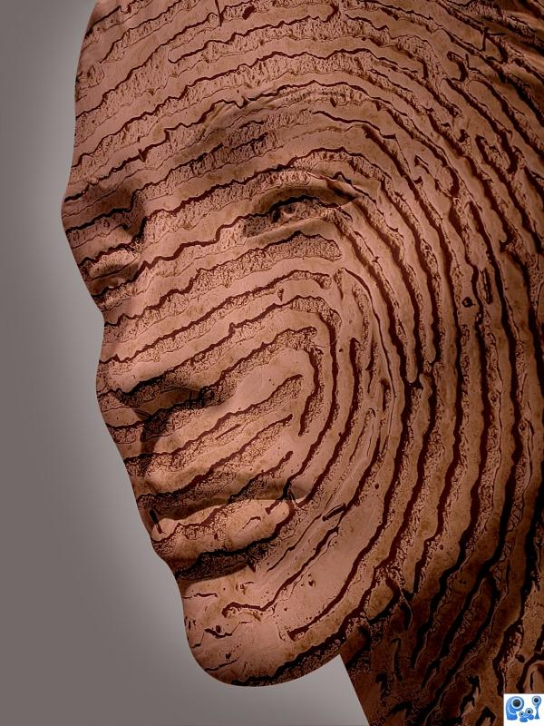
(5 years and 3881 days ago)
Nice entry, very good SBS as well!
Nice looking work. Just one suggestion: it would be even better if you had used a displacement map...good luck!
Very goos.
Oops, soory Meant GOOD 
I agree with CMYK, this would have been perfect for use with a displacement map. It's still a nice image though.
Either displacemment map or even liquefy some of the edges of the source to make it fit the curves of the face more.
Nice job.
The idea is nice, but you could try to improve it by giving the texture depth and shading.
I like your image author, i think you have applied the source very well. GL
Howdie stranger!
If you want to rate this picture or participate in this contest, just:
LOGIN HERE or REGISTER FOR FREE
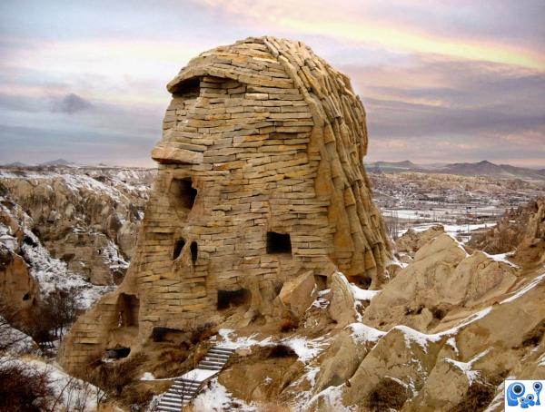
(5 years and 3882 days ago)
Nice 
Very good blend and a nice image. Good luck!
Wow! Great!
Good idea & good blend. Since there's snow on everything else, I'd put some snow on the head, too...
Wow that's tight blend. GL.
I like this very much...really nice blend.
Very nice work Author.
Congrats!
congrats! 
Congrats!!
Howdie stranger!
If you want to rate this picture or participate in this contest, just:
LOGIN HERE or REGISTER FOR FREE
looks great!!


Beautiful work and so different!
Great job! Now we just need to see what or who lives in this cute little house. GL
Congrats, really nice work
congrats on your first place
Congrats!
congratulations...
congrats

Congrats!!
Howdie stranger!
If you want to rate this picture or participate in this contest, just:
LOGIN HERE or REGISTER FOR FREE