(5 years and 3812 days ago)
- 1: erikdungan
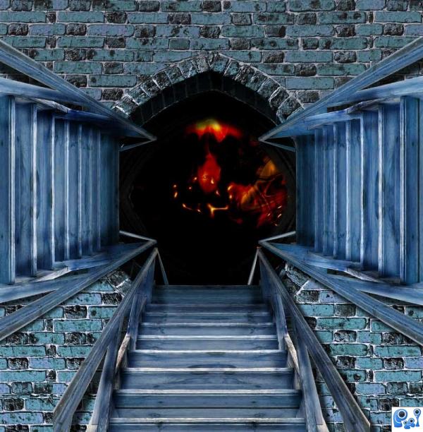
Thanks to Kevin Rosseel, Washington, DC (5 years and 3812 days ago)
Good work... I'd like to see the hi-res. It seems the stairs are more blurred than the image behind...
Agrees.
nice colours. HR would have been nice.
very nice 
Howdie stranger!
If you want to rate this picture or participate in this contest, just:
LOGIN HERE or REGISTER FOR FREE
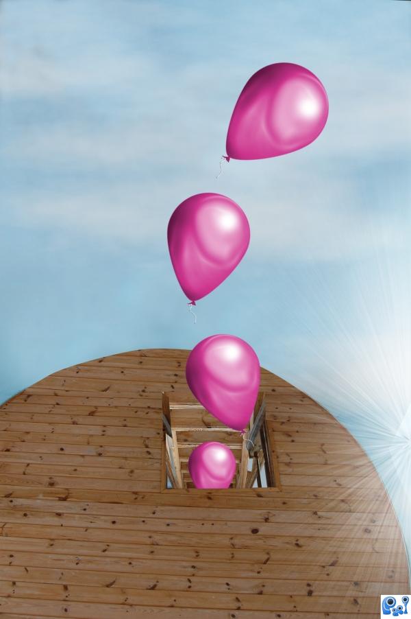
used only source and skills I had learned from the linked tut (5 years and 3812 days ago)
looks quiet good author  i like it anyway
i like this author. the concept is creative and nice balloon colour choice.
Thank you for your comments.
Something very inviting and warm about this image. Nice job, author.
great 
Congratulations for 3rd
Congrats for your third place, sjsmiuk!
congrats!
Thank you.
congrats
Howdie stranger!
If you want to rate this picture or participate in this contest, just:
LOGIN HERE or REGISTER FOR FREE
(5 years and 3812 days ago)
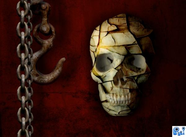
Eye holes need more shadow...
Thanks CMYK. Fixed 
glad i held off voting. the shadow change is much better.
nice composition.gl
very nice 
Howdie stranger!
If you want to rate this picture or participate in this contest, just:
LOGIN HERE or REGISTER FOR FREE
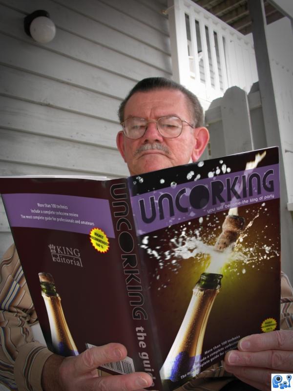
Be the king of the party with this fantastic guide. (5 years and 3812 days ago)
Great blend! Even in high res it's really convincing. GL author!
agree, wonderful blend..nice image
Great job, author! Just in my opinion...the bottle on the back cover would better if it were more subdued or darker than the front. 
very nice 
Howdie stranger!
If you want to rate this picture or participate in this contest, just:
LOGIN HERE or REGISTER FOR FREE
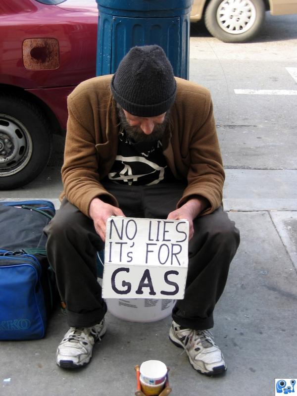
*LOL* It's funny but not much use of photoshop. The font doesn't match the rest of the font on the sign It's not the same resolution. Try a smaller pencil tip and adjusthe contrast and blur some to match. There's some spots you missed on the edges of the sign as well..
Great job, to me it looks good, the bigger font is similar to the one in the original image and it draws your attention. Good luck!
the sign looks fake
how can you say the sign looks fake rofl... do you not look at the source images to see what someone has done lmao... i think it clever author, well done
who stole the gas tank flap? I like the font, it is visually drawing to the eye .. simple but effective work author ... GL
nice work but this isn't funny ;P hehe gl
Howdie stranger!
If you want to rate this picture or participate in this contest, just:
LOGIN HERE or REGISTER FOR FREE