(5 years and 3837 days ago)
this is first time for me here,soI made something easy , and i didnt want to use any filter on my work (5 years and 3837 days ago)
Very nice work - good use of the source image. Personally I would prefer it facing the other way round (catch on the right), but that's just a very minor thing. Good job author.
I don't see the source image.
Welcome... next time try to use more of the source image...
I really don't see the source image either… sorry… I see how you used it in the SBS but that was the only way I figured it out.
nice job.gl
all my work is from the source image, but maybe the part which I took was kinda small,next time i will take something bigger, and still i will add more step to show which part i used
Howdie stranger!
If you want to rate this picture or participate in this contest, just:
LOGIN HERE or REGISTER FOR FREE
Please see SBS for details of execution. Enjoy!
credits and thanks:
http://jusuart-stock.deviantart.com (5 years and 3837 days ago)
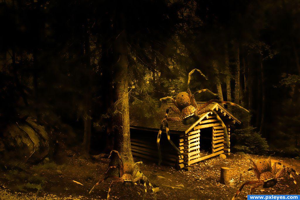
I like the mood, however, you should add a shadow and try to remove the white outlines from the spider, other than that there's not much else to do, although it would be more eerie if the spider was darker and hangin from the trees. Just my opinion, good luck.
I'm with pontiSS - I feel the spider on the cabin is a bit inanimate - if you can 'bring it to life' you'll have a great chop!
Scary... Good job!
nice job
I love the mood of this image but I'm missing the final details like shadows. The spiders have a bit of a cut&paste feeling, this can be solved by adding shadows, both on the spiders and the surroundings. Hope you have time for some adjustments. I think, when done well, it's really worth the effort and will benefit the image.
Add some shadow author and work will be perfect....
sscaaary... good job 
i like the work you have done to the background compared to the original image
wow great work
Spooky Halloween mood!
Congrats
Howdie stranger!
If you want to rate this picture or participate in this contest, just:
LOGIN HERE or REGISTER FOR FREE
not very good at reporting.. I do try though (5 years and 3838 days ago)
good, something different, i like the fact it's against the wall! Good luck
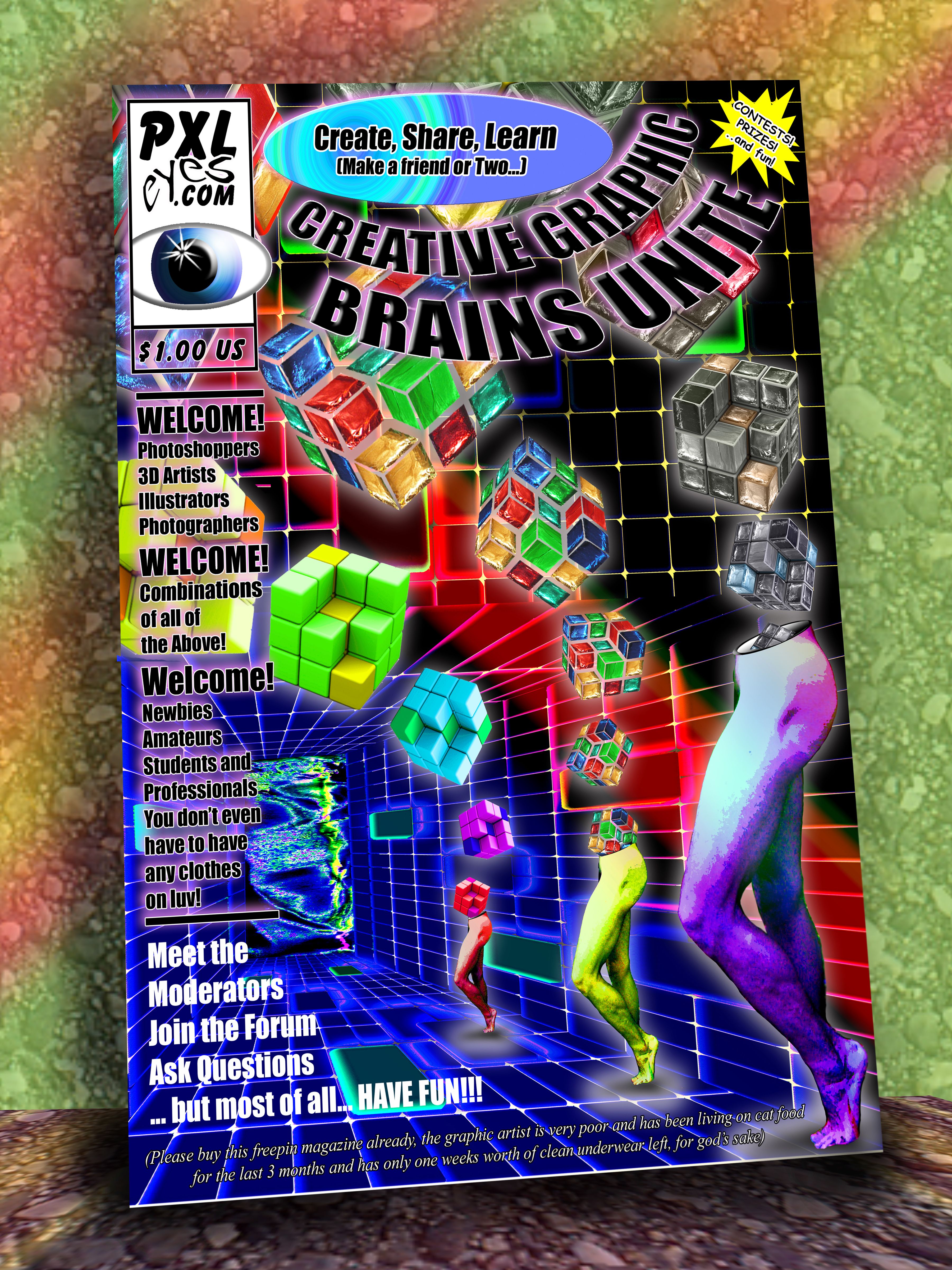
Edit: The only spelling error I see is Combonation instead of Combination. 
got it
nice
hahahahha...great stuff!! Good work!!!
A fantastic entry - love it - a little cheap though, I'd pay at least $4.99 for a mag that had a cover that attractive. I think it's also great to have put the mag against a background.
The cover has an eyecatching graphic, would certainly get your attention. I'm not completely sure about the contents or in fact what I should expect in the first place since there's nothing explained but the lay out of the page is there for sure with consistant use of typograpy. Perhaps you can put some text above in white, so it's in better balance with the lower texts (which are already white). Good luck!
the actual art/manipulation of this is pretty interesting, but lose the bevel on the "create, share, learn" it's totally out of place for a magazine cover. I would focus on an edit that wasn't so "busy"
the oval at the top looks as if it standsout from the magazine, so sets it off from it.
Annabat and Tapiona GOT IT (I think it happened when I was shrinking the image and I forgot to flatten the oval.. It sure got fat right quick LOL (fixed).. and Waz.. thanks.. I used the white text to counter balance the white in PXL logo (I thought there was too much).. I think Flattening the oval did the trick .. THANKS GUYS
great graphic cover. I LOVE THE PRICE> bets the heck out of the $15-$25 Australian average cost here. GL
read the SBS...really good job there...good luck
oh my eyes!!!Too much colors
not bad at all author, atleast you used your OWN imagination lol.... goodluck, you got my vote.
very nice
Howdie stranger!
If you want to rate this picture or participate in this contest, just:
LOGIN HERE or REGISTER FOR FREE
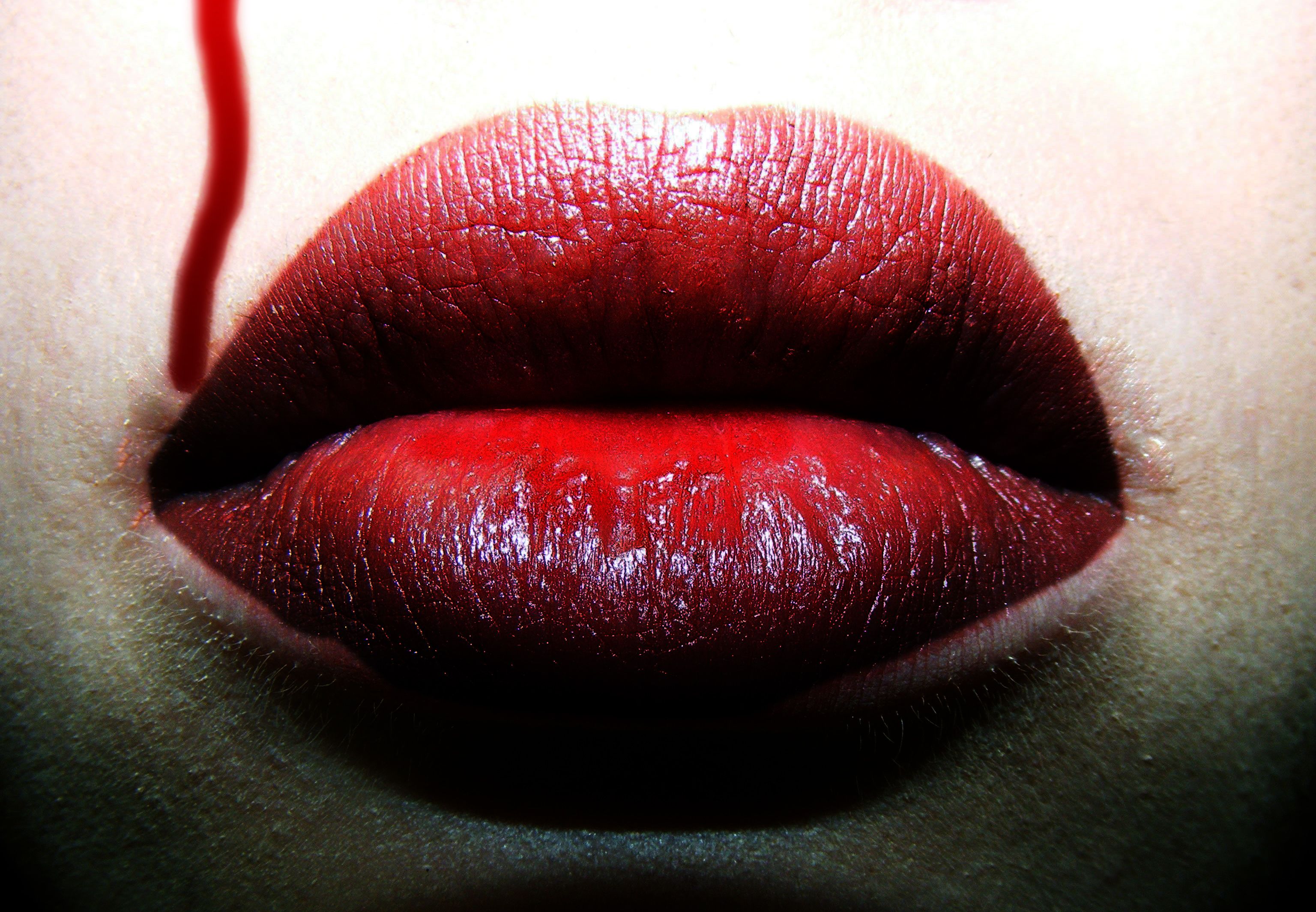
My first entry on here.
please take a look when the picture's shown as small.
I think it has a special touch then. (5 years and 3838 days ago)
Looks a bit simple to me, and the lower part is too dark, but i like what you did with the lips themselves, the look evry luscious. Good luck!
Updated my picture now. Thank you very much for those tips.
It's a better treatment than some, but in high res you can see the filter effects. The blood drip doesn't match visually here because of it.
Nicely Done!
Howdie stranger!
If you want to rate this picture or participate in this contest, just:
LOGIN HERE or REGISTER FOR FREE
Photography and photoshop contests
We are a community of people with
a passion for photography, graphics and art in general.
Every day new photoshop
and photography contests are posted to compete in. We also have one weekly drawing contest
and one weekly 3D contest!
Participation is 100% free!
Just
register and get
started!
Good luck!
© 2015 Pxleyes.com. All rights reserved.


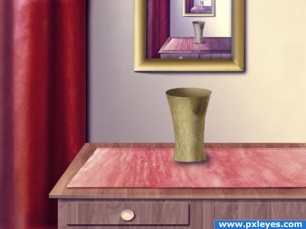
I like this...perhaps save a high res version. It's hard to tell...but it looks like you could possibly use some softer edges on table and vase. Nice work, though!!
I agree with pixelkid.
thanks, I will try to fix it
nice
where's the flower?
nice idea
fixed the vase
Howdie stranger!
If you want to rate this picture or participate in this contest, just:
LOGIN HERE or REGISTER FOR FREE