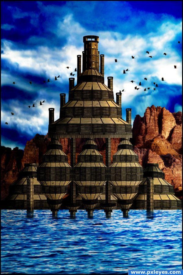
Thanks to geverto (http://geverto.deviantart.com) for the crushing brushes. (5 years and 3907 days ago)
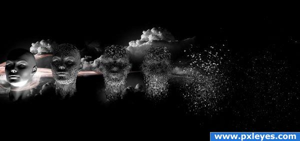
(Please see High res)
demonstrates creation of cloned human life from particles of previous generation of human existed.
sbs on its way
model created in c4d (5 years and 3908 days ago)
looks fantastic
hold up. i've been waiting on a 2 step sbs? that doesn't explain anything? :-S
@elficho, tell me what you want to see and I'll tell you how I did it.
Why not just post a decent SBS in the first place...? Some of us don't know how this stuff works. Actually, was any of this done in Photoshop? Maybe it should be in the 3D section.
@CMYK, overall it's still a digital artpiece and it would worth nothing without the photoshop touches (background, glows, etc.) the following may be a more detailed work progress: 1. I opened a 3d model that I made in cinema 4d software. 2. I duplicated it 6 times. 3. I applied explosion effects on each one of them with different initensities. 4. I loaded the rendered image in to photoshop and put some clouds in the background. 5. I applied waves filter on a lens flare to make the glow. That's pretty much as detailed as I can get, hope that answer your questions.
Amazing idea, i like the final result, you're very creative.
wow!
beautiful!
I truly like the idea. I just started using C4D and know, as you stated, the explosion is a preset effect that is just applied and allows you to run though each stage of the explosion from the segment/intensity amount set. Seems this is a simple use of preset effects in both programs...maybe show how you created the model and add to the SBS to show the work you put into it...Think it will get higher votes, especially from people who know the 3d modeling software. Nice finished product though.
This is a unique entry. I am not sure how this is considered cloning but still a very unique and detailed entry.
thanks all, @woodztockr, you are right that this is a simple use of presets in both programs and I did not say it is anything more. If you get more in to c4d, you'll know that going back to the modelling stage of a face is not such a easy thing to do. And I just realized that the model I used was actually done in zbrush, I followed some tutorials to create it. so you probably can google the tutorial yourself and thank you for the advice. @jawshoewhah, please read the description, thank you for the kind words.
see author, i did not know you can do these things with a couple of clicks. you really should post a decent sbs for a change. you have some pretty cool stuff in your portfolio, but not one good sbs. i don't see a point in making them if you're gonna show me 2 steps without explaining anything. this is a great entry, but you could have taken the head model from another author for all i know correct?
fantastic entry, I would LOVE to see a SBS for this!
this looks sooo cool
LOVE the entry............HATE the SBS!
@elficho, generating a c4d face is really not that hard, there are many programs to help and personnally I used facegen and zbrush to do mine, you can google them. sorry, it's already thursday and I don't want to spend any more time on it/
nice image and effects but i don't see how this is cloning
Amazing!
beautiful job 
Congratulations for 2nd
Congrats for your second place, Neverlander!
congrat to you 
Congrats 
Thanks all!
Congrats
Howdie stranger!
If you want to rate this picture or participate in this contest, just:
LOGIN HERE or REGISTER FOR FREE
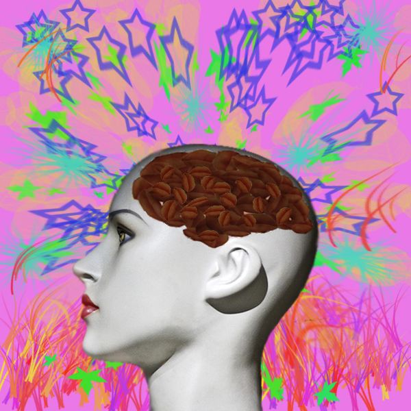
First I selected the lips, I changed the colour, in new layer -> Satin, i did this twice. Then I used a brain pattern and applied the lips, using Move Tool, and adjusted the size and position of the lips, I used merge layers. Then I made a new layer which I painted, then Filter -> Distort -> Pinch. After that I placed the head. Over the head layer I placed the Coffee_brain layer and adjusted size. (5 years and 3908 days ago)
Good idea.
oh i just got it! i think the environment you put the beans in is weird but i kinda like it 
Really, the last thig I would think of was coffee  Nice idea
extreme clever use of source... good luck author
this is interesting i think if you had hidden the brain that came with the original picture it would have looked fantastic
lol.....this is your brain on......nice
Very clever use of the image!
Howdie stranger!
If you want to rate this picture or participate in this contest, just:
LOGIN HERE or REGISTER FOR FREE
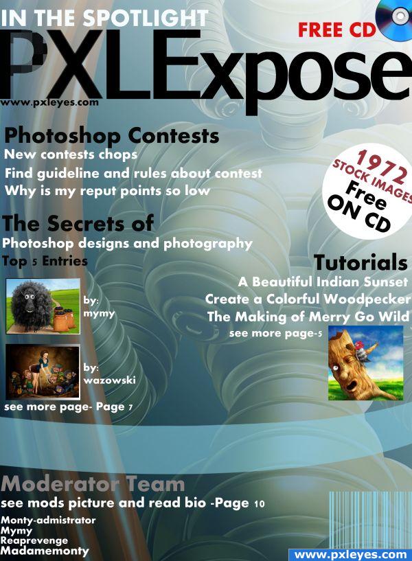
edited.
thanks to the following members
mymy
wazowski
krigios
mqtrf
(5 years and 3909 days ago)
Not bad, but some comments. First of all, the texts you used are too small to read. I cant read them in small version, while the canvas of the magazine is quite big. So the proportions are not ok, imo. If you'd be in a bookshop and see this magazine, no way that you'd be able to read the cover. Other thing is that the texts seem to get off from the cover. Put them a bit more inside the image, will read better. "In the spotlight" is nice, but why you aligned it with the X? I can imagine it would fit well above PXLE or next to that, aligned with to top (so above "xpose" ). Free cd is also always welcome, but you wrote it 2 times, not sure if that's necessary. Your use of colors is ok, it has some computer/ICT- look and feel. And you're consequent with the use of black and white for your texts (which is also good, imo).
Ow, and you have permission to use my image  .
.
Good luck!
I agree with wazowski, the print is too small, but i do like the image and I think it's a nice looking cover!
Where's my free CD? You really should invest in some better sticky tape!  Lovely entry!
Wow! nice
wow, great improvement!!! Looks really great!!! good luck author!
what ladybug said..HUGE IMPROVEMENT and a very fun read
not 100% sure, but i think barcodes must be black on white
Yep, looks better already  . Good luck!
wooohoo another person that did no actual photoshop work!!! just texting lol
Howdie stranger!
If you want to rate this picture or participate in this contest, just:
LOGIN HERE or REGISTER FOR FREE
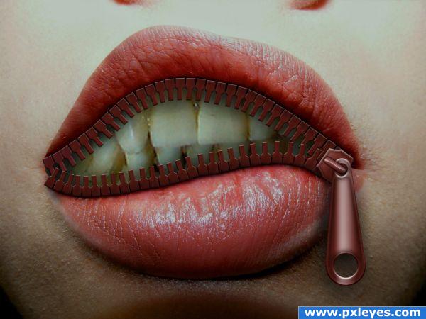
No originality here. Just playing with the zip I learned to draw ;-) Beside, couldn't find a high resolutiion skull to place behind the face. (5 years and 3909 days ago)
More original than most...nice job. (SBS might be good too...).
Great job,lips curve is great but zipper dont have a border teeth,so u can really force her to shut up....
Nice job. Maybe not make the shadow of the zipper so neutral. Warm it up a bit...
i didnt think something like this was possible its great
nice... was there a source for zipper and teeth?
Excellent image.. very very nice.
Thanks people. Chuck, the source for the teeth is a skull [source 1]. The zipper I did by myself following a tutorial. I placed a link in the SPS for a tutorial on drawing a zipper - nice one.
i like you zipper better than the one on the tutorial
Spare my blushes Kayaklovergirl! It's not all that  Thanks.
aww the skull would have been fricken awsome author lol, but hell this is pretty damn good anyway  got my vote mate.
I like the manipulation of the lips, it's LOVELY, however, the zipper part needs to be incorporated a bit more, The zipper and the zipper endings don't match shading wise, and the ends on the left don't look like they would actually zip. If you added more shading on the top zipper it would be a bit better, as the lips themselves would be blocking the light that was hitting them.
original idea.gl
love it...but i think it's good if the pic more bright...good luck 
good job  agree with the left side on the zipper. Nice tut reference too
Very nice..
GREAT STUFFF
Nice work, good luck
Congratulations for 3rd
Congrats for your third place, Divair!
congrats
congrat divair 
Congrats 
Congrats! Way to go!
Howdie stranger!
If you want to rate this picture or participate in this contest, just:
LOGIN HERE or REGISTER FOR FREE
Gee, i wonder who the author is!! Stunning visuals as usual
Great work ! Very nice image!
nice job
Excellent chop - and far be it from me to comment (I'm a mere pleb!) - but might the tiniest amount of blur on the moutains help separate the factory from the background? [I'm prepared to be flamed!]
Yeh it might help... i already added blur but it's probably not enough.
Agrees with Hippunky, but still nice imagination.
Well Done!
Looks good... gl
nice work.
Very well constructed space factory. Love the colors
great
Akassa..... nicely done, congrats for your 10th place too
Howdie stranger!
If you want to rate this picture or participate in this contest, just:
LOGIN HERE or REGISTER FOR FREE