(5 years and 2801 days ago)
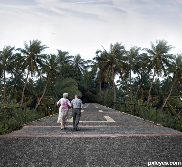
I always wanted to do a manipulation that was completely realistic, without any effect, at most, a treatment of light and sharpness.
I know how this result was simple, unattractive (but was very difficul to manipulate!), but for me it was a new experiment, I know myself, I have a 'heavy hand' to manipulate and always end up exaggerating on effects, colors, light, shadow, as well surreal creations or pieces full of fantasy.
All I wanted, all I needed was to know if I could get close, very close to the real.
I hope that in the opinion of you, I've done it!
Thank you for the support guys! (5 years and 2802 days ago)
Great job, and realistic indeed! I especially like the wire you added. 
Just one thing: I think you should check the palm trees again.
The top parts of the highest ones are a bit cut off and on both sides (with that I mean the trees on the left and on the right of the bridge) you can still see the straight line of the blue sky from the palm tree source. Maybe you could try to blend that a bit better 
I hope that's halfway understandable, I rephrased that 3 times 
Good luck!
Hello dear, thanks for your comment.
I have a calibration problem on my pc, what I use Photoshop.
After your commetn, I opened my laptop and I could see the fault.
God, in my pc nothing appears, but in my notebook I can see!!! Horrible!!!
Now I'm looking at the image on the notebook while I try to fix it on my pc. I'll post again and look by the notebook. As I see fault, I will trying to fix! I'm trying to calibrate my pc monitor, but nothing changes! THANK YOU!!!
UPDATE:
I fixed twice, the second worked!
But I fixed the jpeg image, so I could only give a disguised on top.
Thank you so much!
Nice work. To me the figures seem too small, and a SBS would help us see how you've made this. GL author. 
Refers to the couple? Well I have resized a manner consistent with the wire. You see, the elbow of them fits the height of the wire, as it usually is, imo.
Awww... sbs.... i'm soooo lazy!!!
Thanks for the comment, CMYK!
You did a good job blending the road and the palm trees. There are small details that you can fix, knowing the quality of work you do. The palm trees look very symetrical and some of them are identical. It looks like you cut a picture in half and flipped horizontally. Some of the foliage and palm trees on the right side, look the same as the one you placed on the left side.
About the walking couple, they look small as Bob says. I think correcting these details, you will have a good image. Good luck author.
Thank you for your comment, George.
On the part of the palm trees, you're right, they were repeated and I had not noticed that, my mistake!!! F A I L!!! Hahaha.
Unfortunately it was too much work, and I think I will not touch on this piece anymore (I think I should continue with my fantasy / surreal style!!!!), this entry does not deserve much attention.
I liked the fact that the experiment to do something realistic, but say that I liked the art, no, i don't!
Now, as I said to Bob, about the size of the couple, I expanded the catwalk (is that word??) has to give a feeling of open space for people to walk, and I resized the couple according to the size of the wire. If they happen to touch the wire, the elbow is at the level of support, and in my view this part is consistent. You are looking at the size of the entire environment, so are having the impression that the couple is small.
Thank you , George!!
Yes you are right, about the walking couple, it could be an optical illusion. It is about what you have in mind and what you want to achieve, and it is a lot of work, just thinking.... Good luck my friend!
A simple and straightforward job. Romantic and flashy!
Congratulations!!
Great job on the couple, that looks very real. 
Howdie stranger!
If you want to rate this picture or participate in this contest, just:
LOGIN HERE or REGISTER FOR FREE
Thanks to:
MJ Ranum
Krista Johanson
(5 years and 2802 days ago)
almost looks like an illustration for a movie poster.. great job  GOOD LUCK
Thank you so much, Driven!
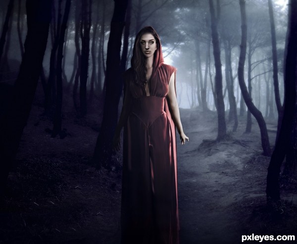
Good mood & color!  Maybe it's just me, but the mouth looks to be slightly crooked.
I dont know, CMYK, maybe not even good, I think too much sharpen 'highlighted' the contour of the lips... hmmm...
Author, if you don't mind a suggestion, I think there are too many highlights & not enough shadows on the shadowed side of the lips. See what you think. 
I fixed her mouth, you were right, was crooked!
I also added a shadow on the darkest part of the face (and lips), I did a 'before and after' (on SBS section) to compare. I hope i'm done!! Thank you!!
Nice colors, and nice setting for the girl. It gives me an eerie feeling of murder by deception. (Just me) Good job!
Thank you so much, George!! I liked your interpretation of the scene!!!
Howdie stranger!
If you want to rate this picture or participate in this contest, just:
LOGIN HERE or REGISTER FOR FREE
(5 years and 2802 days ago)
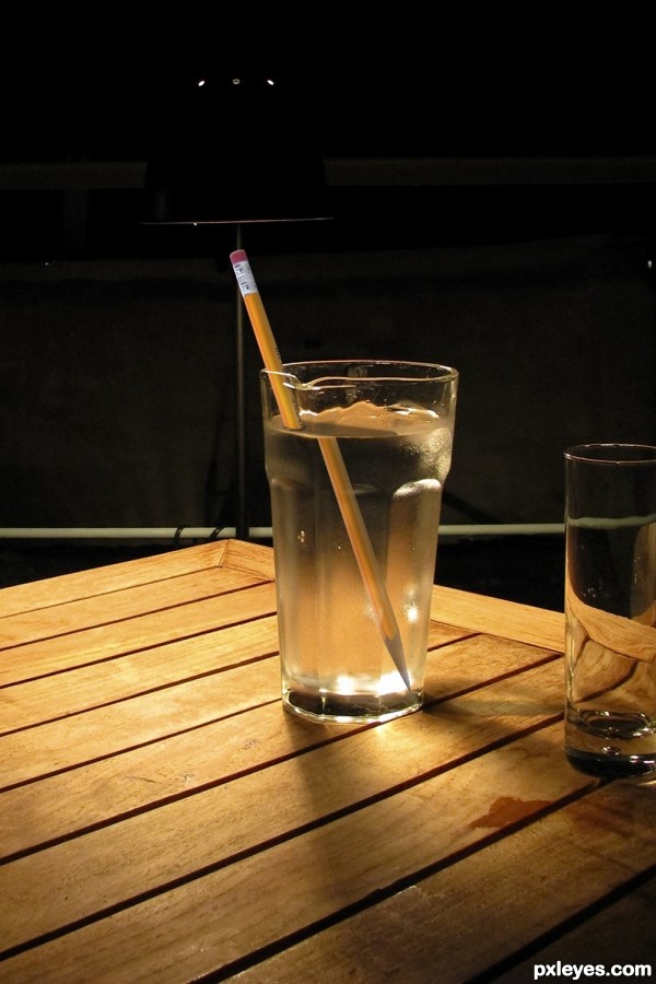
Great idea, try adding a shadow for the pencil though.
added some shadow, hopes this is improved  THANKS!
Nice fix. I think I can even see a reflection of that pencil in the other glass
oh you don't know how I thought about doing that LOL but I am a lazy butt
Howdie stranger!
If you want to rate this picture or participate in this contest, just:
LOGIN HERE or REGISTER FOR FREE
(5 years and 2802 days ago)
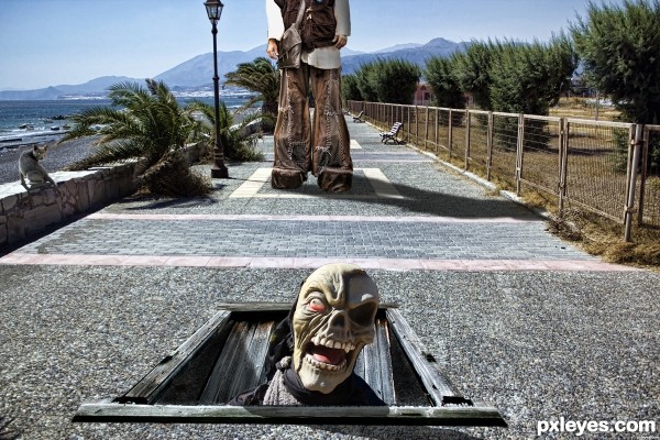
Great work! Love how you've integrated the cat into the scene.....
LOL this one is funny! excelente!
Love the trap door idea! LOLLLL 
Howdie stranger!
If you want to rate this picture or participate in this contest, just:
LOGIN HERE or REGISTER FOR FREE
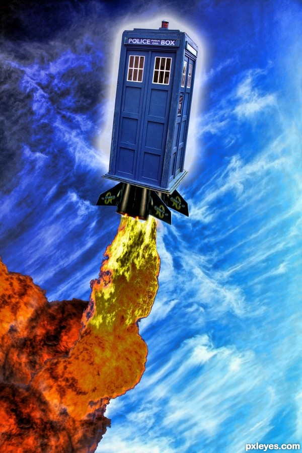
the idea is beautiful, the fire maybe you could do it better.
just my opinion, it is a good job
Is the doctor's wife inside the phone box, trying to fly away from him? Or is she dating an alien from outerspace? Who knows, the idea is yours, and you did a good job. Nice colors BTW! Gl author.
It's a Doctor Who Reference.
http://www.nerdist.com/2011/05/the-doctors-wife-review-spoilers/
One of my favorite shows
Howdie stranger!
If you want to rate this picture or participate in this contest, just:
LOGIN HERE or REGISTER FOR FREE