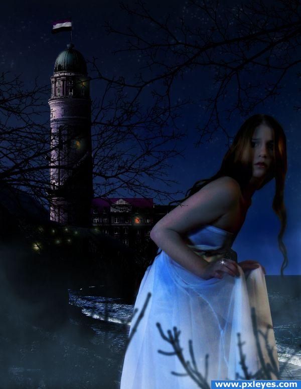
(5 years and 3875 days ago)
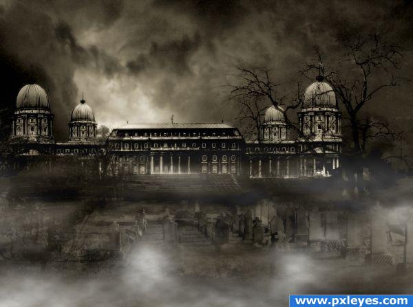
For the mist I used this tutorial.
http://www.redbubble.com/people/alisonjohnston/journal/906885-making-fog-mist-in-photoshop (5 years and 3876 days ago)
I like dark scenaries :3 maybe this one is a bit too dark and details are difficult to see but it has great colors..
nice
Nice and spooky theme, great manipulation.
Nice blending, but would love if you had saved a high resolution version. Great mood!
Creepy... AMAZING! :bigtumb:
Good work, but I preferred it in step 9, looks more centered 
Foreground perspective is off...
spooky
Howdie stranger!
If you want to rate this picture or participate in this contest, just:
LOGIN HERE or REGISTER FOR FREE
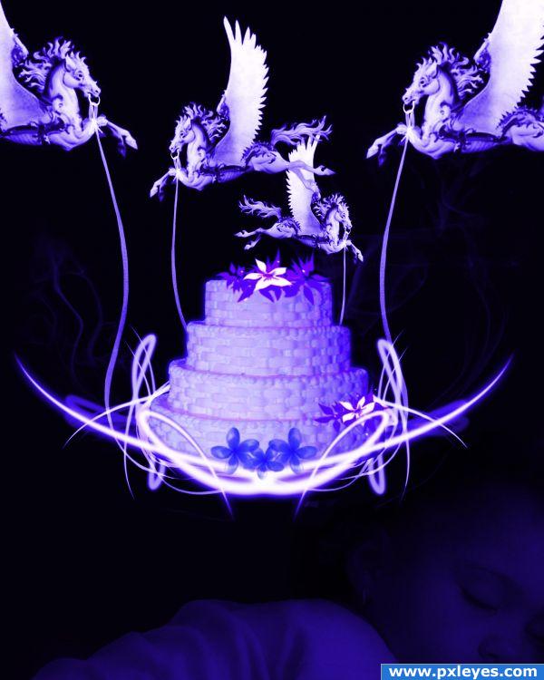
"Hush-a-bye, don't you cry,
Go to sleepy little baby.
When you wake, you'll have cake,
And all the pretty little horses."
Sources used:
DSC_0216_f.JPG By mensatic: http://www.morguefile.com/archive/display/231556
"Carousel Horses" brushes by Teesbo: http://123freebrushes.com/animals_photoshop_brushes/carousel-horses-cs2-brushes
Ribbon and smoke Brushes are old and will have to search for source....(ok, they are in SBS)
Flower Mega Pack Brush set by hawksmont: http://www.brusheezy.com/brush/544-Flowers-let-s-say-MEGA-PACK-
Child Image from my own personal stock. (5 years and 3876 days ago)
Source one is copyright Manassas Cakery, no source link for sleeping child.
author.. place the original image of the sleeping child in a step by step etc... and get permission from the source.. I think they would love this 
Great job! And great SBS! GL 
beautiful work
Howdie stranger!
If you want to rate this picture or participate in this contest, just:
LOGIN HERE or REGISTER FOR FREE
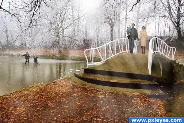
the banister finally received a painting and the park keeper used a broom to remove the fallen leaves.
After the sun came out on this cold and slightly foggy winter day the young family decided to go on a stroll and gave the kids the treat of doing some icescating.
Hope you like it. :) Please have a look at the full res. (5 years and 3876 days ago)
this has a very strange 60s feel.. I think it's her coat.. I love the work on the "ice"... very different.. It does look like an old time magazine cover.... very good work.. (I'm sure there are some tech things.. but the overall image is very wonderful)
Interesting ideai think to make the light beams stand out you should try darkening the image. Good luck!
I agree with GolemAura about the feel of the shot. It's got a nice "cozy" feel to it and I like it a lot. I don't want to always be the one pointing out technical issues but I think it's important to get critiques to keep growing as an artist. The kids in the back are pretty spot on. The couple on the bridge feels a bit out of place. Part of it is the colors are a little too saturated compared to the rest of the shot and also with that strong back lighting you should be seeing a lot of white light wrapping around their edges. Still, a beautiful image and a high score from me! 
thank you all very much for your comments.
@ nudanke: Technical input is always welcome, only that way I can improve my work, thank you very. I played with colors, balance but didn't think of the saturation. I adjusted the image and I like it better now, I hope I didn't take it down too much.
As to the white shine around the people I'm not sure I can agree. The light is bright but also pale, as in winter. It throws shadows, but not hard ones. I live in Switzerland where we have moods like that in winter, I never saw a white shine around people in light like that. What do you think? 
I really like the skaters on the ice... excellent work!
The people on the bridge are looking better now so I think playing with the saturation helped a lot. You may be right about the light wrapping. It seems that you have bit more experience with that type of lighting than I do so go with what you feel is best.
This is great work! Love the nuances of this and the changes to the bridge itself! Only thing I suggest is that the banister seems almost too stark and bright. Perhaps darken the further points from the couple...back and add some variances in tone to the banister. This might help it look a bit more natural. Really nice job, love the atmosphere you've created with this!
EDIT: Railing looks gooood!
Wow! Very nice job on the kids' reflections and the adults' shadows! I would add an animal to the picture  Good Luck
Good job!  I especially like the kids on the ice and that you made the scating traces. These small things make an image real. Good luck!
Howdie stranger!
If you want to rate this picture or participate in this contest, just:
LOGIN HERE or REGISTER FOR FREE
(5 years and 3877 days ago)
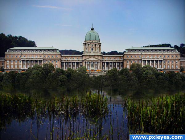
Nice job, but 2 things; The contrast and shading on the building makes it stick out a tad, but thats not bad at all. Then there would be a relflection on the water of the building.
where is the hungarian flag?? is that what this contest mean...?
Dimas that's ok: for every contest you can do everything you want with the source given. The author here decided that the flag wasn't interesting and I agree. About the chop is a good job and if you can provide an high res iis always better to receive higher votes 
Agree with Giallo...would really like a high res version of this. To me, it's almost the only way to confidently vote on something...to look at details and such. 
Cool! I would love to go there 
I ditto the others because of a high res, but what I can see looks pretty good! Looks so peaceful  Good luck!
Getting kind of tired people asking constantly for High Res Images. This is not mandatory and the image is big enough for anyone to judge. It is more likely for high res images to be stolen then this size . So stop asking
clean job good
I like it.. a very peaceful image.
Howdie stranger!
If you want to rate this picture or participate in this contest, just:
LOGIN HERE or REGISTER FOR FREE
oh will you STOP!!!.. hehehe.. now I need the whole story.. what novel is this from?... hehehe.. this makes the imagination wonder into everywhere LOL.. great job
Author..you will be forced to produce a novel/novella to explain this image... because WE NEED TO KNOW.. hehehe..
Nice work, author! I like the mystery and thought provoking imagery.
Very nice! Maybe you should blur the building behind her just to add a nice depth of field effect. Good Luck
are the shadow of the tree on her dress painted?very nice composotion
Howdie stranger!
If you want to rate this picture or participate in this contest, just:
LOGIN HERE or REGISTER FOR FREE