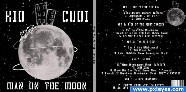
I have designed my own cover for kid cudi's upcoming album man on the moon
*EDIT*
Made the moon, swirls and bunny brighter and got rid of some of the stars in the fore ground! also added a bar code (5 years and 3956 days ago)

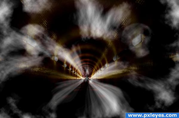
Gee it's dark in here! I hope I don't get eaten by a grue... (5 years and 3956 days ago)
very eerie and darkside... Awesome!
I love the smoke? Fog?
Howdie stranger!
If you want to rate this picture or participate in this contest, just:
LOGIN HERE or REGISTER FOR FREE

Used My own photos of Mobile phone as references.
1 Outside source for the wallpaper.
Taskbar and icon are also from my own PC (5 years and 3956 days ago)
fantastic work!
I really quite like this, good luck to you.
oh great.. why don't you just take all my money right now.. it would save time... great job (though a tad grumpy LOL)
nice! but i think it almost looks more like a future palm pre IMHO
Ummm...what makes this futuristic? It looks like stuff I could walk into a store and buy tday.
The 3D is very convincing and I like the colors.
Great picture...does look like something you'd see alread.
amazing work!
Great image.
Congratulations on the top-three place! 
Congrats for your third place!
Congratulations for 3rd
Congrats!
Congrats!!!!!!!
Congrats!
Howdie stranger!
If you want to rate this picture or participate in this contest, just:
LOGIN HERE or REGISTER FOR FREE

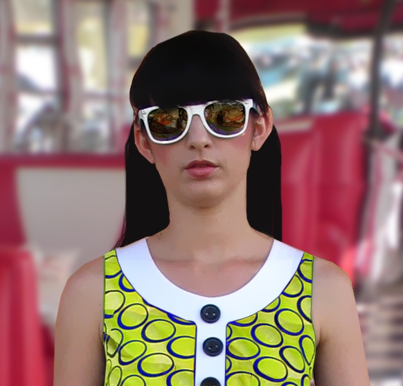
What I was trying to with her is make her "virtual world" like. I think I got it for the most part. Using the source photo I made her dress green (using the lettuce leaf) and the burger reflection in her sunglasses. (5 years and 3957 days ago)
I think if you add some texture hair lines you will have quite a wonderful chop on your hands (the hair is very flat, but that could also be the fact it's not in HIGH RES... can't make out any detail... great job otherwise.. good luck
For some reason I just really like this image.... listen to Golem.... and this is an Awesome image! g/l
LOVE the idea, the only thing I see that would improve it would be to add a glossy finish (more reflective) to the glasses, they kind of look like they are made of paper. Also you may want to curve it a tiny bit, lenses usually have a slight curve.
Love the dress!
Howdie stranger!
If you want to rate this picture or participate in this contest, just:
LOGIN HERE or REGISTER FOR FREE

Thanks straymuse,robby_m,somadjinn,NASA
(5 years and 3957 days ago)
Very creative, good luck!
Wel done
use the elements in the cloud form to retain the roundness.. it's looking a bit flat but I think you wanted it to have the curve feel of the sbs... (the free form and general structure of the image is absolutely wonderful... clever
EDIT: 


O.K Golem
giving it a science-mission-gone-wrong-giving -birth-to-another-planet feel!.good job
Golem has a great point, also the edges should be a little more wispy to match the clouds, it kind of looks cartoony otherwise.
Howdie stranger!
If you want to rate this picture or participate in this contest, just:
LOGIN HERE or REGISTER FOR FREE
Looks good!
Switch the covers...back is in front & vice versa...
oh, but I like it! the typography and block drawings are a great choice imo.
Howdie stranger!
If you want to rate this picture or participate in this contest, just:
LOGIN HERE or REGISTER FOR FREE