(5 years and 3977 days ago)
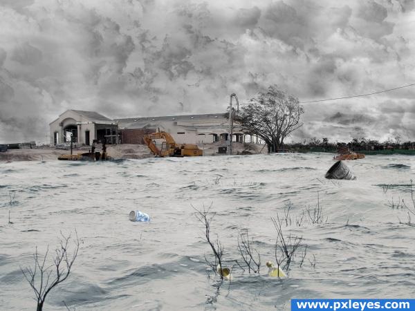
(5 years and 3978 days ago)
Looks like the orange truck is out of scale, otherwise everything else is great! 
Very interesting image  just a few things to clean up, just above the truck there is a corner of the barrel image, just to the right of the blue can there is a odd circle
Would be interesting to see 'high res'.
very nice feel
Thanks madamemonty for catching those. You have a goood eye. Also I put in the high resolution shot. Thanks also CMYK46 but don't think I am good enough to change the truck now.
another thing you could maybe fix is the orange colorcast on the water you don't have to remove it just desaturate it a litle it will make it fit with the whole stormy weather feel
You've still missed one corner of the barrel image, it's just above the tree line 
floods stink....yeah yeah...floods stink -- your picture doesn't though 
I tried what you said slayyou hope I got close thanks. I got it agin madamemonty. This will make me check more closely the next time thanks.
I like it, but some of the objects' colours don't match with the rest of the image, but i know it's too late to change. Good luck!
Congrats for your first place, Norman!
Congrats, really nice job 
Congratulations for 1st
Congrats Norman!
Congrats!
Congrats!
congratulations on your win
Howdie stranger!
If you want to rate this picture or participate in this contest, just:
LOGIN HERE or REGISTER FOR FREE
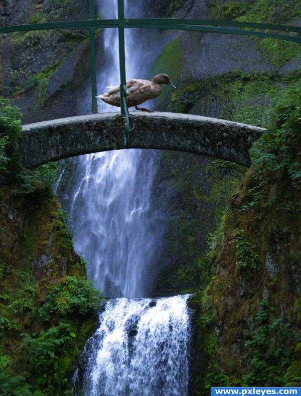
I needed more practice merging multiple images together, So I made an attempt at this one. (5 years and 3978 days ago)
Nice idea and good source choice, the step 3 of the SBS looks better for me, the final image is too bluish
I think the color cast is a matter of preference...either version could work for me...this one seems like early morning, the other mid-day. Good blend, author! 

Nice. There's something grayish half transparent on the right edge under the bridge. Good luck.
Thanks for your keen eye Palaekman. Looks like a part of the original bridge that I didnt mask off right.
Nice result, I believe this. Good luck!
seems to me your blending skills are just fine  good luck!
Where is this duck doing,, Looks like a fun place. Very good Gl
good job
Congrats for your first place!
Congrats, well done 
Congrats! Well done.
Congratulations for 1st, well done, great pic.
Congrats!
Congrats!
Howdie stranger!
If you want to rate this picture or participate in this contest, just:
LOGIN HERE or REGISTER FOR FREE
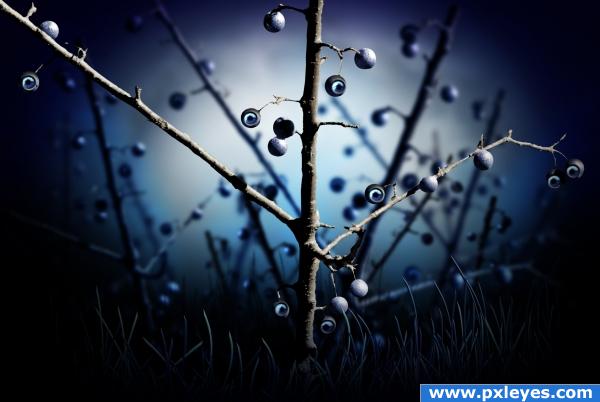
nothing but the source (5 years and 3978 days ago)
very nice use of source.. good luck!
very good mood
really is a nice effect.. good luck author
Fantastic pic
great mood
Very cool!
Hey author...you're creepin' me out here. Nice work. Especially like the dramatic lighting. 
Maybe add some lightning to the "eye berrys" so it match up with the rest. Its a very nice image. Good luck!
SBS doesn't show how you made the eyes...
the eye was illustrated. see the recently added step 8
Very creative and good look!
beautiful color! very captivating! 
Very nice work. right into my favs...
this is good and very well blended
Big eyed thorny bush! Great 

Just lovely! I love all the blue and the eyes! Very good work  Good luck
Congrats! Well deserved win 
Congrats, really well done 
Congratulations for 1st, great.
Congrats!
Beautiful work, congratulations!
This was a sleeper! Excellent and congrats!
Howdie stranger!
If you want to rate this picture or participate in this contest, just:
LOGIN HERE or REGISTER FOR FREE
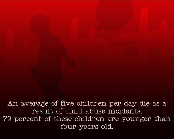
.......not the children.
Sources used:
"Wooden Cross" by ~Stockudith at deviantart.com: http://stockudith.deviantart.com/art/wooden-cross-25099771
and "Balloon People Brushes" by ~xCassiex24 at deviantart.com: http://xcassiex24.deviantart.com/art/Balloon-People-Brushes-86447996
Statistics from Childhelp: http://www.childhelp.org/resources/learning-center/statistics/child-abuse-statistics (5 years and 3978 days ago)
nice color choice..
this looks like a poster you would see somewhere- very good
Howdie stranger!
If you want to rate this picture or participate in this contest, just:
LOGIN HERE or REGISTER FOR FREE
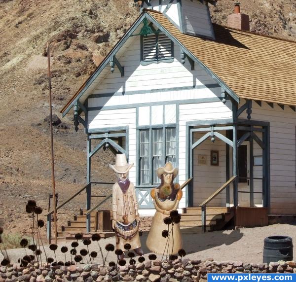
Looks great,, try soiftening those shadows a little.. good otherwise
Well I have to scrap the one that i was working on it is similar to this. That is the calico ghost town school house, isnt it? Ive been there before.
vapaholic, so we think alike...please do post your entry, interseting to see how you would do it
Shadows are wrong...look at the chimney.
Howdie stranger!
If you want to rate this picture or participate in this contest, just:
LOGIN HERE or REGISTER FOR FREE