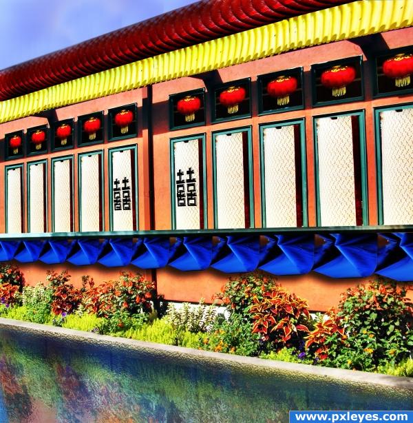
source and my pic (5 years and 3979 days ago)
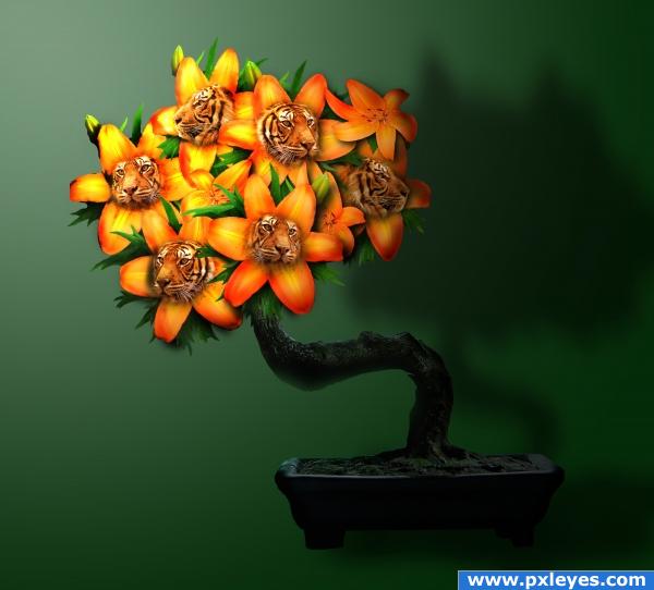
Good 'ol fashioned tiger lilies...careful...they may bite!!
Thanks to swami75, big-d-stock, harper07 for the great photos!! (5 years and 3980 days ago)
Hehe, very nice :p
wonderful color
The one on the far left has its forehead cut off...otherwise very good work. (Might be good to differentiate the horizontal & vertical planes).
love the shading in the background
Howdie stranger!
If you want to rate this picture or participate in this contest, just:
LOGIN HERE or REGISTER FOR FREE
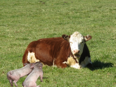
Bebe's kids on the loose again..Where's their mother!
Thanks to Julie Wenskinski for the cow at freedigitalphotos.net
(5 years and 3980 days ago)
cool pic! awesome!
Howdie stranger!
If you want to rate this picture or participate in this contest, just:
LOGIN HERE or REGISTER FOR FREE
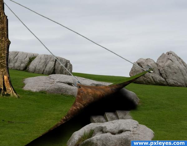
thankand credits to enimel and sxchu (5 years and 3981 days ago)
uhm o.o; what is it?
Hmm.. this doesn;t make too much sense to me, sorry :S
Good surrealism! 
awesome!
neat idea. I like how the "sod" is pulled up.
It would be easier to read if the steps when farther down into the pit.. but I get the Idea quite well... but head clearance would be nice to add to the chance that you could really run down into the hole (looks like Grendl's lair)
hmmm ?????
Lots of imagination here :P
This is a bit confusing at first! Good luck.
Howdie stranger!
If you want to rate this picture or participate in this contest, just:
LOGIN HERE or REGISTER FOR FREE
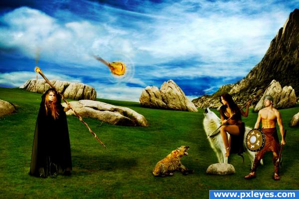
A battle between a sorcerer and two barbarians, hope you enjoy it as much as i did :)
Credits ad thanks to...
- mjranum-stock (http://mjranum-stock.deviantart.com) for the barbarian warrior pcitures.
- liam-stock (http://liam-stock.deviantart.com) for the wonderfull sorcerer.
- nefarostock (http://nefarostock.deviantart.com) for the scary hyena o.o
- matrija-stock (http://matrija-stock.deviantart.com) for the pretty sky.
- deadeyestock (http://deadeye-stock.deviantart.com) for the nice cliff picture.
- erulisse2 (http://erulisse2.deviantart.com) for the workable fur brushes. (5 years and 3981 days ago)
Mixed light sources, bad shadows...
What lights? The only mixed one i can see is the staff's but it's rly hard to invert that shadow.
wow very wizardyly! lov it love these kinds o' images!
its a nice idea but they dont look like they are batteling
neat
to improve this image you may like to explore a colour overlay or the such like at the last stage. this would give a colour connection between all your sources and take that CHOP PIECED together look. creating a more "REALISTIC" creation. good idea and nice images used. GL
Added more definition/lights.
The "dog" is the only one who looks ready for battle! Good luck.
Howdie stranger!
If you want to rate this picture or participate in this contest, just:
LOGIN HERE or REGISTER FOR FREE
It looks nice, but i think you should add some ripples on the water, because even though on the source they look realistic, they're not too convinving on your entry. Good luck!
Perspective on letters is off, agree about reflection...
EDIT: Looks better now.
fixed
Very nice idea! But it hink the picture looks a bit blurred.
colorful
good job redesigning that snack bar; I also like that you used your own picture
very artistic!
Howdie stranger!
If you want to rate this picture or participate in this contest, just:
LOGIN HERE or REGISTER FOR FREE