Hope you like! :-) (5 years and 3977 days ago)

Credits and thankyou for stock photos to the following:
Thank you to Falln_Stock for Skeleton
http://www.falln-stock.deviantart.com/
Thanks to LongStock for Pirate
http://longstock.deviantart.com/
Stockz4U for pirate ship
http://stockz4u.deviantart.com/
Trish the stocker. for the sky
http://trish-the-stocker.deviantart.com/ (5 years and 3977 days ago)
LOL...haven't seen too many zipperhead pirates lately, especially ones with conflicting light sources. 
thanks, working on the light source. Not sure how to do that yet... OH WELL> new skill coming up.
thanks for the hint..
i thought the pirtate was a little bright for the forground and lighting direction from the sky. these were the things i was exploring to fix.
Hint: if you can, just flip the pirate ship, and good luck!
ok FEED BACK on lighting please. i kept a copy of lighter pirate if this is wrong.
Err what sup wit the lighty edge on the ziping part? o.o
This is nice! But there's one thing I noticed: since there are no eyelids or any skin whatsoever on the left side, we would see the whole eyeball inside the eye socket. See if you can create that. And if not, just leave it as it is  It's stil a nice image
And also, you should make a hole in the unzipped skin (where the eye is supposed to be) 
Pretty nice work, especially liking how the skull is in sync with the real head
Oh I love the title!  Very nice work and composition, with the ship in the background. Good luck!
thanks for the feed back. hope the changes are better.
Beauty is literally skin deep hey! lol... great job author!!
love it!
Howdie stranger!
If you want to rate this picture or participate in this contest, just:
LOGIN HERE or REGISTER FOR FREE
(5 years and 3977 days ago)
Oh lord! If that's the pick of the litter i can;t wait to see the rest! Great image  Good luck!
omg this is one ugly varmit!
Good blend & color match. 
Oy!
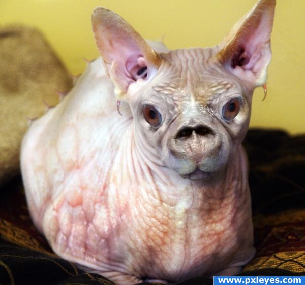
Do I sound strange, when I say, that I think it is cute?!? Cause it is. In a way...  Very nice blending and good choice of sources
  Good luck!
Lelaina...my son said the same thing lol
Good to know, that I'm not alone with my opinion. I'm feeling less strange now  Good luck again!
excellent blending!
wow! I looked at the high resolution and you really nailed the blending--Awesome!
wow! mesmeric glance.
Very nice image, well made
Ohhh that's ugly!! I mean that in the nicest way!
Oh my.... NASTY!! lol... nice work author!
Oh this is one ugly #@#@#@#
Congrats for your second place!  I still think, that it's cute
Congrats!
Congratulations for 2nd
Congrats!
Howdie stranger!
If you want to rate this picture or participate in this contest, just:
LOGIN HERE or REGISTER FOR FREE
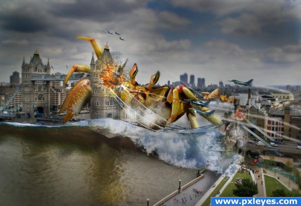
Having fun with montages...
My Thanks to the following:
http://www.sxc.hu/photo/812553
Thames
Richard Styles
.............
http://www.sxc.hu/photo/976092
Wave
Marco Caliulo
..........
http://www.sxc.hu/photo/724127
wave
Paul Martlew
.............
http://www.sxc.hu/photo/549910
plane
Jean-Philippe Paumier (5 years and 3978 days ago)
Good work on the image.. some elements are way too blurred though, but if you worked a little bit on that the image would look much better.. i'll hold my vote for now.. good luck!!
Ok Dude .. how's that???
It's hard to figure out anything. Could you upload a high res?
Roflmao! So funny and real. Amazing work author, well done.
Definitely needs a high res version...
Looks a lot better in my opinion, high res would also be nice.. good job and high marks.
Ok Guys ... Hi Res uploaded as requested ...
a few masking issues ( cables on bridge, water etc) but over all very well done 
great imagination!
lol GODZILLA CRAB!
This is an awesome entry. It looks better small than in high res. It would be better in both if you sort out those masking issues 'EvanMugford' was on about. Good Luck.
It was late at night when i did this ... if i had to do this all again i think i'd probably get rid of all the cables and things and draw them in again. This would get over all the fiddly masking issues...
lol this is so awsome!
Excellent idea!!!! great work author... i love it 
The idea is really good, but you'll need to pay more attention to the masking and blending. The high res looks really terrible to be honest; but your imagination is great. Get your skills up and you'll have some awesome images coming in the future.
I agree with Robvdn. A few more skills and you will create some killer CHOPS. The bonus of HIGHRES. if you view you can see where to fix. i will hold vote incase you manage to fix a few things GL>
nice reminds me of transformers. But here looks like bumblebee copied a crab than a car :P
I love it... this is what I wanted to do in a 'War of the Worlds' vein... outstanding!
Congrats for your third place!
Congrats!
Congratulations for 3rd
Congrats!
Howdie stranger!
If you want to rate this picture or participate in this contest, just:
LOGIN HERE or REGISTER FOR FREE
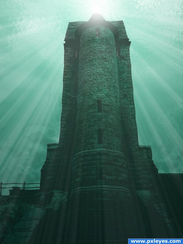
I have not used any external source.I have worked on different layers using the gradient toul, image adjustments,blend mode, opacity and the photoshop filters.
Correction:Add noise to the seabed with the external source.Corrects hue and saturation. Apply gaussian blur, blend mode to Luminosity, low opacity and High brightness and contrast.
Correction: Apply filter distort wave to the birdhouse water ripple.Maybe not a good idea with these parameters.
(5 years and 3978 days ago)
Maybe a little simple, it's very nice, but you should try changing its location or doing something a bit more complicated. Good luck!
This kinda reminds me of the story of the fish and the bird who fell in love but the fish could not live in the air and the bird could not live under water. So they were eternally sad. But I think the location is perfect. And the light source and the beams are well done. I would, however add some other underwater elements. Really excellent job on the surface, too. I will hold off on my vote in case you decide to add more underwater stuff to it.
wow awesome!
You could add a water ripple to the entire building to give it a more under water effect... just be careful not to over do it.. sound Idea all round though 
This is very well done but I feel it's missing something. Add some more atmoshpere. Maybe find some sources of fish, shipwrecks and/or underwater plants. This entry really has the potential to go that little bit further.
You say you have used no external sources but you have linked one anyway. Explain?
neat colors
Howdie stranger!
If you want to rate this picture or participate in this contest, just:
LOGIN HERE or REGISTER FOR FREE
Nice work.....think it needs a lil bit work in the reflection.......but its hard to figure out........high marks
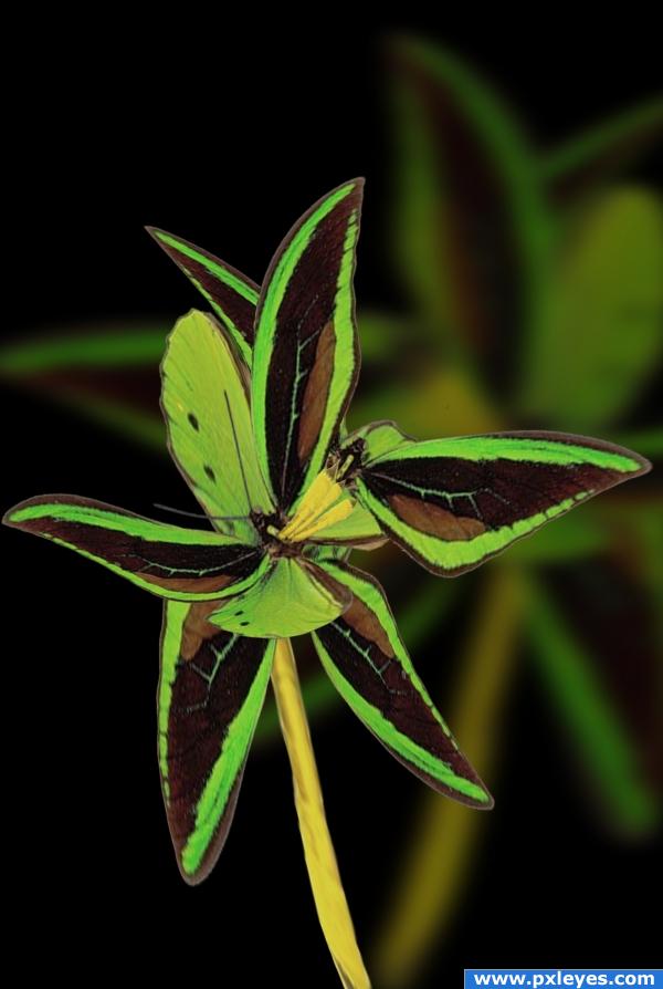
Really good job here, the flower does like realistic, but you can see elements of rarity which makes it right on theme, good luck!
another name could be the BRAIDED BUTTERFLY FLOWER ... they really blend well!!!!

Name change is great... just a wonderful piece all round
cool
a little oversaturated
agreed. lower the saturation a bit.. otherwise, cool image!
Howdie stranger!
If you want to rate this picture or participate in this contest, just:
LOGIN HERE or REGISTER FOR FREE