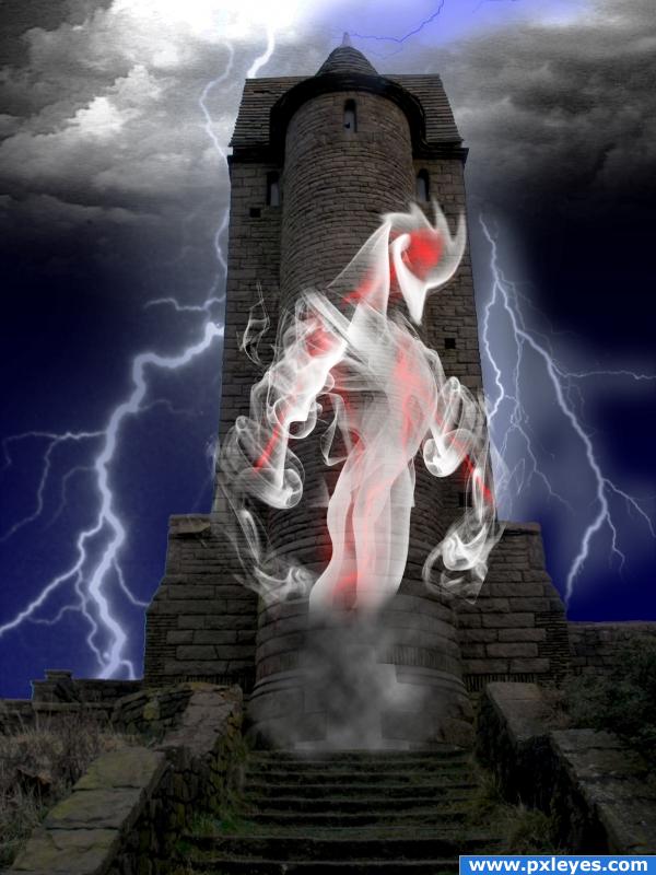
No external sources used... SBS going up soon (5 years and 3980 days ago)

made from only the source and photoshop (5 years and 3980 days ago)
Nice idea, good luck!
really good
slick looking carrot
Howdie stranger!
If you want to rate this picture or participate in this contest, just:
LOGIN HERE or REGISTER FOR FREE
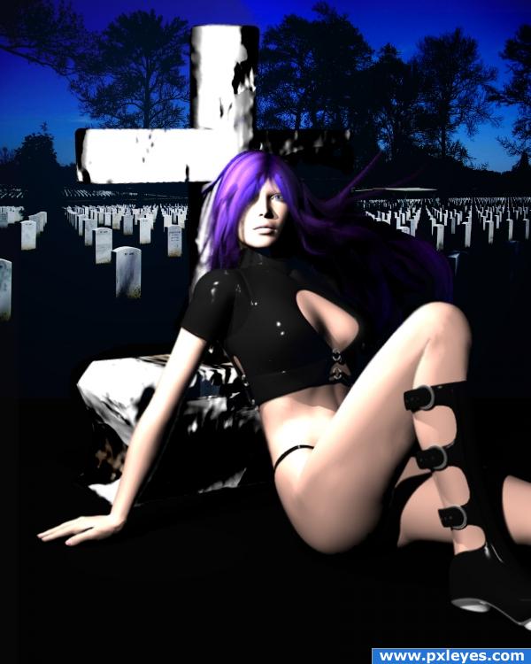
No sources used except original image....
DAZ freebies used:
RAVENOUS boots/jacket/panties, can be downloaded at renderosity.com; Mitsu-hair for Aiko, can be downloaded at Daz3D.com
touched up the gravestone a bit... (5 years and 3980 days ago)
I don't really understand, but it's a nice image! Good job 
Light source on figure is opposite light on tombstones, edges of cross need blurring, bottom edge is too regular, since it's on grass...
i'm gonna stick with the lighting...my light in the Bryce scene is placed to the left of the model, and that's where i placed my light filters as well....but i'll def work on the rest of what you mentioned...
All you have to do is flip the background for the lighting to match...
i like this image! and i dont get it either but i like it all the same!
either way, in order to flip anything, i'd have to do it over, because of the masking.....so here's a semi touched up gravestone, my quick fix.
btw, cmyk - which background did you mean i should flip, the graveyard scene, or the model?!?!?
back ground is usualy in the back.. meaning the graveyard in this case...
hey Eladine, you're pissing me off. (:
The graveyard scene...I thought it would be an easy fix. 
(Assuming the girl & cross are on different layers and the graveyard's behind them...).
thanks cmyk....i had to question cuz my original BG layer is the model scene...and i layered the graveyard on top, thus my confusion. It's a pretty simple do-over, so even if I don't do it for the contest, I want to do it for practice, so I can get a better perspective on lighting. i appreciate the tips....
author ur reply is uncalled for O.o if you have personal issues can you keep that to privat? this is not the place to vent them...
eladine: i'm sorry, but you choose to comment on my work, and i can't say i've been happy with some of them.
while the idea is good and points for playing with the 3d programs, the poser and her tombstone look very blurry... but again, nice try, you will improve fast 
thank you everyone for tips and advice; although i may not re-do this piece, i keep it all in mind for future work.
Very nice... Love the hair colour...
Howdie stranger!
If you want to rate this picture or participate in this contest, just:
LOGIN HERE or REGISTER FOR FREE
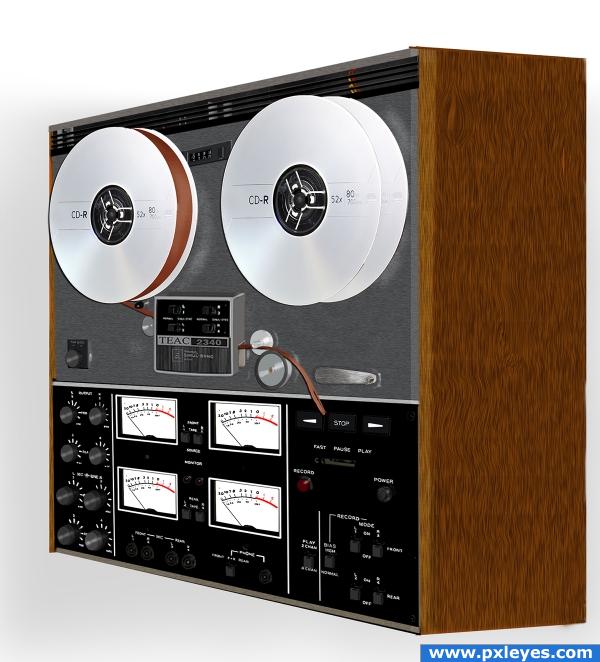
If you can remember these, you are getting old. lol
Source and CS3 (5 years and 3980 days ago)
Really nice!! Good job!!
great perspective!
Good Job Author!  Take me back to my teens Rocking my apartment
excellent!!
very nice work, just some parts are not rly in perspective o.o; and i guess im getting old :P nice work
I just have to FAV this because my brother had one of these and it attacked him on a weekly basis LOLOLOL.. I think I learned most of my swear words listening to him trying to make the darn thing work LOLOLOL
Now that's what I call different and definitely thinking outside the box.....! Maybe a reflexion would have complemented the image....but high marks from me.....! Best of luck!
My dad had one of these! And I remember, that I was 5 or 6 years old and always wanted to press and twist all the buttons. Unfortunately he never allowed it... What doesn't mean, that I didn't made it behind his back  So thanks for letting me remember this with your lovely entry! Very very good work
  Good luck!
Creative idea. 
Congrats Loyd!
Congratulations for 1st
Congrats. really well done 
Congrats!
congrats
Congrats!!
Howdie stranger!
If you want to rate this picture or participate in this contest, just:
LOGIN HERE or REGISTER FOR FREE
(5 years and 3981 days ago)
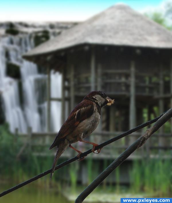
Such a peaceful image  I really like your composition, but maybe you can try it with a little less blur on the waterfall? Cause right now it is almost impossible to recognize the waterfall, without looking at your SBS. And don't forget to add the links to the images you used. Only naming the author in the SBS isn't enough. Good luck!
Edit: The background looks much better now! 
very nice n simple
Nice image, very nice in fact - but why not try blurring it a little less?
Thanks alot Lelaina!!! That really does look alot better now hey 
Nice chop
personally, I think the blurring brings out the bird clearly this is done on purpose
You didn't cut out the space between his foot fingers and i cans ee some white edges around the bird.
you should contract the bird and the branch a little bit because of the white and blue edges (probably of the original background) 
the edges need blurred a little
Howdie stranger!
If you want to rate this picture or participate in this contest, just:
LOGIN HERE or REGISTER FOR FREE
cute
Very interesting xD Good luck!
haha b=very cool looks supernatural...love it

sickk!! realy love the smoke creature makes it just looks evil!
just one tip try using adjustment layers to make the tower blend beter with the sky and to unify the whole as one piece
Howdie stranger!
If you want to rate this picture or participate in this contest, just:
LOGIN HERE or REGISTER FOR FREE