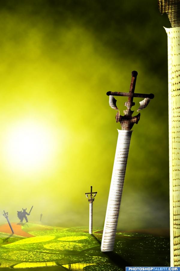
only source
I know the lighting is to bright but I like it!...
;) (5 years and 4023 days ago)
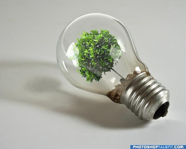
Turn lights off... let the Earth breathe!!!
(I was inspired by the whole "plant in a bulb" idea...so decided to make my own interpretation of it.. :) (5 years and 4024 days ago)
very nice 
Looks very similar to this: http://www.stockxpert.com/browse_image/view/42608631
yes Paulus...and? it has nothing to do with it though..this is my interpretation of "go green" and I've seen a tree in a light bulb everywhere..it has been done before... and that is why I wanted to give it a shot...
Hi Paulus62. You are right (How you found it?), but still it's a good job.
I don't understand what the problem is? the idea is the same..but the execution is totally different... and for your info : I hadn't even seen that picture...
for me very nice! 
Nice idea i like it good luck!
there is nothing wrong with being inspired by something. the "go green" idea itself has been done a lot of times before. as for the image itself, it's flawless as far as i can see so high marks from me! 
Thank you elficho!
I have to agree with elficho, great blending, nicely done.
I will definately say INSPIRED from the Paulus LINK (I will say, what EAGLE eyes you have Paulus.. Fantastic) and It's good to have that as a reference.. but this is extremely different work and image.. high Marks from me as well, this is a tree inside a 25/45 watt laying on it's side with a definate light source while the image in question is a hand held vertical with NO shadow cast and a seedling tree, not a grown one) they are two totally different images in the same vein.. It would be like me drawing a ketchup jar from a restaurant I ate at this afternoon.. (and thank you for my babble 
AUTHOR.. save yourself some grief and Place a link as reference in your SBS or just say.. I've seen something like this on the web and thought I'd try it.. You know.. the usual BS, it really helps prevent confusion (Oh yeah.. YOUR SBS is mind blowing in it's simplicity when I know a whole lot more work into it.. YOWZA)
This is really a well done image... 
Amazing job! GL!!! 
nice ideea
Just a thought here...the angle suggests that there would be more dirt spilling into main area of bulb. It would also set it apart from the references that everyone is talking about. Nice work, author! Excellent execution and the simplicity you kept is really nice. 
This is great!
nice job
nice approach!
i am impressed, very good job
This is an excellent image! Well done author. One small nitpick. The shadow of the tree just seems a little small in comparison to the lightbulb shadow IMHO. I'm no expert in drawing shadows myself mind you, but it's just how it seems to me. Good luck 

Your image is a far supperior to the one (link) that Paulus noted... I think you did a very good job - the tree really looks like it is behind the glass - good job 
That's a really good idea  but how does it gives light? :P
nice! i think this could work better if perhaps you get a picture of you holding it, so that you can see through the bulb, and see you (the transparency effects could prove quite impressive rather than just a white background...) have you hold it close to the 'camera' and blur out the background of you, as if it were a perspective shot. just an idea, but i believe it could make this already great image even better. 
I think its a great image - well done - Sadly i dont think it fits the theme..
gooooood one !!!!!!!!!!!!!
It would be good to see an image in this contest that's actually on theme, but this is a well made pic...
Love this one! Great idea and well done!
good job! your idea has more of a symbolic meaning which i think it's great
Pure genius!
like it a lot
very nice idea 
nice
Nice job Author.......Good Luck.
Nice idea but off-theme...
Congrats! Well done!
Congratulations for 1st, well done.
Congrats fabulous idea 
congrats for 1st 
congrats!!
Congrats!!
congrats  great meaning!
congrats on first place! (im surprised your reading this, shouldnt you be more focused on your current projects...) as to the rest of you, you have way too much time on your hands... (as do i or i wouldnt be typing all this. lmao) XD
Howdie stranger!
If you want to rate this picture or participate in this contest, just:
LOGIN HERE or REGISTER FOR FREE
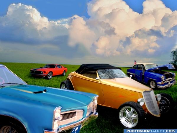
Closed the hood on the Pontiac. A combination of paint brush, dodge, burn, and external source image use to makeover the car. (5 years and 4024 days ago)
looking good looking good.. .woo hoo.. good luck author.. I will check back for the SBS (Awesome so far)
EDIT: Yep.. just as I thought SBS is even Awesommmerrrry.. or something like that .. brilliant research for sources.. i wouldn't even know where to begin.. good Luck Author
good work. some lighting issues and car in the distance is dull
nice blend 
Nice - your bonnet outline on the foreground car looks a touch transparent near the windscreen. There is also a blur along there that effects the rim on the next car back. I would maybe burn the shadow side of the red car also..
Cool scene very nice work on the cars.... the sky needs a little bit of attention tho there is a line that runs from the middle to the edge about quarter the way from the skyline & a mark of some sort above the red car & to the left of the blue car
nice work on the restoration, good one 
Top job sir..... you would never even know
Great work, you did a good job rcreating the cars! ^^
nice work
coolness
nice
congrats! 
Congratulations for 2nd
Congrats
congrats
Congrats!!
Congrats on 2nd!
Congratulations 
Howdie stranger!
If you want to rate this picture or participate in this contest, just:
LOGIN HERE or REGISTER FOR FREE
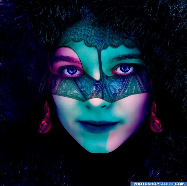
(5 years and 4024 days ago)
ah come on author..WE NEED THE SBS.. LOL... such wonderful colors.. and the blending is absolutely splendiferous..and the bell earrings are INCREDIBLE... very great job.. high High HIGH MARKS!!!
EDIT: THERE's the SBS.. hehehe.. kinda thought it was coming  GREAT!
I'm scared to enter this contest now!! Great work, nice colours and nice blend. Well done!
Nice image & colours!
Try to blend the sharp blue edge on the chin, otherwise nice color effect...
wow! I love colors! very strong entry! Good Luck!
nice colors. good entry
love the color 
i like the mood here good luck! but u need more work on the mask
very nice 
Good Luck 
nice colors
like the colors.
good
Howdie stranger!
If you want to rate this picture or participate in this contest, just:
LOGIN HERE or REGISTER FOR FREE
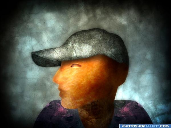
This is my interpretation of the person. It is meant to be more illustrative.
My reference images is on the page provided by link:
http://www.pxleyes.com/forum/viewtopic.php?f=4&t=61&start=40
(5 years and 4024 days ago)
nice! 
this is just sooooooo Lovely.. great IDEA!!!
Nice work
style is good
nice job 
lol 


The style reminds me a bit of illustrator Brad Holland, well done. Good luck!
Howdie stranger!
If you want to rate this picture or participate in this contest, just:
LOGIN HERE or REGISTER FOR FREE
Great work! GL!!
very nice
bright light asunder... what a wonderful image you have created.. the color scheme is in the GREEN but I don't think it really matters.. it looks like a page right out of a story book of old.. just a wonderful overall feel.. good luck on this author.. GREAT
I'm waiting for words to appear on the page like they do in those wonderful dated animations of old Disney
Nice work! Good job!!
Nice work, author. Really like the colors too.
very nice work. good color
Cool scene great imagination!!
Great! Different and creative entry
kinda hard to see the source
nice depth you've created and the colors are good as well
very nice idea and nice work
congrats!!

Howdie stranger!
If you want to rate this picture or participate in this contest, just:
LOGIN HERE or REGISTER FOR FREE