(5 years and 4034 days ago)
1 Source:
- 1: woman
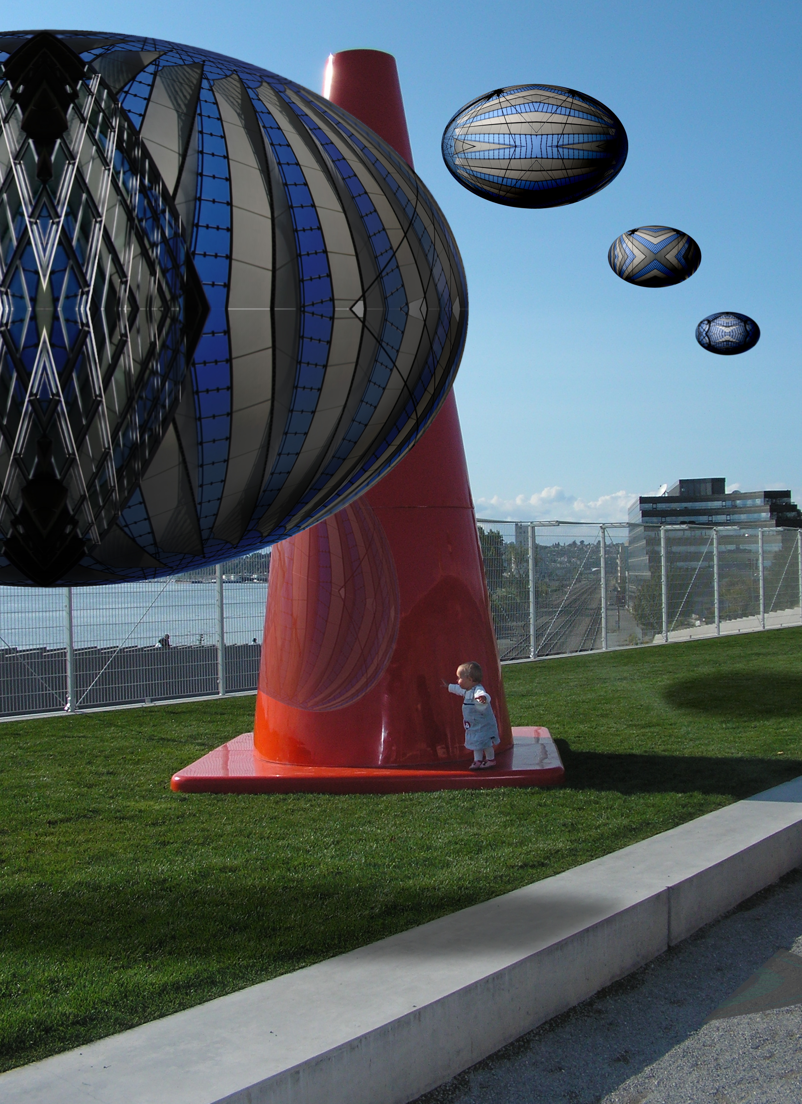
The Investigators, curious as to what the small earth child was up to, decide to see what she is doing. (5 years and 4034 days ago)
cool
Nice idea. Shadow of large one on grass is too sharp, Not sure about reflection.
Light is from low left...oval things wouldn't have visible shadows...reflection is cast as if the object were in front of the cone, not already past it.
okay I drew a line from the corner of the pylon down to the ground.., line from little girl to her shdow. .matched those lines with the descending shadow.. they match.. large orb in the sky in back I took liberties with the shadow I know.. but it's still a neet effect.. as to the reflection.. I followed the back cruve of the oval and place it skew to the surface of the pylon and cut away any excess.. don't know what else I could of done.. the shadow is coming down just like the shadow on the pylon????
THANKS FOR THE HELP NASIR AND CYMK
okay I blurred the large shadow.. (when I eliminated the shadow and all the heaviness of the ovals were lost.. didn't like that.. and the reflection is from the BACK of the orb which should have light hitting it and reflecting back.. I copied the angle of the reflection of the little girl only opposite.. don't see what else I could do???? and I used guide lines and everything
gold stars to both of you
The girl doesn't even have a shadow, she's within the pylon shadow. What do you mean by the "corner" of the pylon? The top? If you draw a line from the top to the ground, the shadow would be longer than the pylon. Applying the same thing to the orbs would put their shadows out of the picture. The angle of the light source is just too oblique. As for the reflection, since the orb is on the near side of the pylon, the reflection would also be on the near side.
nice!!
I'm talking about the little square corner of the base of the pylon.. this is so hard over the web....it's almost a perfect 45 degree angle.. because it's so close to the ground.. the same angle is right under the girl.. you can see the little black disk right below her in the high res.. it's about at 4/5 oclock.. I matched that as well.. I agree with the second oval shadow not being there. but the oval so close to the girl would be impossible not to cast a shadow.. it's to hard when you can't be right next to me showing what you mean.. as hard as it is for me to show you what I mean..
CMYK lets just let me be wrong and you right (Cause I'm sure you are right, I just can't see your vision..because if we continue to talk ..we are going to write a novel no body will want to read LOL. .thanks big guy. and another gold star for you.. 


(that was a lot of fun
The curb's shadow is a bit wider than the height of the curb, so the angle to the sun is not quite 45 degrees. The foreground orb's shadow should be moved to the right; I would expect to see the orb's left edge's shadow near the left edge of the image with the rest of the orb's shadow continuing all the way to the right and off the edge of the image. Orb shadow should match intensity of pylon shadow. Rear orb shadow must have come from an orb we can't see. Stronger shading on the front orb might be appropriate given the sun's intensity.
Goood grief its a very nice image plenty of WOW factor, i speacialy like the reflection in the orange cone...high marks from me good luck! (h)
hey, welcome to the competation, good luck
idea is nice
COOL. very nice idea
Howdie stranger!
If you want to rate this picture or participate in this contest, just:
LOGIN HERE or REGISTER FOR FREE
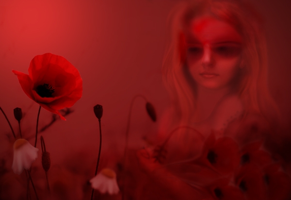
You can find the high res below where you place source links. I knew the red would kill! (5 years and 4035 days ago)
Nice atmosphere.
awesome use of color
i like it very much! lovely colours and feeling. love its subtlety . i think you could have worked slightly more on the character, especially the eyes...too much black around them. try to repair them a little, it's a pitty...
very nice usage of source and red color.
It does look very nice in High Res.. this would be a printers NIGHTMARE lol.. thank god for visual monitors LOL.. I could see my printer look at the file and say ARE YOU NUTS!!!!.. hehehe.. You'd have to show this in a gallery on a Wide Screen TV..hehehe.. GOOD JOB
Thanks all for your comments, much appreciated. @ImmerVerloren, I know the eyes seem incomplete, but it was intentional to leave them similar to the part of the source image I used.
Excellent! Lotsa red...but lotsa good!
i like this one
You should never upload running contest images on other sites, as your entry will not be anonymous when people get to know you. There is a High Res link when you upload your entry, use that next time. Nice image BTW.
Thanks solkee, I understand what you are saying. However when uploading the high res image the compression for the smaller image was absolutely terrible, so I opted to upload at 600 pixels and provide a high res elsewhere. This not something I would ordinarily do. Thanks!
very interesting entry, congratulations
you did very well
Howdie stranger!
If you want to rate this picture or participate in this contest, just:
LOGIN HERE or REGISTER FOR FREE

(5 years and 4035 days ago)
nice source image, but I don't see much difference (except her nails). To be honest her skin looked better before...
Same what FairyGardens said.
Howdie stranger!
If you want to rate this picture or participate in this contest, just:
LOGIN HERE or REGISTER FOR FREE
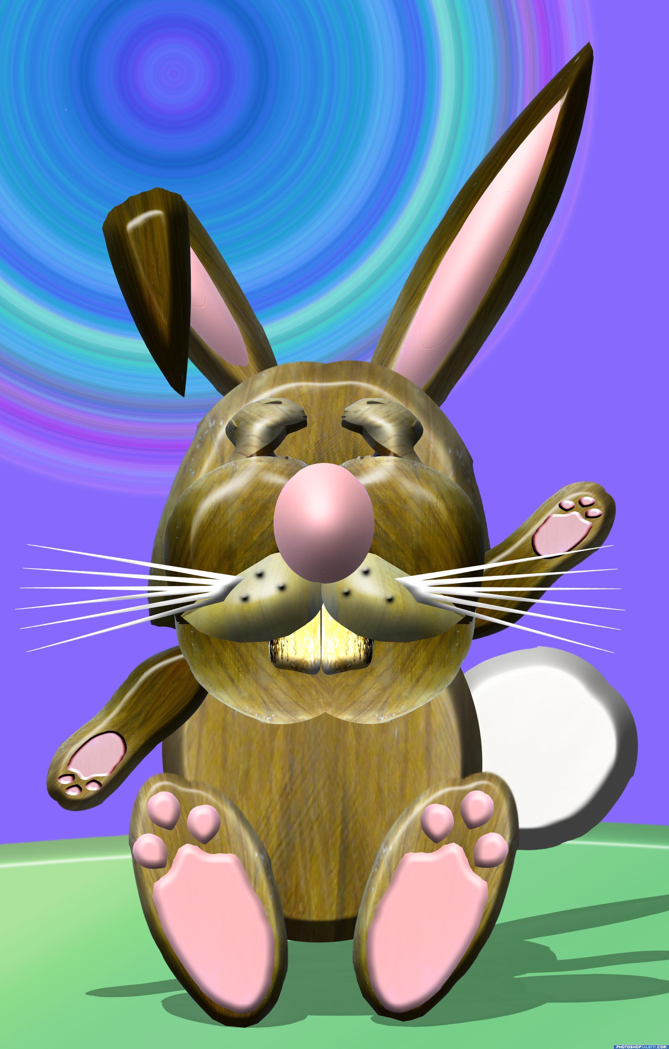
all source (5 years and 4035 days ago)
ummmmm...
cool
Very Cute  Good Luck
good design, but the emboss effect on the legs are different, one is look like a pillow emboss
gopan..I went back in and looked at it. I didn't use PILLOW on ANYTHING. and High Res shows NOTHING, and I checked all four legs, I have no Idea what you are talking about, so I guess we agree to disagree
Very original concept .
nice entry, way to go
Howdie stranger!
If you want to rate this picture or participate in this contest, just:
LOGIN HERE or REGISTER FOR FREE
Photography and photoshop contests
We are a community of people with
a passion for photography, graphics and art in general.
Every day new photoshop
and photography contests are posted to compete in. We also have one weekly drawing contest
and one weekly 3D contest!
Participation is 100% free!
Just
register and get
started!
Good luck!
© 2015 Pxleyes.com. All rights reserved.


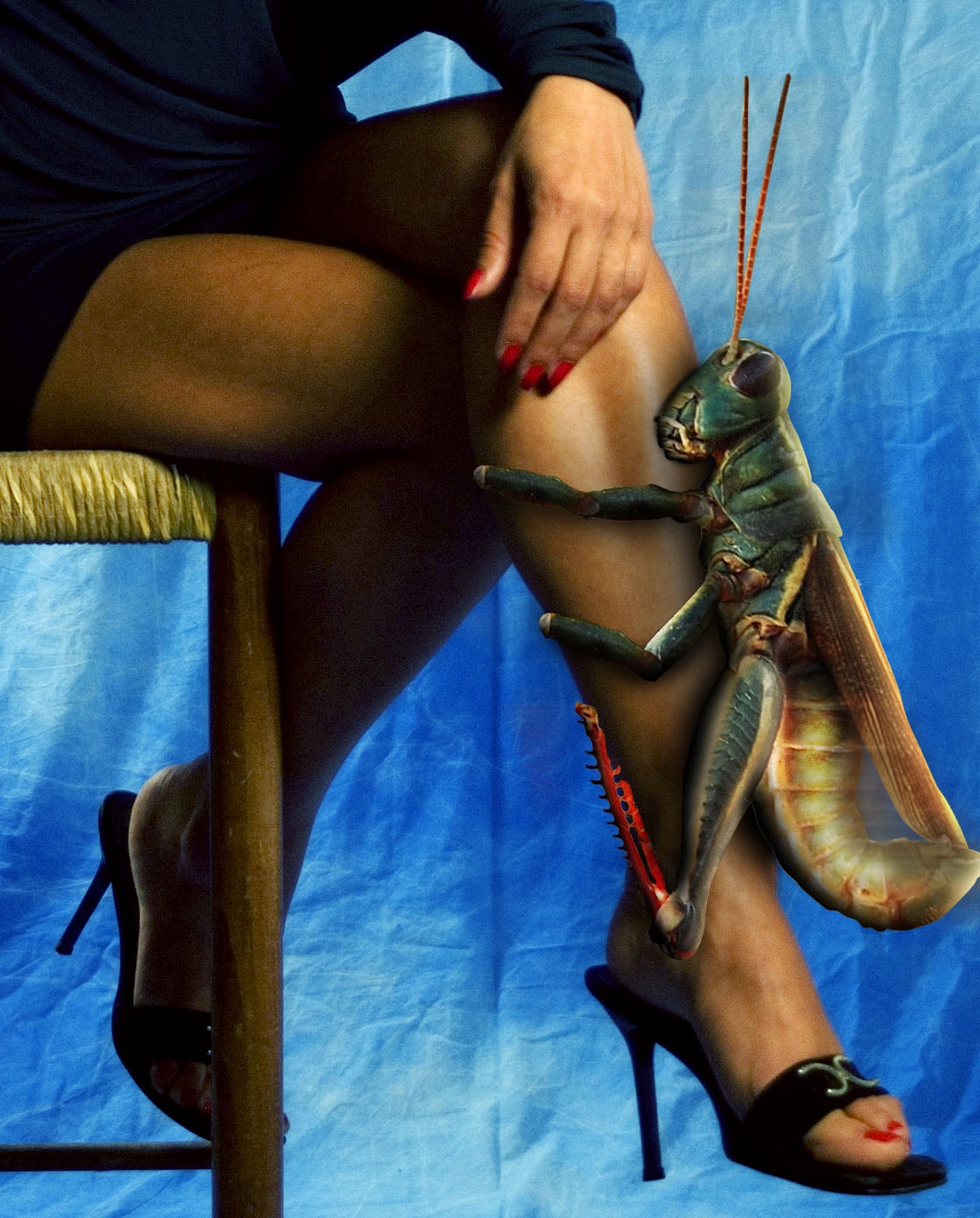
LOL. Perhaps it would be funnier if...No it can't be funnier. That is awesome! Work the shadows.
Really funny, but she sure wouldn't just be sitting there, she'd be whacking the bejeezus out of it!
I know I would be whacking the bejesus out of it I am scared to death of grasshoppers! I don't know why, they just creep me out!
imagine the fish you could catch if you used that thing as bait.. LOL
haha, very funny. shadows need work. i know this isnt your fault but isnt that hand a tad bit manly? good luck
Really great work ! Really good shadows and blending...
Nice work really funny stuff humor of the scale!!
Minimonst, I don't mean to pick on your comment, but there's only a bit of shadow I have a problem with, and that's the one at the top of the head which shouldn't be there (Pay attention, author! ) If you want to comment that something like shadows need improvement, please be specific so the author can improve. Thank you, my friend.
High Vote for the funny factor...LOL Good Luck
getting him some leg...great job in the humor and the PS skills departments
Ohh man.... they don't have a creepy bar-cuz that just creeping me out----GL
very neat
lol!!! really well done and funny! hahaha!!!
nice work
LOL!!good luck
@ Nator: Motion blur!! Hahahaha.. It would be too noisy? Arent they like a cricket? Plus at that size would be deafening!! Very funny Author: my only thing is that is a touch blurry - but thats probably from the source?
Nice, work a little bit on the shadow just above the hoppers head, and the little piece between his body and wings. When you use multiply tool(with color same as object but more towards black/gray or blue) for the shadow instead of the black brush you get a more realistic effect.
haha!!
A leg-humping hopper for a pet? She doesn't seem to mind... Good luck...
lol good luck
ololo )))) nice idea! gl
Yuck, i would faint with that for sure lool funny idea!
Howdie stranger!
If you want to rate this picture or participate in this contest, just:
LOGIN HERE or REGISTER FOR FREE