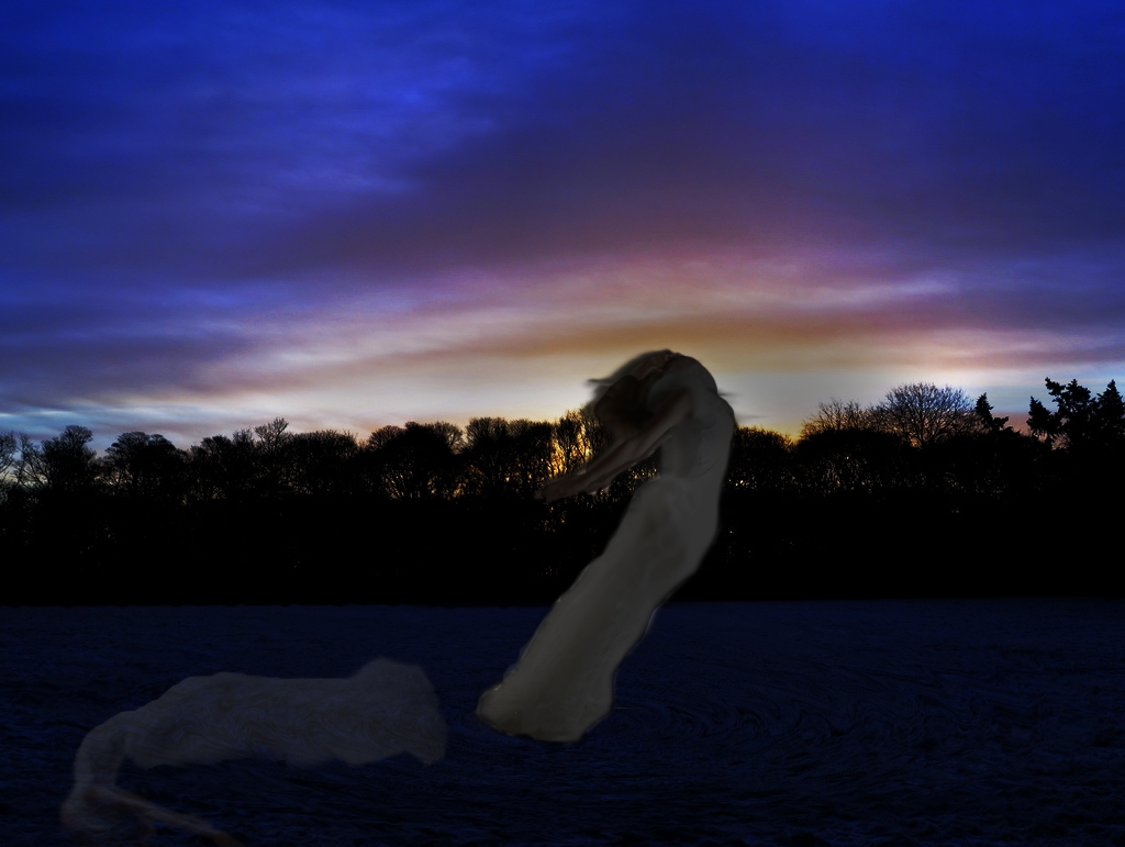
The Lady Of The Water feels good, strong and happy on the water. Every morning she embraces the sunrise and enjoys life as it is.
Edit: I watched the suggestions and I played with it a bit more. (5 years and 3961 days ago)
1 Source:
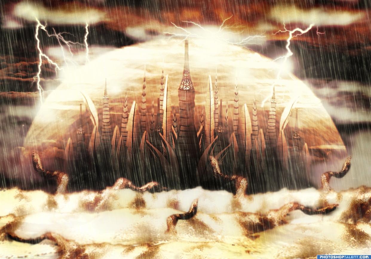
My source of inspiration was the city from Stargate series (I'm not a big fan, I just liked the city). My main goal wasn't to replicate this city, but to create one of my own, therefore I have added some personal fantasy elements.
I have build the city entirely out of parts from the source image, created the protective aura, added some waves and got the demons silhouettes from the same waves.
A lot of work was done to find the perfect color match and to integrate lots of brushes the best way I could.
Hope you like it!
(5 years and 3961 days ago)
good job! gl
Author.. SBS please.. we really can't SEE the use of source.. and the SBS will Clarify, will hold vote til then.. BAYOOTIFUL entry by the way..  Just need to know how you did it before I vote...
SBS IS AWWWWEEEEESSSSOOOOMMMEEEE


AUTHOR.. you rock
great!!
SBS on the way....thanks for the quick comments...lol...happy you've liked it!
good one it looks like the final fantasy city
Wonderfull job... Just... Beautiful! Good Luck!!! 
awesome!
Very cool, reminds me of stargate atlantis if you have seen it
Good-looking image very nice work!
Ace place
nice work
I don't mind the rain, but the foreground, middle ground & background are the same colors, and it kills the illusion of depth...
great entry, however, I'm a bit confused as to where the city sets.
Good-looking scene...Very final fantasy
cool image...love the idea, I think it some depth would really improve this, like with the rain and dome. Good luck!
Sweet manipulation, really like it The protection circle looks really cool 
O-o-o-o-o, so many scary worms want to eat this beautiful city. It needs to be protected
Congratulations for 2nd
Congras!
congrats
congrats
Howdie stranger!
If you want to rate this picture or participate in this contest, just:
LOGIN HERE or REGISTER FOR FREE
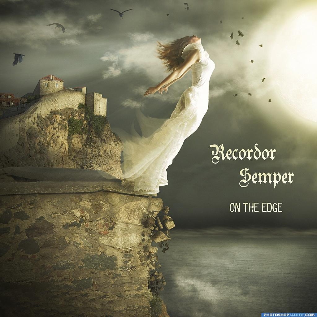
Cover to the album of imaginary band. (5 years and 3961 days ago)
nice colors
Nice! The bird in the left corner is supposed to be behind the clouds, I think, but he just looks transparent. recommend bringing him infront of the clouds (my apologies to the bird if it's a girl)
nice work author
nice mood
Very nice scene great colours & composition but & there is always a but the text is spoiling it where it is try the top & bottom just to see how it looks...
My absolute favourite!
supa! i like this one very much! the motion is well rendered, i can picture her falling down!!!!
very nice -- I'd buy it just for the cover
look very good! good job
Beautiful chop!
Nice work, good one, Good Luck
very nice colors and concept
lose the type it takes from the drama otherwise i like it very much
Very nice!
Love the mood, good job.
Nice result. Colors are nice indeed and those crumbled stones are a nice touch. In case you wanna keep the text (for this time ai can understand as part of the album cover), you may want to try to put the band name above the horizonline (lets say where the title is now) and the title under the horizonline. At least a bit more down, right now there's happening quite a lot there above (but it's also just my opinion of course). Good luck!
Very nice image! Personally I would like it better without the type, it detracts from the nicely done image.
Great feel to this...imo...remove the writing..................GL
nice. Looks good. Good luck
very realistic... DONT JUMP!!!!!
Thanks for Your comments and votes.
Howdie stranger!
If you want to rate this picture or participate in this contest, just:
LOGIN HERE or REGISTER FOR FREE

source and ps
Thank you kmh425 (5 years and 3961 days ago)
extra points for an excellent SBS... really shows off the work making the piece even MORE personal.. great job author.. this is a Wonderful piece.. would be excellent in a Piano Bar/Music room.. good luck
ditto golem
great
good
Nice image love the over all look of this piece!
Musical Feelings.........Good job Author........G/L.
i like it! gl
nice image
I like how the big music note turned out. Not so sure about the stretched pianokeys, they look like big black stripes now.
beautiful, congratulations
you did very well
congrats Tap!
Howdie stranger!
If you want to rate this picture or participate in this contest, just:
LOGIN HERE or REGISTER FOR FREE
(5 years and 3962 days ago)
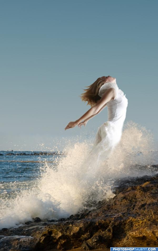
Nice image, but please level the horizon...I'm getting seasick!
sea... sawww... sea.... saw.. it is incredible.. but it does make you tilt.. sorta like being spun around very fast and having to run all of a sudden.. solid work
It is going to hurt when she lands on the sharp rocks! Good luck
good work
I leveled the horizon, I hadn't even noticed that in the source
Make her look more watery and it will be much better
Very nice. I noticed just a tiny tiny bit of white around her hand. Other than that, it's perfect as is.
The light source on the rocks is from the left, but the main area is effective enough that it's not real noticeable.
I lile the photoshop work but the composition is a little weak. Maybe would work better in a horizontal composition with less negative space and more air in front of the figure. IMHO.
Love the mood. Very good. Good luck
its a dolphin... its a walrus... its... a girl?? i like it
Howdie stranger!
If you want to rate this picture or participate in this contest, just:
LOGIN HERE or REGISTER FOR FREE
Photography and photoshop contests
We are a community of people with
a passion for photography, graphics and art in general.
Every day new photoshop
and photography contests are posted to compete in. We also have one weekly drawing contest
and one weekly 3D contest!
Participation is 100% free!
Just
register and get
started!
Good luck!
© 2015 Pxleyes.com. All rights reserved.


not sure.. you might want to work on the shadow cast on the water.. doesn't follow her form and the light seems to be coming from below her.. you might want to put a reflection in the water rather than a shadow.. just a thought.. good luck
had time to think... you could put a reflection (maybe moon) in the water reflecting backup at her to give her light.. again. .just a though.. good luck
she's way to bright for this situation!
I agree, you should make her darker for this piece, she does not seem to fit in
way to dark
Nice idea author, you should flip your reflection horizontly, but nice idea.
became dull
cant really see it sorry but gl
Howdie stranger!
If you want to rate this picture or participate in this contest, just:
LOGIN HERE or REGISTER FOR FREE