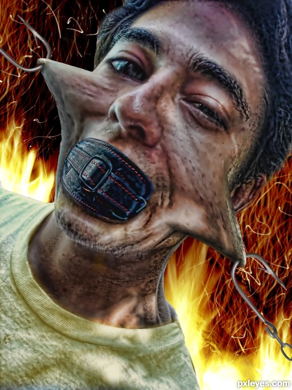
It's weird growing up Catholic (5 years and 2907 days ago)
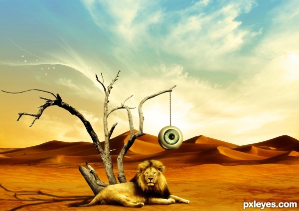
(5 years and 2909 days ago)
I like the stark landscape with some odd elements and an enigmatic title. (I wish there were an SBS [especially with the use of brushes], but I really appreciate that your source list at least identifies all the separate elements you chopped together because I'm too lazy to check out each source.) I do find this 'flatish' with just a foreground and a background with nothing in between. The nearly-centered foreground elements reduce the drama IMO.
This ones very appealing to me. 
Thanks a lot 
Congrats for your second place, Divair!
Congrats!!
Thank you very much people. Sorry, I've been away for some time, and I'm afraid I'll be away for a couple of weeks... Businesses, you know 
Nice Congrats! 
Howdie stranger!
If you want to rate this picture or participate in this contest, just:
LOGIN HERE or REGISTER FOR FREE
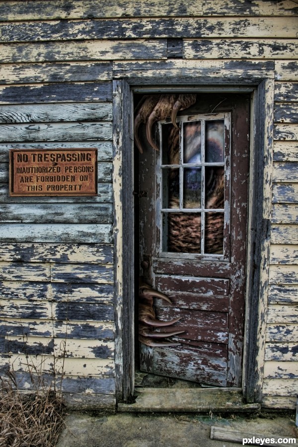
(5 years and 2909 days ago)
Very good!
Nice... doesn't look like I'd want to enter whether I was authorized or not 
Howdie stranger!
If you want to rate this picture or participate in this contest, just:
LOGIN HERE or REGISTER FOR FREE
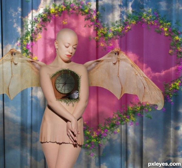
One more source in SBS (5 years and 2909 days ago)
Congrats! Great entry! 
Congrats 
Congrats
Congrats Rob
Howdie stranger!
If you want to rate this picture or participate in this contest, just:
LOGIN HERE or REGISTER FOR FREE
Answer in SBS (5 years and 2909 days ago)
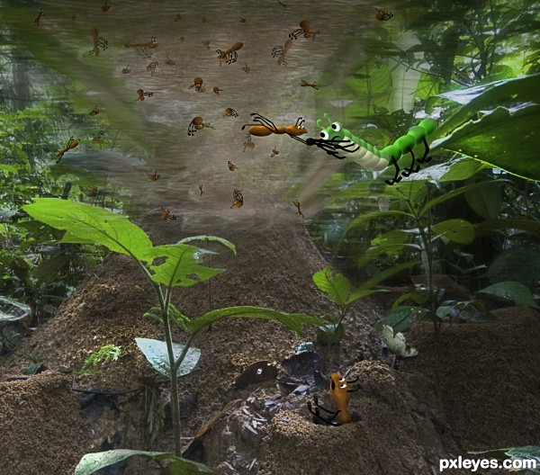
lol love there little faces!
my first attempt at a drawing thank you
This reminds me of the French series I think is called Minuscule, with animated insects in a real environment. Nice work author 
there was a Australian series called Dot and ___ I think that did the same thing. thank you
Congrats  well done
Thank you .. if you ever here the song again .. think of those poor ants 
Congrats!!
Howdie stranger!
If you want to rate this picture or participate in this contest, just:
LOGIN HERE or REGISTER FOR FREE
I think going less on the textures in the face and shirt will enhance your entry a lot.
I kind of like both of them now, can't decide (but I put your suggestion up in the contest piece and the original with the comparison in the sbs)
Howdie stranger!
If you want to rate this picture or participate in this contest, just:
LOGIN HERE or REGISTER FOR FREE